Flying Fish + A Powerful Promotion Poster: Latest Poster 2023 Submissions

If an image is worth a thousand words, what’s the worth of a poster? This week’s Poster 2023 entries show us how the skillful use of design and imagery has the power to move its viewers and tell a story, with or without words. 

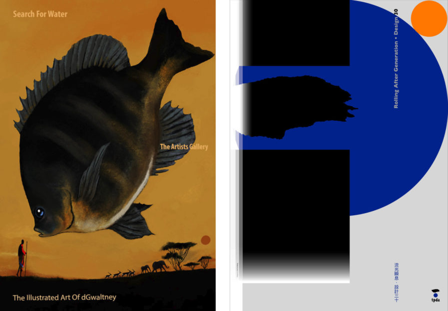
Search for Water” (above, left) was created by Poster 2022 winner David H. Gwaltney to promote “Mystical Creatures,” a series of limited edition prints featured in his online gallery dGwaltneyArt. Drawn on Procreate, Gwaltney’s preferred drawing tool, the illustration is a strong visual of the effects of climate change on aquatic life. Set in the African grasslands, a lone figure stands underneath a giagantic floating fish. In the background, antelope and elephants run under some trees. Everything is tied together with a color palette of yellows, browns, and blacks, except for a pop of red and blue on the figure and the fish’s eye. Between Africa’s scorching setting and the warm color choices, it’s easy to get Gwaltney’s point with a fantastic landscape that may soon become all too real.

Fa-Hsiang Hu is an award-winning designer and executive creative director of Hufax Arts Co., Ltd., as well as the director of the Taiwan Posters Design Association (TPDA), an organization that hosts a yearly poster competition. To promote the 30th Anniversary Exhibition of TPDA, Hu designed “The Power of Poster” (above, right) which represents the significant role posters still have in communication, art, and advertising. The poster’s design was created by incorporating TPDA’s logo and Chinese characters to spell out the 30th anniversary along with Hu’s trademarks eye-catching colors, simple backgrounds, and use of space. The poster also has hidden in it an abbreviation of the word “power”, which Hu hopes will convey to people the belief that posters are power. 
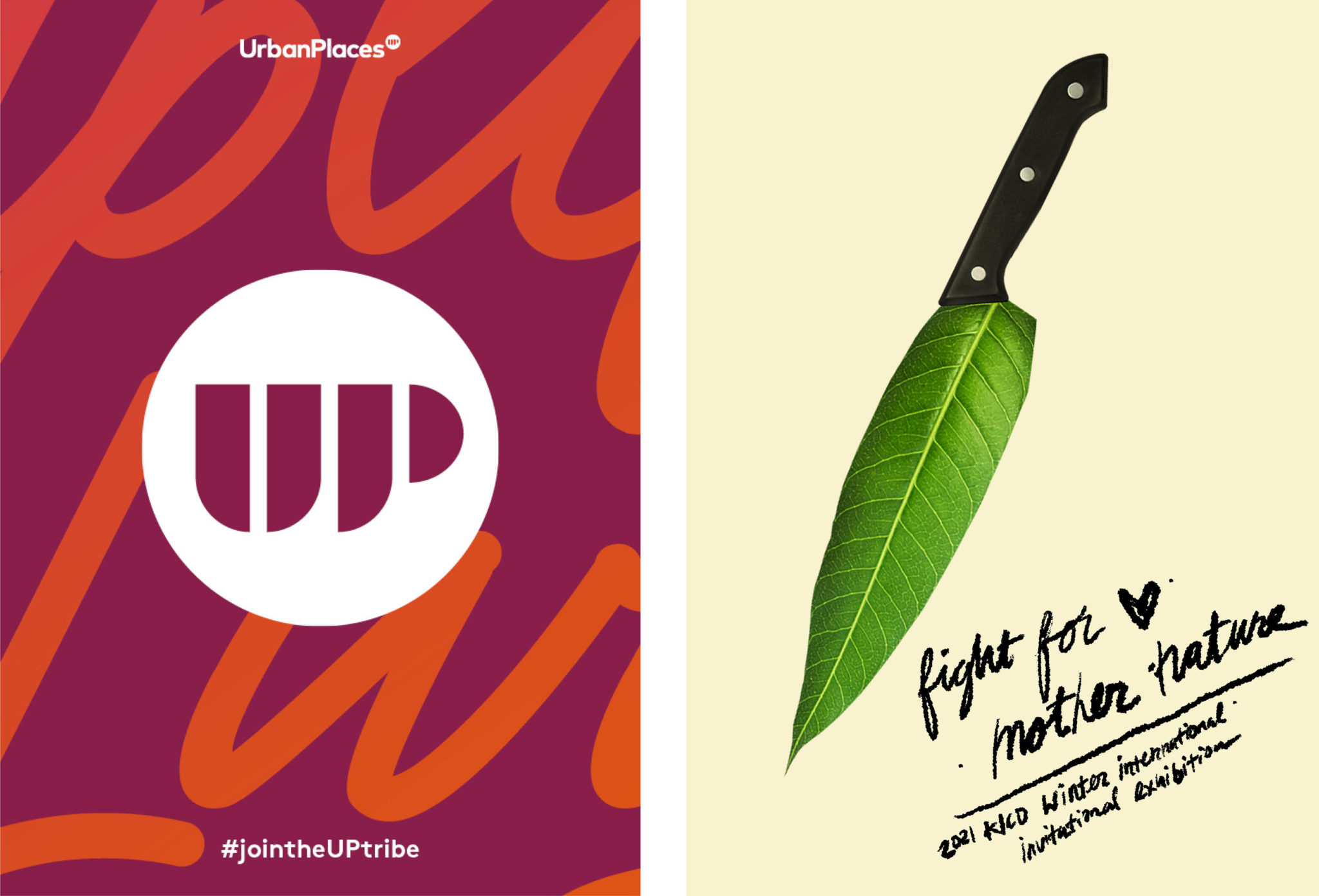
Built with Love” (above, right) is a poster series designed by Nichole Trionfi, Walter Ochoa, and Clare Harder of Australian design firm Hoyne as a part of their branding strategy for the real estate company Urban Property Group. As the company took on the burgeoning built-to-rent (BTR) sector in Australia, the designers knew that Urban Property needed a strong brand that would not only engage investors but demonstrate the benefits of the BTR lifestyle to prospective tenants to support their leasing activity. To do so, the designers created a bold branding identity conveyed in the poster’s warm color pallette of oranges, pinks, and violets, combined with oversized letter that takes up most of the image. Each poster also features photographs of people smiling and laughing with phrases behind them such as “Built to love” and “Built with love,” adding an warm feeling of invitation. In the last poster of the series, the cheeky phrase, “Well, well, well look what we got here” frames a photo of the company’s proposed apartment building. In an industry based on temporary and at times impersonal housing, Hoyne’s posters gave Urban Property a friendly personality that conveys the company’s commitment to providing quality spaces that feel like a home, charming potential renters and investors alike. 

Lastly, “Fight for Mother Nature” was created by Gold winner Ryan Slone for the KICD Winter International Invitational Exhibition, a poster competition held in South Korea. Submitted under the category of environmental issues, Solan’s poster depicts the Photoshopped image of a knife with a leaf as its blade. If it was just the knife, the poster could simply be a metaphor for how people are killing the natural world, but the featured tagline, “Fight for Mother Nature,” turns the image into a more motivating one that empowers the viewer to take action. It’s a perfect example of Slone’s aesthetic with the unadorned background, single powerful image, and a little text, and the result is simple yet provocative, inspiring a sense of urgency in the viewer.

To check out more poster entries, visit graphis.com.

Author: Graphis