It’s pretty obvious that when it comes to design, you want to build a emotional connection between the work and the viewer. Whether the designer is creating their own piece or working for a client, the best of design makes you feel something and identify with the some aspect of the work.
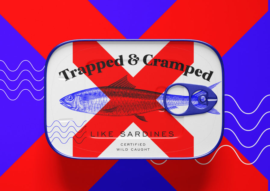
Ever wish you could just stick Covid 19 into a box and store it away? “Covid Feelings Packaged” (above) is a collection of packaging mockups created by Jan Šabach of Code Switch as a way express the designer’s mix of emotions that he (and everyone else) have felt throughout the Covid 19 pandemic. The collection utilizes various types of forms, ranging from sardine cans and seltzer drinks to chocolate bars and ice cream tubs, and each design uses different colors and graphic styles to humorously explore the feelings and capture the thoughts people experienced during lockdown back in 2020. For example, “Trapped and Cramped like a Sardine” mixes a vintage sardine image with simplistic ocean waves while using blue and red to symbolize the aquatic and the inability to leave the “house” respectively. Other packages, like “Anxie-T” use sharp typography and a large scribbled letter T graphic that visualizes anxiety to a T. With other labels reading “Fatigue: Zero Energy Drink” and “Natural Low Self-Esteem Ice Cream,” the products chronicle feelings of restlessness, fatigue, loneliness, melancholy, and even FOMO (fear of missing out), and despite the different styles come together in a clever, attractive packaging presentation.
