Daniel Pelavin grew up in Detroit, Michigan, trained as an apprentice in local art studios, and began practicing in the days when Adobe was primarily known as construction material. From his earliest work, produced using templates, french curves, and drafting tools, to his present-day virtuosity in digital media, Pelavin has showcased his unparalleled knowledge of geometric forms, rich colors, and letterforms inspired by a wide range of 20th-century cultural ephemera. His work, including illustration, typographic, and icon design, has been the subject of articles in books and magazines. Now based in New York City, he is an instructor of illustration, design, and lettering, an author of articles on design practice and education, and has presented his work to design organizations and universities throughout the United States and New Jersey. He earned his BA in advertising and MFA in graphic design, but he credits high school industrial arts classes and studio apprenticeships as his most valuable source of training and inspiration.
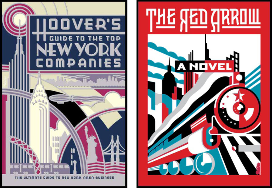
Pelavin’s work encompasses a sort of retro-futuristic vibe that mixes modernistic design with elements of 1920s Art Deco. Pelavin showcases this brilliantly in his book covers like “Hoover’s Guide to the Top New York Companies” (above, left) and “The Red Arrow” (above, right). Both cover designs simply scream Pelavin’s name with his signature typography and illustrations. The main focus in the first design is, obviously, the color red, but Pelavin adds a dynamic twist with his angling of the train and the city in the background. He also adds splashes of teal blue and black to set off the red and make the whole design cohesive. “Hoover’s Guide” leans heavily on Art Deco influences, which makes sense considering the subject matter of the book is New York, the birthplace of Art Deco in the United States. Buildings in New York City such as the Chrysler Building and other skyscrapers stand as monuments to the Art Deco style, and Pelavin perfectly captures them with highlights of silver, navy, and cream in his design.


