Design: Inspiring Platinum- and Gold-Winning Works from London and New York

These designers elevate ordinary brands to new heights of esteem

There is no easy way to quantify quality in design. While competitions such as the ones at Graphis suggest there is a cut-and-dry method to doing so, design is still a personalized moment of allure and introspection. What can seem intriguing and eye-popping to one, can seem boring and drab to another. There is no simple way of ascertaining which design or designer is better than the next. It is part of the intangible aspects of the humanities and arts–it’s entirely subjective. And yet, it is difficult to deny quality design when you see it, which is the case for designers Stranger & Stranger, Osborne Ross and IF Studio’s father-and-daughter team Hisa and Toshiaki Ide.
Stranger & Stranger’s designs for the United Nations’ 2017 International Peace Day stamps (ABOVE) are a marvelous celebration of modernist camaraderie. The vibrant colorization, multicultural evocations and international languages, all point to the United Nations mission of upholding peace, civility, human rights, and more. It points to an era in which mankind was determined to work together in a liberalized global order, one that would lean on one another for support rather than castigate and shun. It’s a hopeful imagery that perhaps one day will indeed become an actualized reality. But for the time being, it seems that is more a dream than anything else.
   
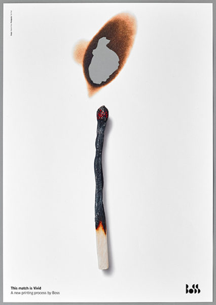
Osborne Ross’ Andrew Ross and Deborah Osborne incorporate intriguing design aesthetics in their work for Boss Print, entitled This is Vivid (ABOVE, LEFT). To showcase Boss Print’s superior printing techniques, Osborne and Ross played with paper texture. They incorporated fire, cutting, holes, tears, and more demonstrate how the printing quality of Boss Print is so high that it is indistinguishable from the real thing. It’s a productive approach, one that surely showcases the company’s excellent standards of printing.
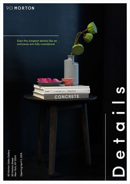
IF Studio’s Hisa and Toshiaki Ide’s work for Brack Capital Real Estate, entitled Details (ABOVE, RIGHT), is of a different approach, showcasing a high level of stylization that is indicative of the metallic black steel aesthetic that adorns the building, 90 Morton. The Gold award-winning project pays a high attention to detail and an eye for elevated aesthetic. The team at IF Studio has done an outstanding job of bringing 90 Morton to life.
It isn’t too late for you to see your work up here too! Submissions for Graphis’ Design Annual 2020 Competition run till March 13, 2019. Winners will have the opportunity to see their work published on our website, blog, newsletter, and social media platforms!
Author: Graphis

Leave a Reply

Your email address will not be published. Required fields are marked *