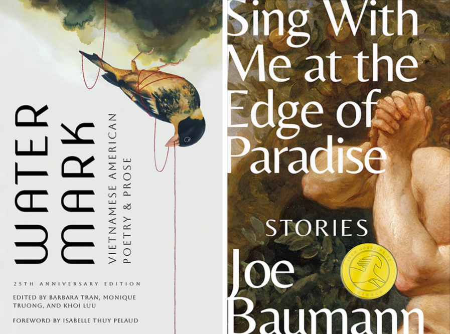
Texas Tech University Press (TTUP) has a distinguished approach to uncovering and nurturing literary gems. Under the creative guidance of senior designer Hannah Gaskamp, TTUP garnered prestigious awards in the Design 2024 competition. TTUP’s self-initiated book cover projects, “Watermark” (above, left) and “Sing With Me at the Edge of Paradise” (above, right), exemplify the harmonious blend of artistry and narrative. This blog story delves into the intricate process and artistic considerations behind the award-winning work, illuminating the path from conceptualization to realization.
By: Hannah Gaskamp, Senior Designer, Texas Tech University Press
Texas Tech University Press (TTUP) finds its catalog through a variety of means including partnerships with other organizations as well as annual awards. The 25th-anniversary edition of Watermark, a seminal anthology of Vietnamese American literature, came to the press through its relationship with the Diasporic Vietnamese Artists Network. Sing With Me at the Edge of Paradise came to the press through its relationship to Texas Tech’s literary magazine, Iron Horse Literary Review. For the Iron Horse Prize, TTUP chooses among submissions of short story collections for publication each year. Sing With Me at the Edge of Paradise was the chosen collection for 2023.
Once the press acquires titles, our design team (which consists of only me) is responsible for creating covers that efficiently and effectively communicate the genre, tone, and general concept of the book.
Watermark
The primary inspiration for the cover design of Watermark was a piece of art by Trinh Mai provided by the editors of the collection, as well as some of the formatting and themes present in the text. Poetry, which makes up a large portion of this collection, often takes on unique formatting. The content of the collection is also described as experimental. I wanted to emulate both of these ideas on the cover with a unique/experimental layout of the text. I also, admittedly, am always looking for a way to make the title as large as possible. Breaking the title in half and putting it vertically was a way to both accommodate the art and make the text larger than it would be in any other formation. The typeface chosen for the title is Nova Slim, designed by Wojciech Kalinowski and available from Google Fonts. I felt this typeface had interesting and unique shapes that added much to the effect of the title. I also enjoyed the way the W and M of the title reflected cleanly. Thankfully, the editors had no qualms with this design and were happy to move forward without changes.
Sing With Me at the Edge of Paradise
Sing With Me at the Edge of Paradise is a collection of short stories revolving around queer men of various ages trying to temper their expectations of the world with their lived experiences. The titular story focuses on a modern and queer retelling of Adam and Eve in the Garden of Eden, and a representation of this story was requested for the cover image. I wanted a classical painting of the scene to be the imagery to juxtapose the purity of the original with the subversive tones of the book. The image chosen is The Rebuke of Adam and Eve by Charles-Joseph Natoire, available in the public domain courtesy of the Metropolitan Museum of Art’s website. I wanted to focus on Adam, as the book is about queer men, and of all the works I looked at, I liked the way he was portrayed here the most.
I originally included more of Adam, most notably his face, but the author requested that we cut it out to keep things more anonymous and relatable. This allowed for a close-up of the gorgeous textures present in this painting, focusing on the leaves and the details of the brush strokes and adding a new level of intimacy that aptly reflected the tone of the book. A handwritten typeface was also tested, but we ultimately landed on Belleza, designed by Eduardo Tunni and available from Google Fonts. Eduardo mentions that this typeface was inspired by the “elegant models and feminine beauty” of the world of fashion. While this book is not directly related to fashion, feminine beauty is often associated with queer men and seemed fitting for this spin on a usually masculine story.
I wanted to play with the idea of edges on this cover. In unchosen options, I had put the painting in a circle and had the title interact with it, cutting it off and changing its color, but another option was what was chosen: having the title bleed off the edge of the cover. I was excited to be able to see this idea come to fruition. In the interior of the book, I was not able to have the chapter titles extend to the edge of the page, so to keep up the idea of edges, I added extra hyphenations, breaking them more frequently than necessary to create more edges in the text.
Conclusion
It’s always a great honor to receive recognition from a historic and respected institution such as Graphis, and it’s encouraging to see awards being given to in-house designs at a very small university press. I hope to see more design that breaks the “rules” of cover design—like vertical text, broken text, and text that bleeds off—be celebrated in the future. It proves that it’s always worth it to take the risk of unusual design choices on the chance the client is willing to move forward with something a little more daring and fun.
While this work was done in-house at Texas Tech University Press, the press only publishes books that fit our list and niche and is not open to anyone simply seeking quality design work. However, I, as the sole and senior designer at the press, also offer freelance book design and am currently seeking projects. Other work, rates, and contact information can be found on my website.
Hannah Gaskamp received her BFA in communication design from Texas State University in 2019 and became senior designer at Texas Tech University Press immediately upon graduating. At the press, she performs all things design, including all cover, jacket, interior, and marketing design. She has been featured in Graphis several times for both her cover and logo designs. She has also been honored by the PubWest Book Design Awards and LogoLounge and was shortlisted for the Communication Arts 2023 Design Annual. She has been additionally freelancing since 2020 for both traditional and self-published book design. She can be found at hannahgaskamp.com.


