
Code Switch, led by Jan Šabach, crafted a brand identity for the University Museum of Contemporary Art at UMass Amherst’s “Sixty Years of Collecting,” which earned a Gold in the Graphis Design Awards 2024. Jan’s design masterfully combines typographic clarity with visual impact, capturing the museum’s rich history and forward-thinking ethos, ensuring the exhibition resonates meaningfully within academic and local communities.
By: Jan Šabach, Graphis Designer & Creative Director, Code Switch
About the Exhibition:
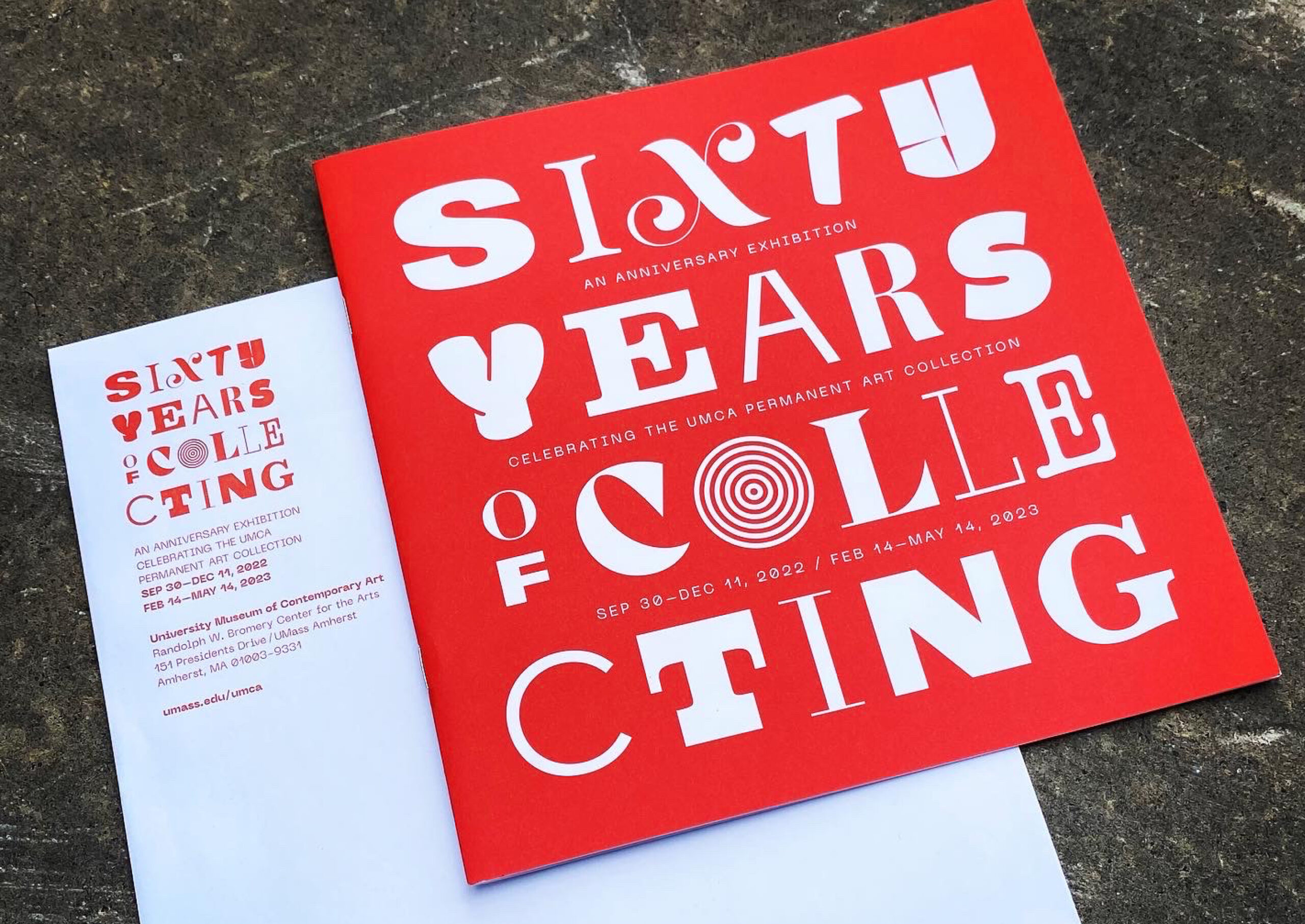
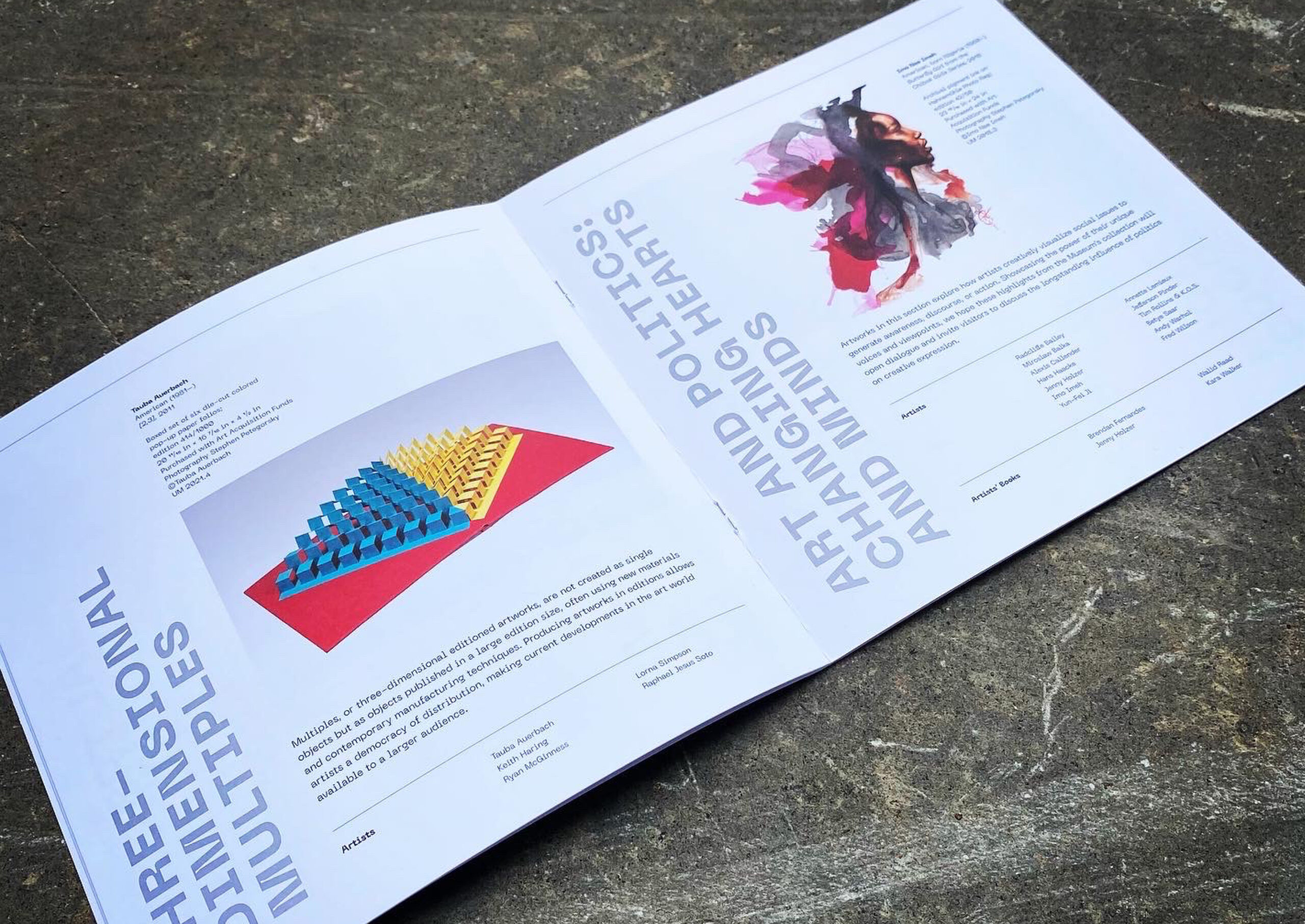
The University Museum of Contemporary Art (UMCA) celebrated the 60th anniversary of its permanent art collection with this unique exhibition of 115 artworks drawn from its growing collection of more than 3,600 prints, drawings, photographs, and multiples—from masters of mid- and late-20th-century art to work by the leading artists of our time. The 60th-anniversary exhibition is a significant milestone for the UMCA and a moment for reflection, critical examination, and charting new directions. The exhibition reveals the museum’s most recent collecting strategy, which prioritizes diversifying the collection.
According to the museum’s director, Loretta Yarlow, “The goal of this exhibition is to uncover new connections and to invite innovative interpretations of the art in the collection. This has been our mantra since our beginning, and it will continue as our Teaching Museum becomes even more fully integrated into the fabric of our entire academic and local art communities.”

Creative Strategy
Selecting representative artworks from a collection spanning six decades is a daunting task. We chose a typographic-based identity to capture the diversity and richness of styles. Each letterform symbolizes distinct artistic styles and the breadth and depth of artworks within the collection.
A restrained color palette was deliberately chosen to harmonize with the exhibited artworks, while a vibrant red hue was strategically employed to draw attention and ensure text legibility.
The limited color palette was used so that the identity wouldn’t clash with the color of the exhibited artworks. Still, the red is bright and contrasty to get the viewer’s attention and preserve the legibility of the text.
The letters are mostly used in a square composition, which works well for the museum’s outdoor signage, brochures, and social media posts. However, they can also be arranged as a horizontal rectangle to be used as a cover image on the museum’s website. The title of the exhibition worked equally well as a large-format sign and as a stamp.
Results
The client was pleased with their identity and how it visually supported one of the core objectives of inviting innovative interpretations of art in the collection.


Jan Šabach is a Prague-born graphic designer and a creative director creating distinct brand identities, book covers, and posters for international clients and global causes. He has experience in leading design teams and working directly with clients. Jan’s work has been honored by numerous international design awards and is consistently showcased in leading design magazines and publications worldwide such as Graphis, Communication Arts, Print, AIGA, and Type Directors Club.
Currently, Jan runs Code Switch, a graphic design studio in Northampton, Massachusetts, and teaches graphic design at the University of Massachusetts Amherst. He likes to dedicate a portion of his time to projects that raise awareness about critical social issues.


