Design Activism: Protest Posters 2 Featured Entries

As much as graphic design is used for commercial or artistic purposes, it is also used for powerful activism. This week’s Protest Posters shed light on environmental, health, and political issues around the world.

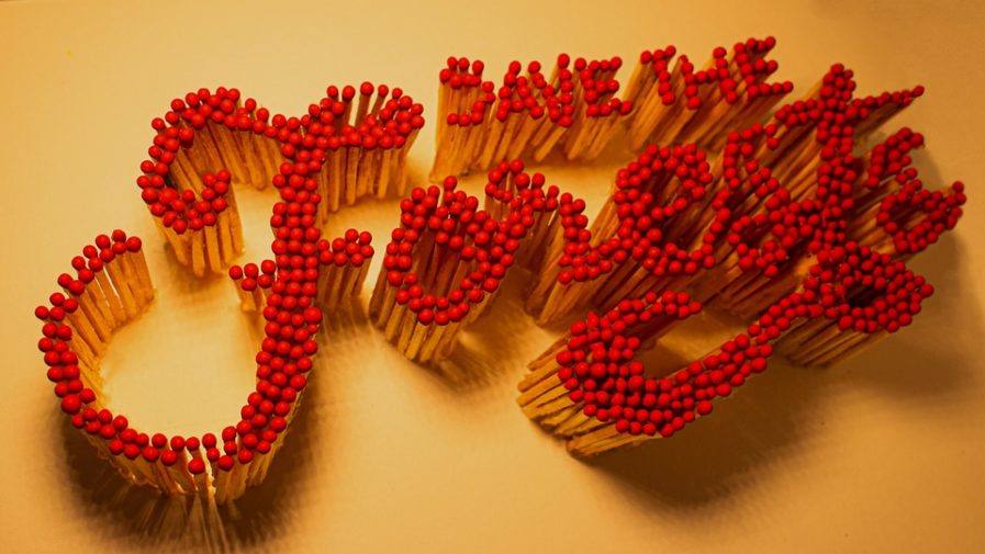
Brazilian creative art director Udo Döhler uses irony to convey a simple, but important message: Save The Forests. In “Save the Forests“, (above) he arranges matches to write the aforementioned message, highlighting the destruction of forests that occurs in Brazil and other parts of the world each day: “With the fires around the world we are losing our forests. That’s so dangerous for the environment and also for humans. I am trying with some design skills to communicate how important it is to think about it more often and make people feel part of the problem,” Döhler explains. The Sao Paulo-based artist succeeds at such, as viewers can’t help but to think of the grave consequences of deforestation as the stark, red matches stare back at them, conveying a sense of urgency and the responsibility we all have to do something.
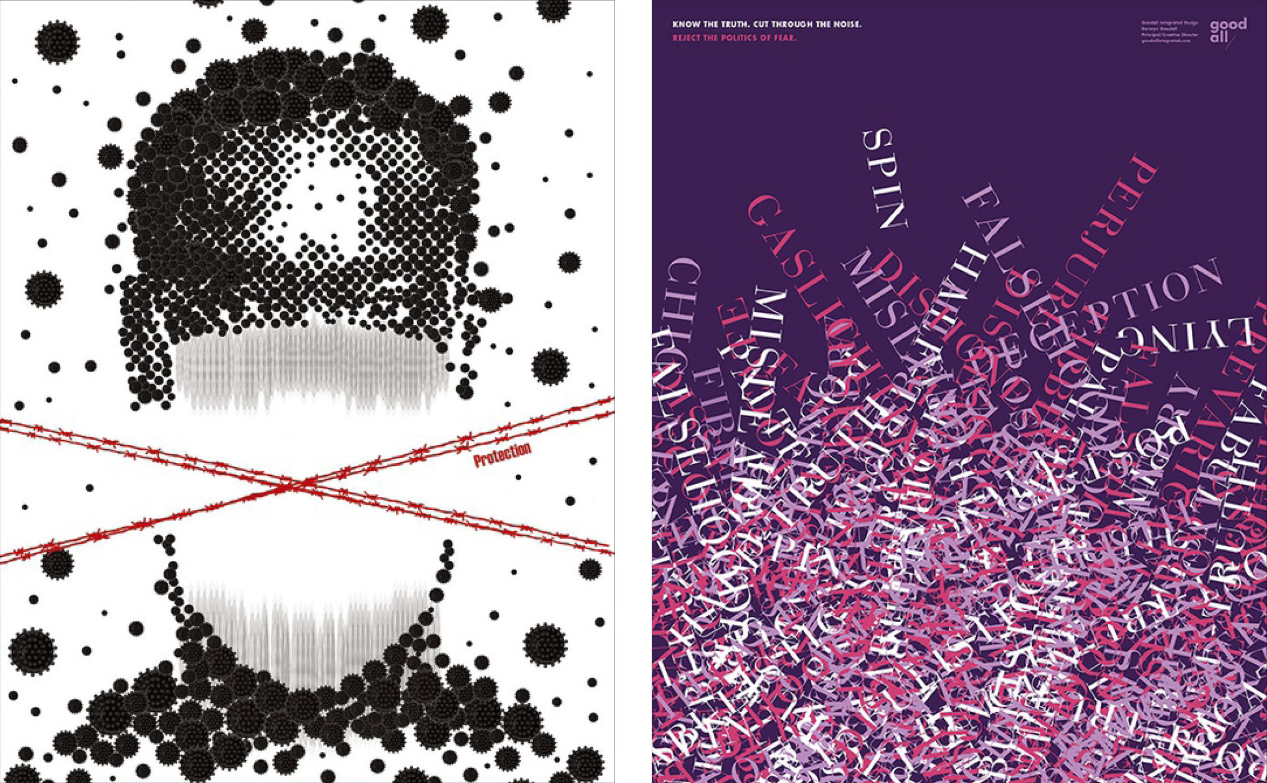
Kasai Noriyuki makes a large statement about health with his poster “Protection” (above, left), exhibited at the 2021 International Poster Exhibition which was hosted by the Korea Institute of Design Research Society. The coronavirus pandemic has rocked the world, and Noriyuki uses the creative method of dot design to remind people of our duty to wear a mask and social distance: “Our new normal [is] wearing a mask … to protect ourselves and other people, we have to learn to get accustomed to [it].” Noriyuki used black dots to symbolize the virus and lengthened the face mask in his design to represent social distancing. He also included a red cross line to symbolize protection against the virus by adhering to the two guidelines. The poster comes at a pertinent time in our society, and with some people disagreeing about the best practices to use in order to protect ourselves, Noriyuki reminds others that it is never the wrong choice to be cautious and make small sacrifices to ensure the safety of us all.

Derwyn Goodall of Goodall Integrated Design, a Canada-based design studio, says that “the truth is often obscured by gaslighting, lying, and dishonesty,” and such is the theme that he conveys in his political poster “Know the Truth” (above, right). The brightly colored amalgamation of words is meant to “communicate the importance of knowing the truth and rejecting the politics of fear,” Goodall explains. With so much information at our fingertips, it is a rightful concern to worry about the flood of misleading and fear-mongering articles meant to cash in on people’s ignorance on certain topics. With the words in Goodall’s design differentiated by color, the viewer can see that what may once start out as a little white lie – or “spin” on certain situations – can turn into full-blown gaslighting. Goodall reminds us to stay vigilant and do our research before accepting everything we are exposed to.

We all need a little reminder about the important issues in the world and artwork is an excellent way to connect with a broad audience. For more compelling Protest Posters and to submit your own, visit graphis.com.

Author: Graphis

Leave a Reply

Your email address will not be published. Required fields are marked *