A “Vulgar” Display & A Fresh Face Forward: New Talent 2022 Competition Entries

Design students go big with their design projects, creating everything from new tourist destinations to the next biggest brand. You’ll be blown away with these New Talent 2022 Award entries!

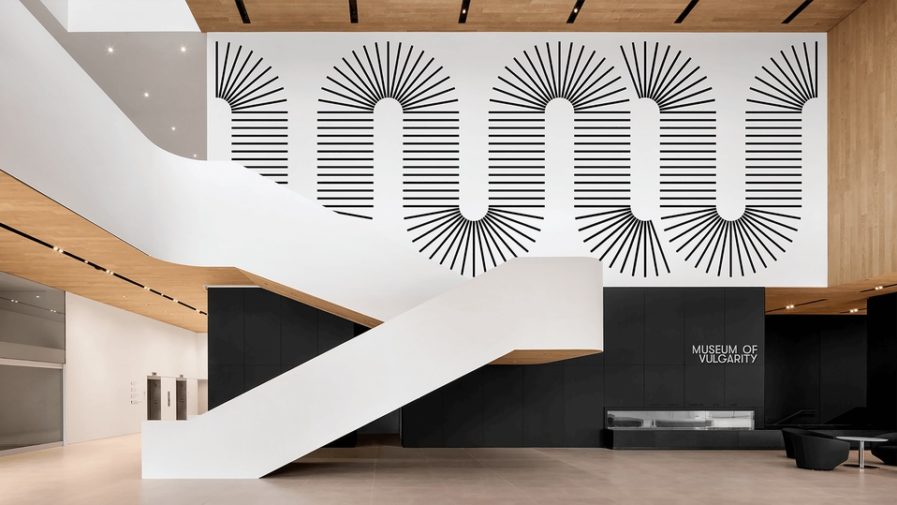
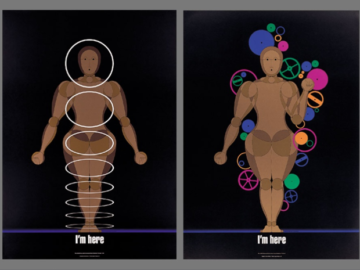
When you think of museums, you usually picture a place filled with tasteful, high-end work. That’s not the case with the Museum of Vulgarity (above), a non-mainstream museum that covers sensitive and controversial works while maintaining a sense of exclusivity by offending mainstream audiences. The concept was created by Xizhong Zhang, a student at the Maryland Institute College of Art, under the direction of Professor Andrew Waters. Zhang also created the museum’s logo and promotional material, which included banners, lanyards, business cards, and stationary. Regarding the logo, Zhang tried to capture the curve shape from a sink drain trap, which is something that, surprisingly, can be compared to every one of us: “Everyone has their own secrets, preferences, addictions, etc. Even some of them are dark, evil, nasty. But we can’t see them from the outside. Just like the water trap – clean outside, dirty inside.” In doing this, Zhang brings peoples’ ‘vulgarities’ to light and makes the viewers wonder what displays the musuem has.
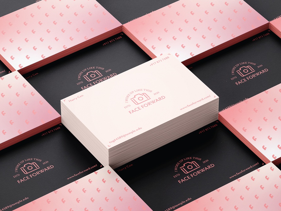
Harry Cen, a student at Temple University’s Tyler School of Art and Architecture, had only one assignment for the semester, which was a UI/UIX design case study, and the effort he put into it clearly shows. Under the direction of Professor Abby Guido, he created a brand named “Face Forward” (above) which helps customers aiming to have a better look on social media. There were three parts to the case. The first part, research, was to introduce the concept to the audience to let them learn about the issue and possible solutions. The second part, the design process, included showing the audience how Cen designed the logo and other branding elements. The style went for was something geometrical and symmetrical while focusing on the line art as well as the typography. For colors, Cen chose nude and pink shades for a modern feel with a charcoal shade for contrast. He also created color gradient designs to add more visual interest. Finally, in order to complete the case study, Cen created material including business cards, Instagram story campaign ads, desktop mockups, and a UI design video.

Want to see more work or enter your own design? Check out the competition here!

Author: Graphis

Leave a Reply

Your email address will not be published. Required fields are marked *