This week’s winning posters are all bold statements on the art of color and craft within a design. From Platinum to Gold, each poster effectively communicates its message, blending typography and image into something stunning.
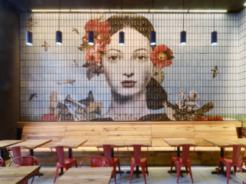
Our first Gold-winning poster comes from designer and Graphis Master Gunter Rambow, who was tasked with designing a poster for Oper Frankfurt, an opera house in Germany, to promote their production of Hector Beriloz’s “Die Trojaner (Les Troyens)” (above, left), which was inspired by Virgil’s classic epic poem, the Aeneid. The design takes all of the elements of tension and violence from the original poem and turns it inward by having shards of mirror glass stick out from the back of a person’s head. These shards almost resemble a punk rock mohawk, which brings the classical material into a more contemporary light. Rambow designed the poster’s typography in a way so that the viewer must seek out the information since it does not compete with the image, but rather hides behind it (at the top) or appears in the negative space (at the bottom). The color palette throughout remains quite moody, allowing viewers to soak in this tale of classical anguish in an easily approachable, modern way.
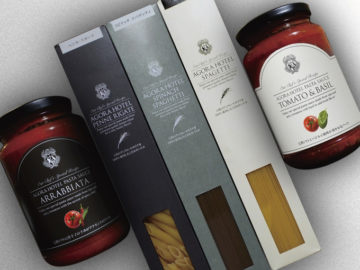
“Equality is_Relevant” (above, right) is the next Gold-winning poster, as designed by Tom Davie from StudioTwentySix2. At first glance, a viewer might be struck by its abstractions and its experimental take on color and shape. The left side of the poster is cool, reminiscent of a wave meeting an algorithm, while the right side plays with fire, its color gradients full of pinks, reds, and yellows. Utilizing digital rendering, typography, data visualization, and color theory, this poster is the perfect experimental example of what design can achieve and strive for. Layered with complexity, Davie’s poster allows viewers to follow different thought patterns as they develop their own analysis and understanding of the work.
