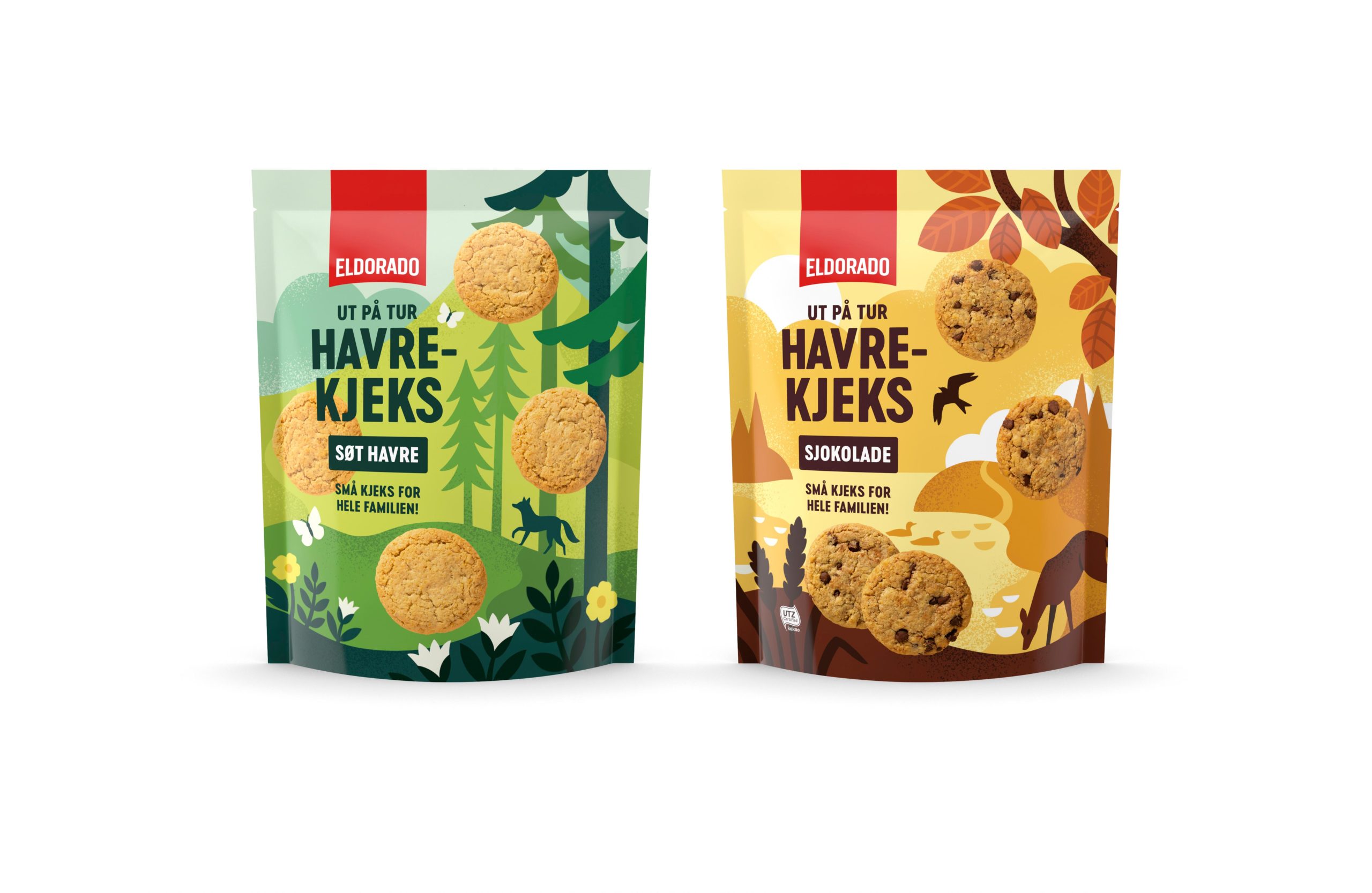
Feast on these food-based Packaging 10 entries! PepsiCo Design & Innovation celebrated an anniversary with festive new cans, while Strømme Throndsen Design baked up some new pastry packaging for Unil AS.
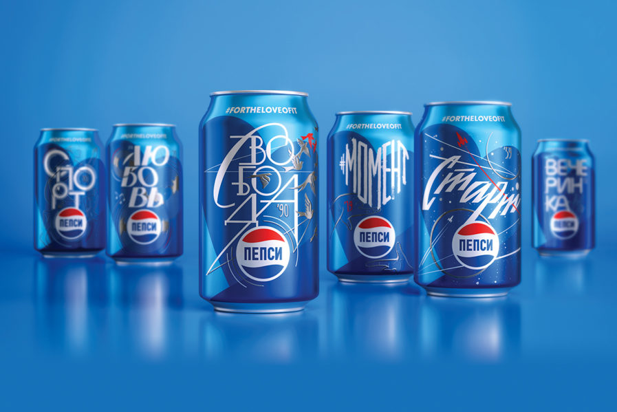
“Pepsi 60 Years Ltd Ed Cans” (above) celebrates sixty years of Pepsi in Russia with six limited-edition cans, each commemorating significant events from six decades. Their hope was to connect with the Russian consumers by using the Russian lettering system as well as to link each generation to the next. These cans also seek to further strengthen Pepsi’s role within Russian culture, while maintaining the iconic Pepsi brand, through their signature red, white, and blue color scheme. It’s no wonder that this nostalgic yet sleek design won a Silver 2020 New York Design Award.
