Blending Beauty + Forms and Visions: Newest Poster 2023 Submissions

This week’s posters redefine a poster’s longstanding purpose: promotion. Whether it’s for movies, TV shows, or exhibitions, an informative yet picturesque poster is an invitation to check out something new.

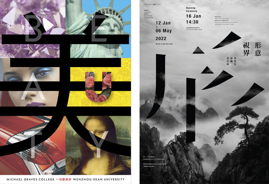
Who has more school spirit than Randy Clark? An award-winning designer and assistant professor of graphic design at Wenzhou Kean University in China, he teaches courses in print, typography, and silk screening. To celebrate the opening of the university’s new architecture and design building, Clark created a poster named “Beauty” (above, left), which highlights the Asian and American sensibilities of the Sino-American collaborative university. Using iconic artworks, photography, and landmarks of both countries as the backdrop, Clark skillfully incorporated the English and Chinese translations of beauty as a part of the layout, creating a harmonious celebration of design in both cultures.

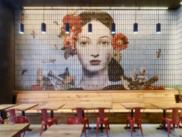
The Taiwan-based designer Leo Lin is an art director of his studio Leo Lin Design, as well as a professor and dean of the College of Arts at the National Taiwan Normal University and former President of the Taiwan Poster Design Association. He created “Forms and Visions” (above, right) for the Soka Association to promote its poster exhibition held in China. Lin’s poster design shows a gorgeous grayscale photo of a mountain peak with the Soka Association’s logo at its center. The itinerary for the exhibit is outlined along the perimeters of the page, detailing the names of guest speakers, topics, and the days of the event.
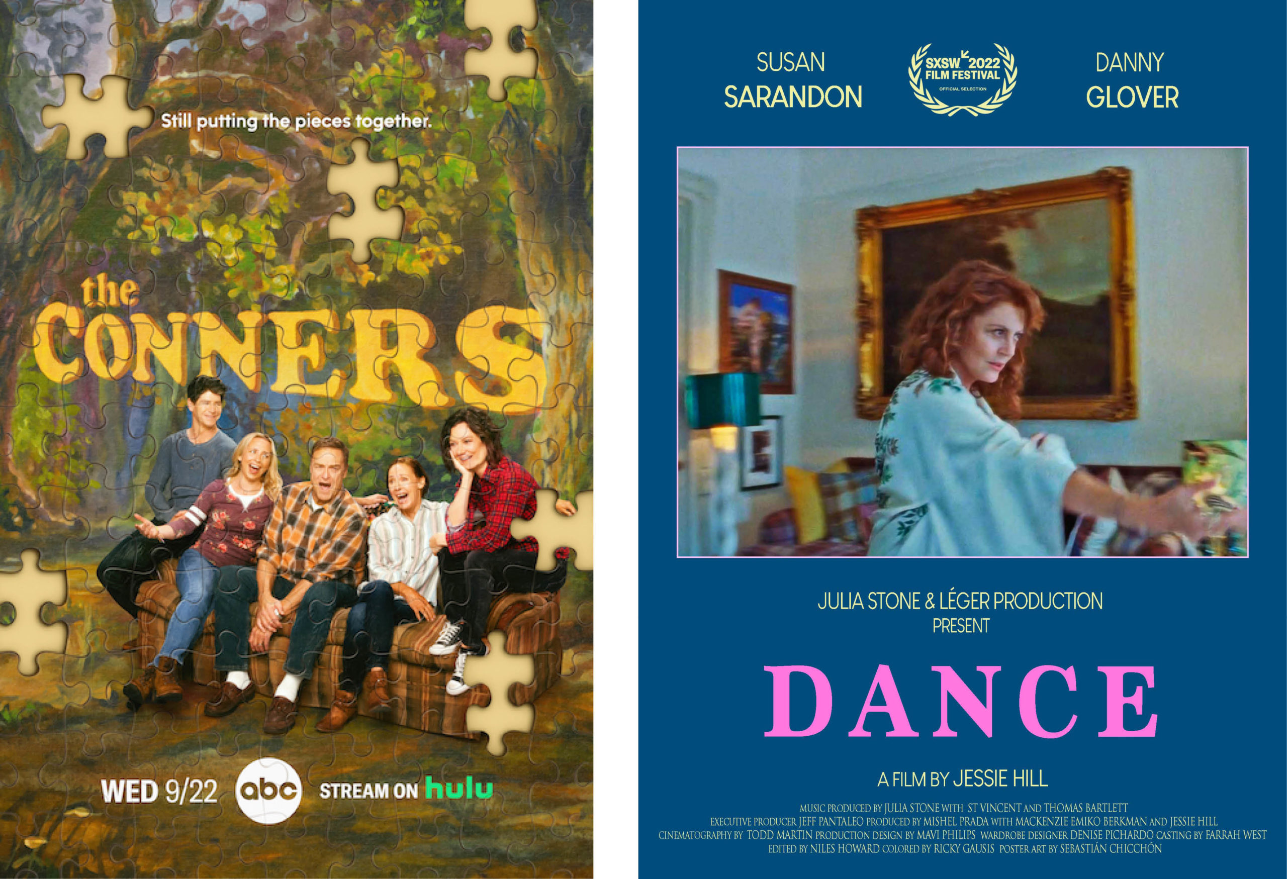
Known for specializing in digital, A/V, and print campaigns for the entertainment industry, The Refinery is one of the most acclaimed advertising agencies out there. For one of their most recent projects, the agency teamed up with ABC to create a promotional poster for the network’s TV show, “The Conners” (above, left), a spin-off continuation series of the hit show Roseanne. With the show’s 4th season gearing up for its September premiere, the agency’s poster design features the Conner family as pieces of an incomplete puzzle, seated on the show’s iconic couch.  Near the top of the poster, the tagline reads, “Still putting the pieces together,” underlining the family’s ongoing journey through grief, addiction, and financial trouble.

The last poster we’re looking at is “Dance” (above, right) by Peruvian designer Sebastián Chicchón. The short film, which debuted at this year’s SXSW festival, was directed by Australian director Jessie Hill, who began her directing career with a series of music videos for Angus and Julia Stone, an Australian sibling folk and indie pop group. “Dance” is Hill’s most recent video with Julia Stone, featuring the iconice Susan Sarandon and Danny Gloveron on a track produced by American musician St. Vincent. The video itself is about falling in love later in life, and Chicchón wanted his poster to capture the energy and excitement that comes when one realizes that it’s never too late to find love. To express the feelings mentioned above it was decided to use a soft color palette and a photo where we can see the character is full of life. For the layout and typography, it was decided to go for an elegant, classical but joyful look with the touch of bright pink. The result was an interesting and eye-catching poster that really captures the meaning of the story.

The deadline to submit your work is less than 7 days away. Visit graphis.com to learn more!

Author: Graphis