Graphis is excited to partner with Monotype to bring you a monthly series on type trends.
“There is a rich, thriving world of type out there that rewards the curious seeker with inventive, memorable, even mind-expanding designs.” – Phil Garnham, Monotype Creative Type Director.
One of our most popular pieces, Monotype’s annual Type Trends report, recently dropped. This report is not our work. It’s work by brands and agencies that we admire and whose work really stood out over the last twelve, and some odd, months. This is not an advertisement for Monotype; it’s a story of typographic creativity and some of its root causes; a celebration of the unique typographic voices of our times.
In this related Type Trends series, you’ll find the result of a year’s worth of looking, collecting, and curating by the Monotype Studio. Each year we reflect on which trends have continued, which ones have morphed, and which ones withered on the vine. We’ll continue to explore other trends in future blog posts and highlight the exciting work by designers, foundries and agencies that helped shape the trends.
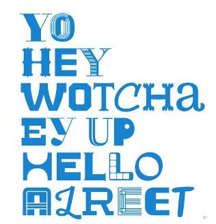
In the spirit of “mixing things up,” we’re going a little out of order and starting with the trend that graced the cover of our report, “Mix-Up.” Individuals, groups, and the culture at large are embracing diversity—fluidity—ambiguity—inclusion. Mix-Up is typographic diversity, pairing multiple typeface styles in one identity to turn diversity into unity.
Like the Loopy logo (more on those in a future blog) Mix-Up is an easy concept that’s not particularly easy to pull off. But even when it’s not done particularly well, the idea is sublime: embracing differences.
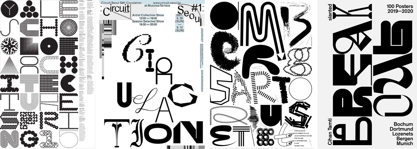
The idea is old and new—or old in a new context. In 2015, Pentagram designed the poster shown for the Yale School of Architecture. And more recently, Phillip Kim designed the poster for the exhibition Circuit Seoul in Korea. Sam Steiner designed the poster, “Amberg, Sartorius, et/et.” for an exhibition in Switzerland. Finally, breakout-design-star Cihan Tamti i created the book cover for German publisher Slanted, for a collection of his posters designed in reaction to the pandemic.
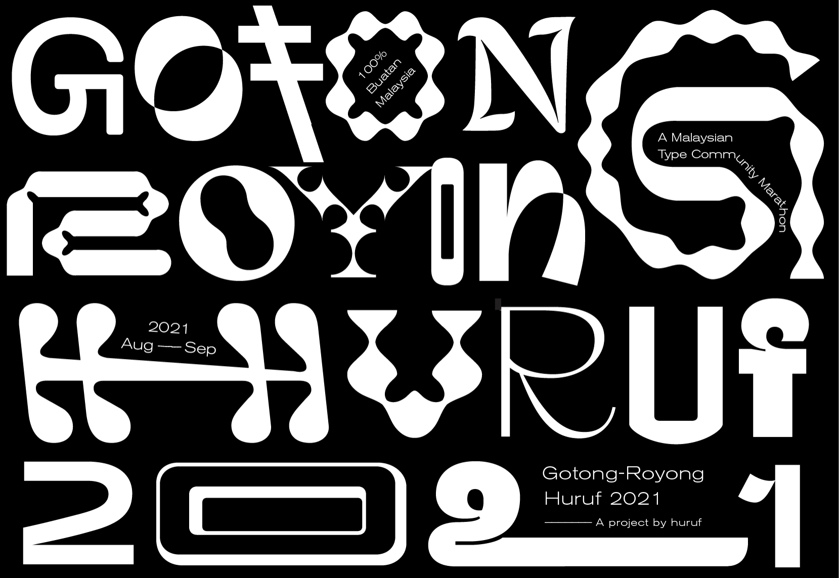
In Gotong-Royong Huruf, by the Huruf type collective, it is done particularly well. Through a type design marathon bringing together the Malaysian type community, the collective created a Mix-Up typeface inspired by a place and an ethos of mutual care, or “gotong-royong”. Twenty-six designers contributed two letters each to combat isolation, foster digital solidarity, and document the current Malaysian zeitgeist.
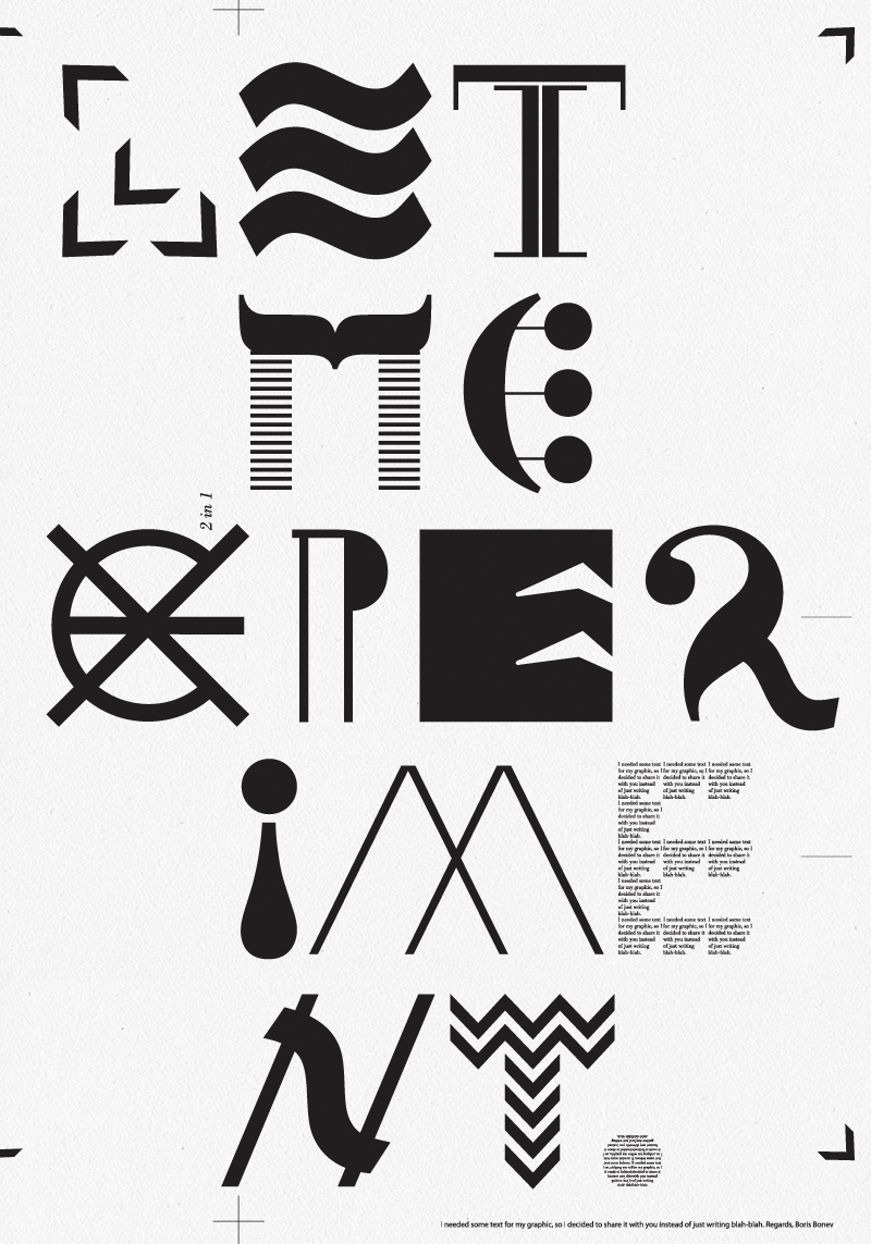
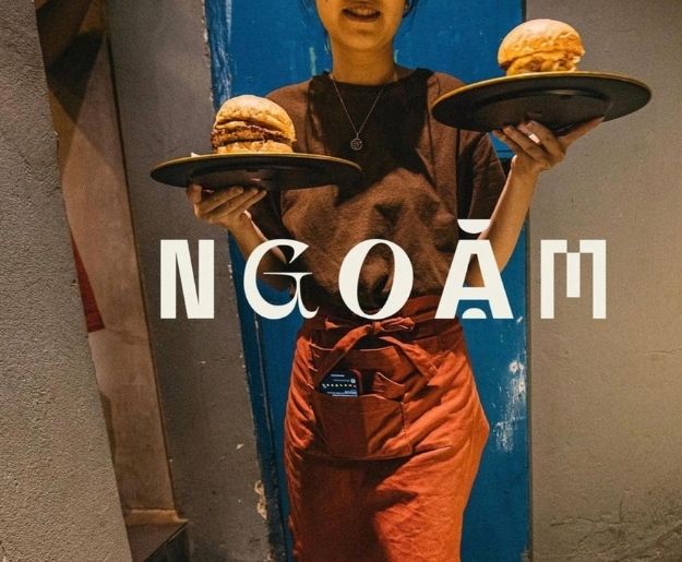
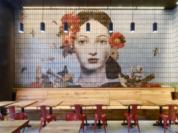
Studio Cohe in Vietnam describes Ngoam’s identity as “using ransom letters as motif” to give an impression of “experimental cuisine” at a place “where diversity becomes unity, where cultural ambiance breathes life into each taste.” The agency Triboro uses a Mix-Up treatment to express a variety of proponents of innovative design in a book published by Fast Company. Dutch designer Boris Bonev’s Mix-up poster is a simple command: Let me experiment.
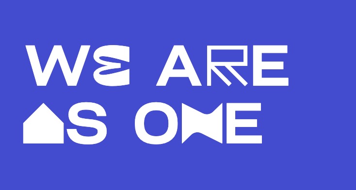
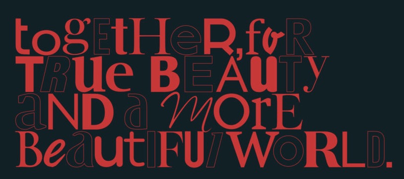
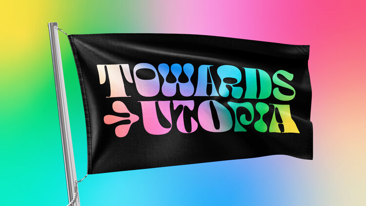
Agency Airbourne Studio in the UK created a Mix-Up custom typeface called AsOne to express the idea of “unity in diversity” for their identity. Henkel Beauty Care in Germany is dedicated to diversity and inclusion throughout their company and brand. Interbrand used Mix-Up to express that in their typography. Towards Utopia is a trans-feminist, anti-racist organization focused on art, education, and resources. Dazzle Studio gave them a beautiful riff on Mix-up to express that ethos.
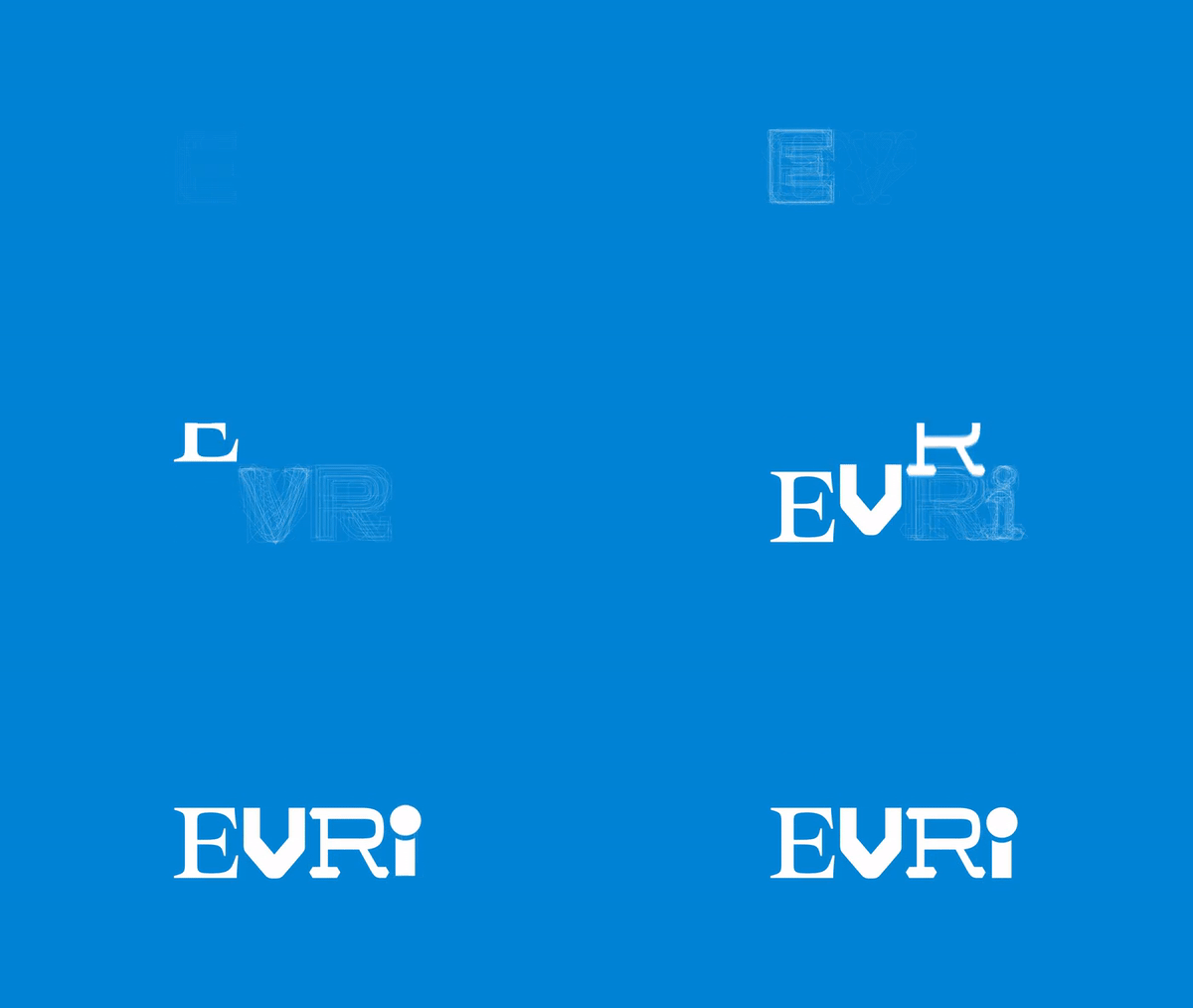
Recently, Hermes, the UK’s largest parcel delivery company, rebranded as EVRi with a Mix-Up style logo that has 194,481 permutations. The Monotype Studio partnered with leading branding agency, SuperUnion, and set out to create another ‘world’s first,’ a generative logotype system that was unlike any other seen before. By employing variable font technology, the Monotype Studio design team, led by Creative Type Director, Phil Garnham, envisioned the design of an adaptive logo system, one that enabled Evri’s logotype to change its letterforms entirely, and yet remain sticky; a logo that eliminates consistency at every customer interaction whilst still being completely recognizable. No small task!
This ambitious goal of creating a living logotype was made possible by variable font technology. A variable font is a dynamic font family, it can behave like multiple fonts, and with a little extra creative thinking, they can become responsive too. Variable allows us to interact with and apply external data points to font data, to manipulate the font style to whatever form suits the design, the context, or even a customer’s preference. Our vision for Evri was to create a variable logo system that adapts from one to many viable alternative designs.
