In the Advertising Awards 2024, Haas Design landed Gold with “Library of Mistakes,” a campaign that turned financial blunders into branding brilliance. This UK project, led by Oliver Haas, was a crafted narrative of insight wrapped in irreverence, challenging the stuffy norms of finance education. Haas Design didn’t just design; they disrupted, transforming the Library of Mistakes into an icon of tongue-in-cheek humor and wisdom.
By: Oliver Haas, Founder, Haas Design
Standing on the Shoulders of (Gi)ants: Designing Promotional Materials for the Library of Mistakes
The story leading up to this promotional campaign for the Library of Mistakes (LoM) started in 2013, when the library’s founder and keeper, Russel Napier, got in touch and told me about his idea of establishing a library focused on financial mistakes, a knowledge that was woefully overlooked in financial education and industry. It was to be a physical library, and he needed a logo and fundraising pamphlet.
I was in my tenth year as an independent graphic designer, balancing branding work with mainly literature and infographics for non-profit organizations. Most of my work comes from personal recommendations. I knew this one was special: Edinburgh is the second largest financial center in the United Kingdom after the City of London. It is also a globally recognized place of learning with four universities. A library specializing in financial mistakes would make some waves, and its brand would have to equal that.
My approach to branding is partly shaped by the study of humor in advertising. At the heart is a principle that applies to the best of design. Simply said, it combines two frames of reference, one relating to the business or service itself and the other to its core value, message, or activity. If that is expressed in a visually elegant and witty way, you have a winner. Ideally, to me, a logo is like a punchline to a joke; it is rewarding, joyful, and memorable.
For the LoM logo design, I sidestepped the ubiquitously used heraldic shields and book icons of other educational and library logos. For a new and unknown institution, I found it essential to emphasize the name in a simple word mark. For the twist, the capital M gifted itself as a performance graph in a downturn that captured the spirit and purpose of the library.
The funding drive, the first outing of the LoM identity, was successful, and the library was opened in 2014 by former British Chancellor of the Exchequer, Norman Lamont. In the following years, the library established a quirky and sometimes irreverent way of communicating. For example, in 2015, Russell Napier commissioned me to design a label for a beer, specially brewed as a gift for supporters, called ‘‘Roughly Right’’ based on a quote by the economist John Maynard Keynes. Of course, the label included mistakes, and some bottles in each case had their label applied upside down.
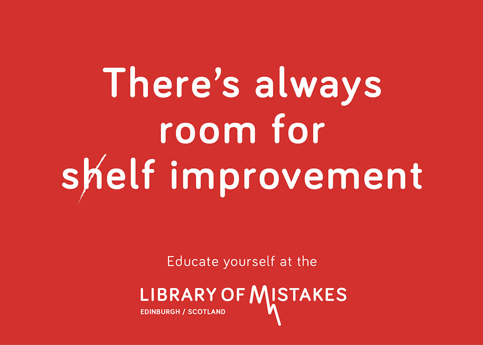
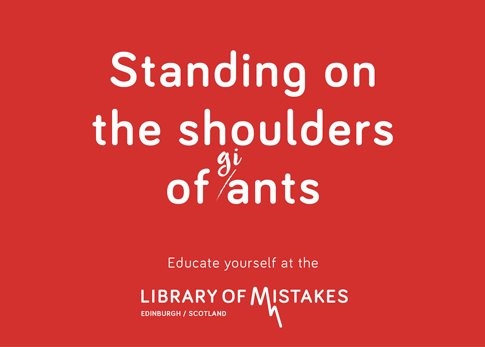
Later, when the library outgrew its original building, I was asked to design the brand signage for the new Edinburgh premises and find suitable quotations for murals. During my research, I found that quotes did not quite fulfill the potential of the occasion, that here was an opportunity to go beyond the brief and write some new material with the library’s own voice that could be used to raise awareness and build stronger ties with existing users, the ‘‘errorists’’ who had embraced the brand.
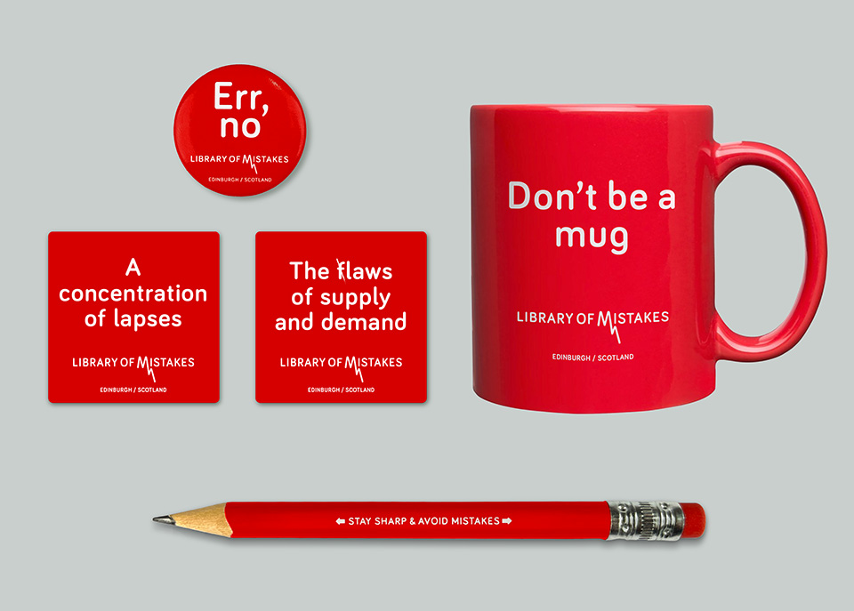
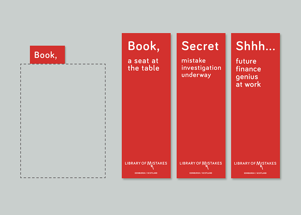
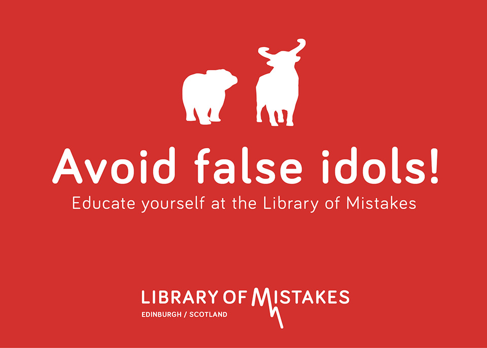
The copy and designs I presented suited the irreverent tone and humor with which the library can engage with venerated financial concepts such as bull and bear markets and puncture the conceit of experts by calling them mugs and ants. They show the library to be unstuffy and gutsy and to have the authority to expose mistakes and bluster without being preachy. The brevity and simplicity of the executions suit both the messages and the limited library funds. The fact that items such as postcards, bookmarks, and pencils could be produced at low cost played a significant part in them being realized.
The library was excited to advance with the ideas, and we produced an initial batch of items in early 2023. They are on sale at the library and during local and away events, where they also help to create a brand ambiance. In the meantime, a Library of Mistakes has been established in Pune, India, and Lausanne, Switzerland, with further locations planned in London, Sydney, and Amsterdam. The story so far shows that the development of a brand can be anything but linear. Keeping the brand language consistent over time and internationally is a significant challenge requiring careful guardianship.
The Library of Mistakes logo can be found in Graphis Logo Book 9, and the promotional campaign items are in the Graphis 2024 Advertising Annual.
Another branding exercise for Russell Napier for ERIC, the Electronic Research InterChange, was also strongly influenced by humor. The logo was inspired by his favorite joke. The ERIC logo is in the Graphis Logo 9 book and the Graphis 2017 Design Annual, with a Gold and a Silver Award respectively.
Oliver Haas obtained his design degree in Germany. He moved to Edinburgh, Scotland, in 1990. After working for various design agencies, he set up Haas Design in 2003. His design work for charities such as Unicef UK and Christian Aid spans two decades. He has a PhD in advertising communication that explores links between humor and message appreciation and has taught at the Interactive Design Institute and Edinburgh Napier University. Oliver’s creative work has been recognized with awards in design, advertising, and art competitions.