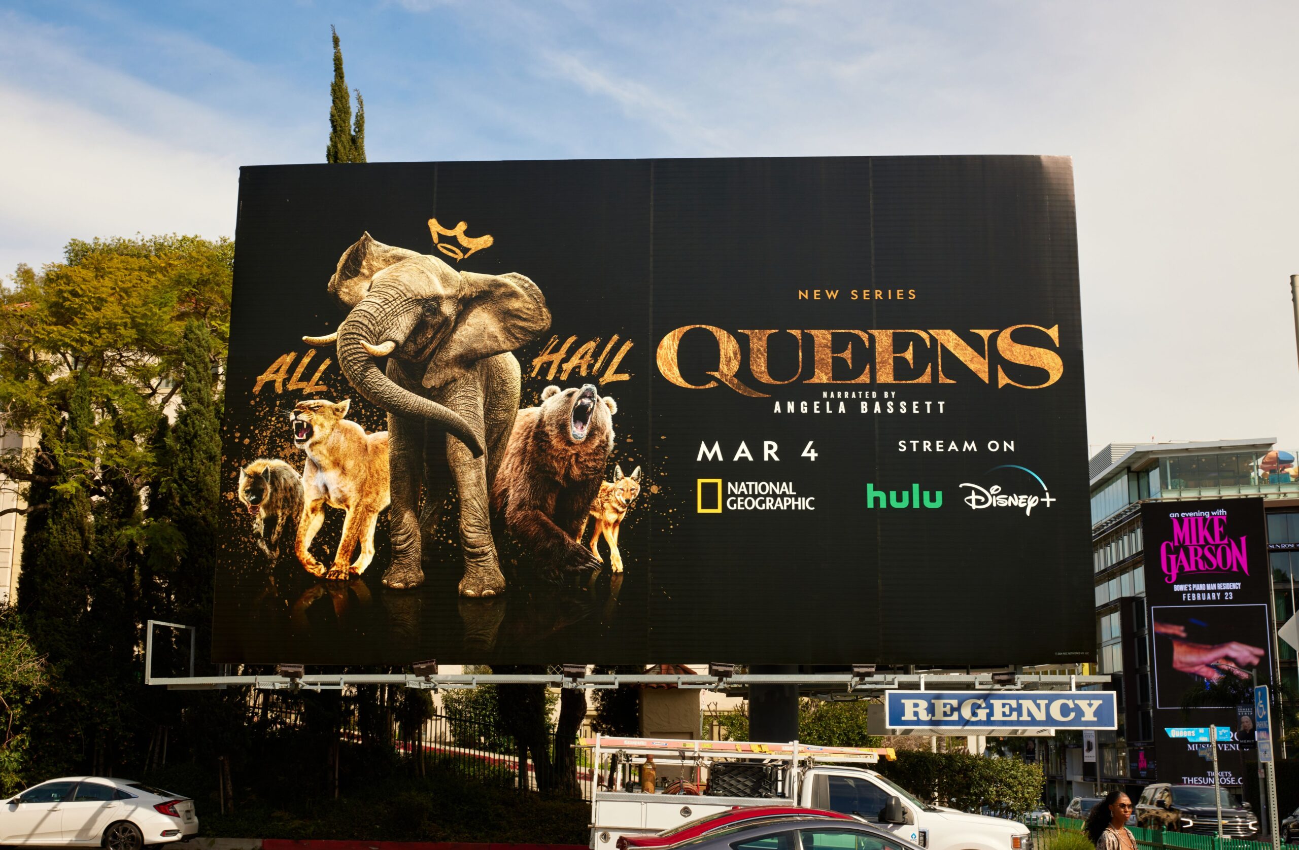
In a bold departure from traditional nature documentary marketing, Canyon Design Group landed a coveted Graphis Advertising Platinum award for their campaign that transformed National Geographic’s “Queens” into a fashion-forward celebration of female power in the animal kingdom. Through opulent golden tones and striking visuals, the campaign reimagined these magnificent matriarchs as cover stars, merging the grit of wildlife with the glamour of high-end editorial.
By: Justin Hidalgo, Senior Project Coordinator, Canyon Design Group
At Canyon Design Group, we believe in the power of bold visuals and emotional storytelling to connect with audiences. When National Geographic approached us with Queens, we knew it had the potential to be something truly special. Queens is a celebration of female power, both in front of and behind the camera. Through stunning cinematography, the series explores six ecosystems led by extraordinary matriarchs, redefining leadership in the animal kingdom. Our goal was to amplify this story in a way that felt as bold and powerful as the series itself.
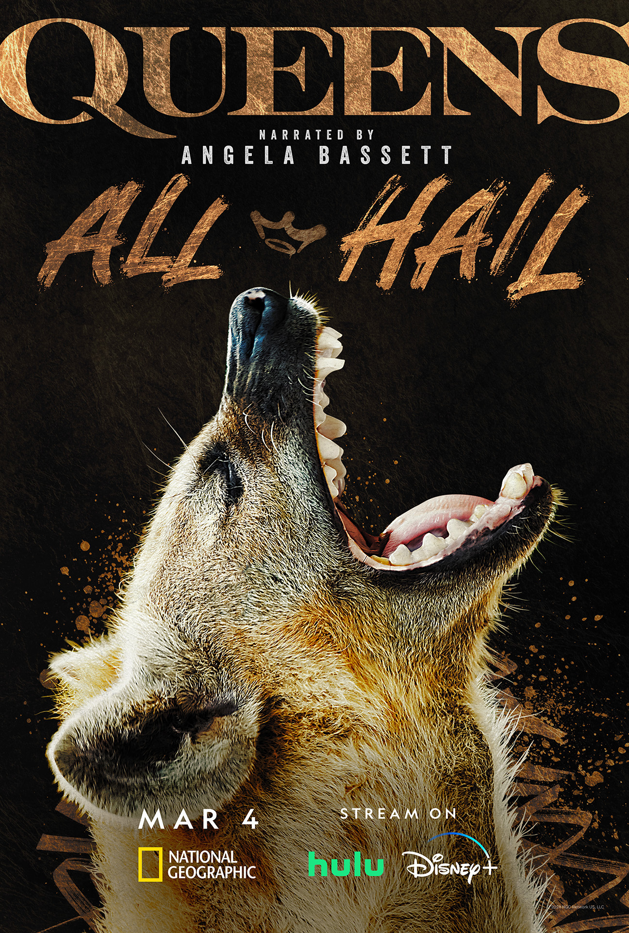
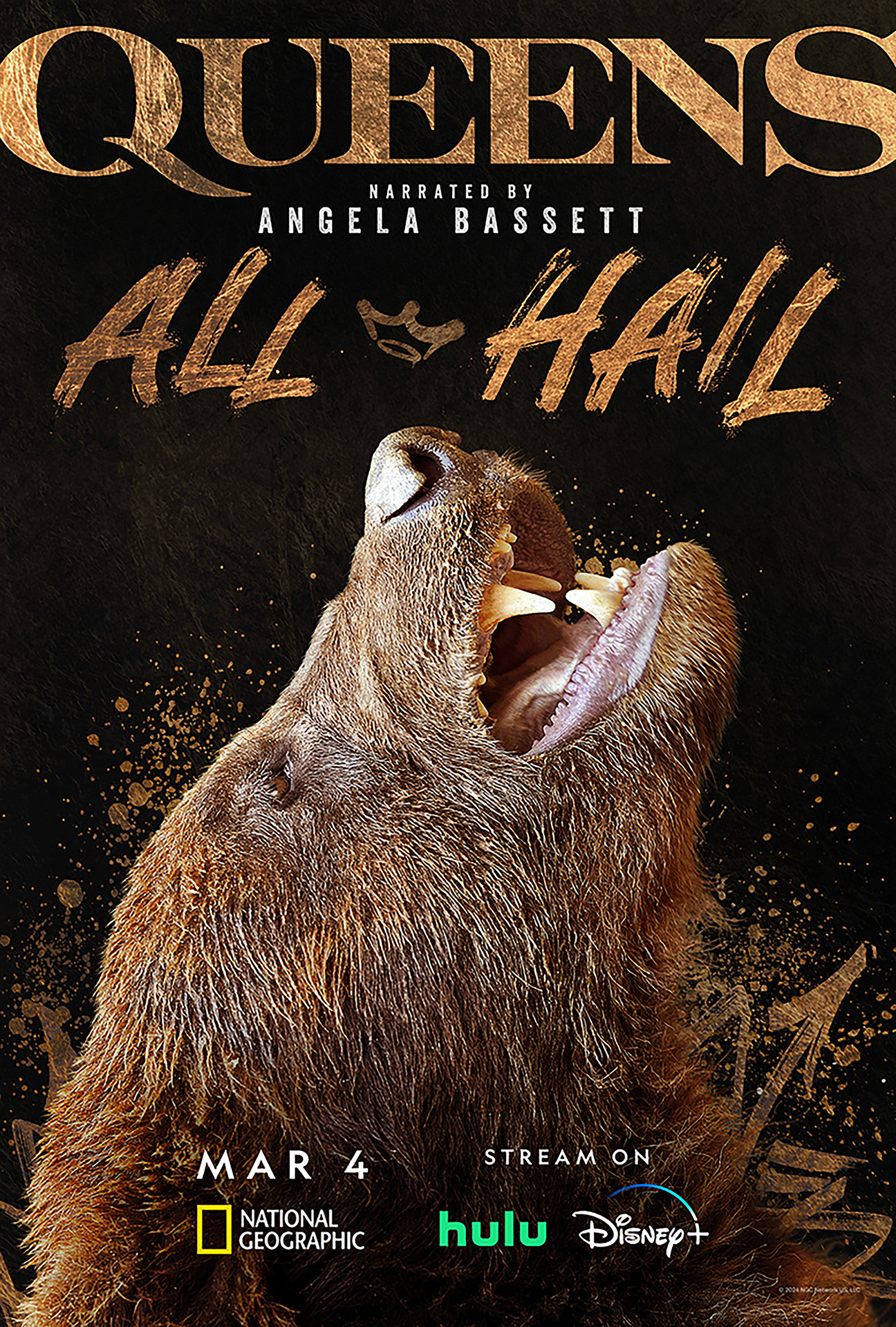
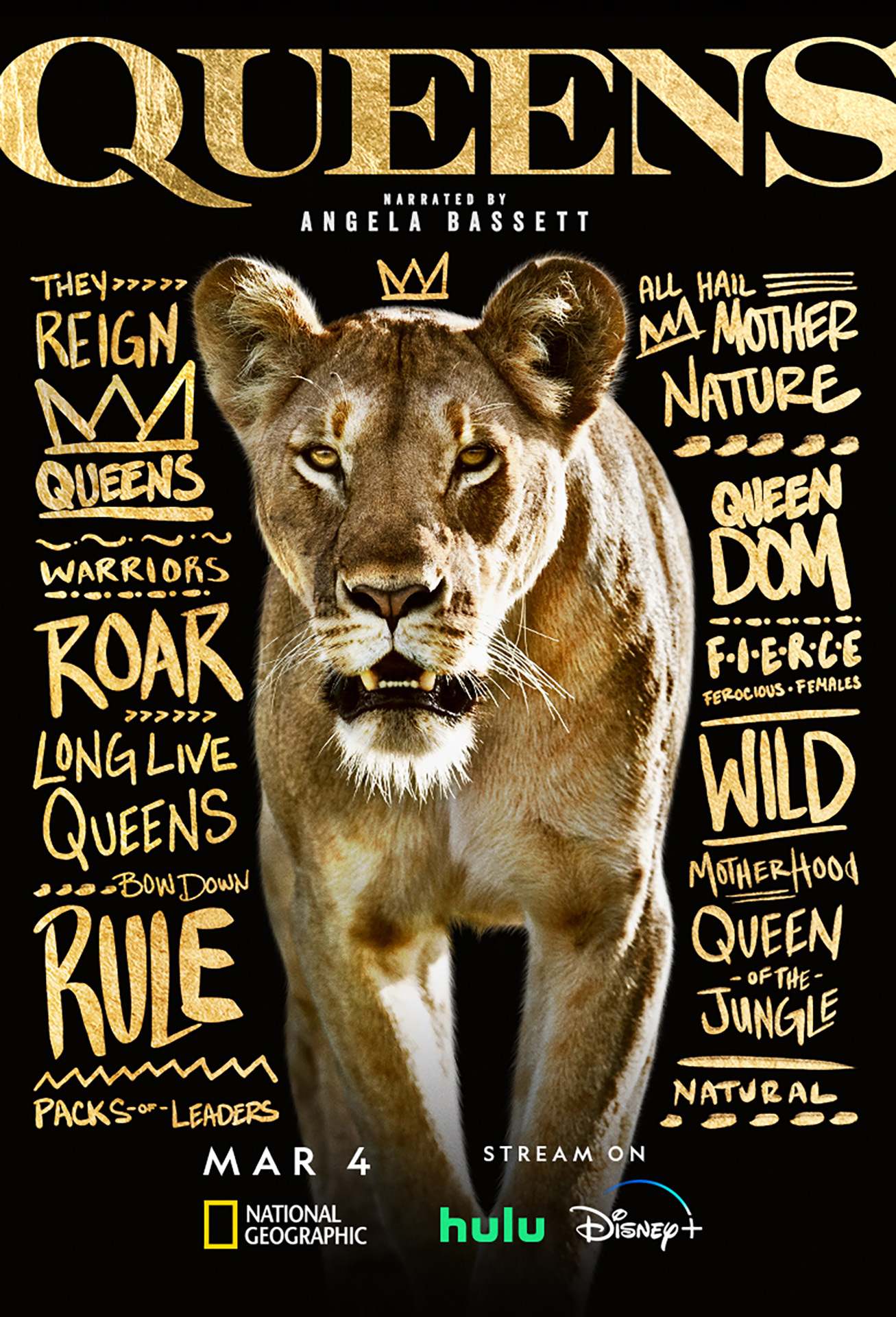
From the outset, Queens needed to exude power, sophistication, and a modern, glamorous edge. We leaned into golden, opulent tones to evoke a regal aesthetic, treating these awe-inspiring animals like magazine cover stars. Instead of the typical nature documentary imagery, we focused on commanding, striking, and deeply expressive visuals. This approach helped us reimagine how natural history could be presented, making it modern, sophisticated, and unapologetically bold.
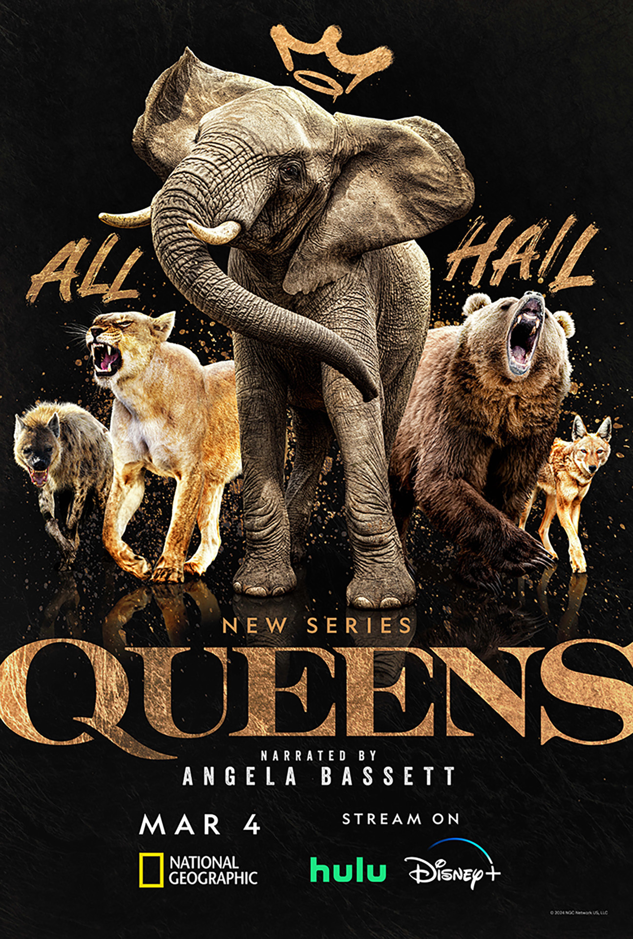
One of our biggest challenges was sourcing high-quality assets. “The lack of assets always presents a challenge,” explains Dan Pavia, who created the character banners. “Screenshots from a master screener are always an option, but the quality is never optimal. We used royalty-free stock for the best results. Art directors created compositions of animals grouped together, ensuring species accuracy. The real challenge was making the lighting believable so they appeared in the same space.” At one point, a live animal photoshoot was considered, but budget constraints made it impractical. “Creative directing a grizzly bear would have been a first for me,” Dan jokes, “though I’ve directed actors who can behave worse.”
Each visual component played a critical role in shaping the campaign. Rachel Siner, who conceptualized the teaser, crafted a striking introduction to the series. “I embraced the challenge of balancing the grit of handwritten graffiti typography with the elegance of a black and gold palette. Refining the lion to exude a fierce, fashion-forward aesthetic and extending that vision to the title treatment were proud moments for me.” Dan brought together powerful imagery to emphasize the distinct presence of each character banner. Julia Lambright, who created the payoff, reflected on the collaboration. “Combining our unique styles into one cohesive theme was really inspiring. Seeing the work come together so beautifully and having our efforts recognized by Graphis was truly rewarding.”
The campaign for Queens not only met but exceeded expectations. The striking visuals and empowering narrative presented the series as not your father’s natural history show. For Dan, winning the Platinum Award from Graphis was a full-circle moment. “Throughout my career, I’ve always looked to Graphis for inspiration with its award-winning work. Receiving a Platinum Award was an honor, and having the lioness featured on the annual cover was the icing on the cake.” Rachel reflects on the importance of bold storytelling in design: “I hope to see design continue embracing bold storytelling and merging influences from art, fashion, and culture to create dynamic, impactful work. Queens exemplifies this approach, delivering a nature documentary campaign unlike any other.” Julia adds, “I love seeing more out-of-the-box campaigns emerge in the entertainment industry. Campaigns that make you stop and look, that spark excitement and curiosity. The cooler the subject matter, the cooler the posters.”
For those looking to break creative boundaries, Rachel offers this insight: “Own your vision but remain open to collaboration and refinement. The smallest details can elevate a project. Pay attention to nuances and advocate for your ideas, even in the final stages. Experiment with contrasts and unexpected combinations—they often lead to the most compelling visuals.” Julia echoes this sentiment. “It’s easy to get attached to your work, especially in design, where everyone has a particular style and voice. However, working collaboratively can be one of the most rewarding challenges. Have confidence in your abilities and vision while being equally open to creative direction. We are all creative as hell—let’s use it.”
Queens is more than just a series. It is a glimpse into the future of natural history storytelling. It is a reminder that powerful, authentic stories can connect deeply and inspire change. As the industry evolves, we hope to see more projects that celebrate diverse perspectives, challenge traditional narratives, and embrace bold creativity. “I’m optimistic that entertainment advertising will continue to thrive and that there will be a demand for imagery that stands out in a saturated market,” Dan says. Looking ahead, we remain committed to pushing creative boundaries and telling stories that resonate.
Canyon Design Group is an award-winning creative agency with over 20 years of experience. We are a team of imaginative collaborators and strategic problem solvers. Collectively, our passionate and talented art directors, illustrators, storytellers, builders, strategists, 3D and motion artists, photographers, and writers bring their unique perspectives and skills to each project, designing dynamic campaigns powered by captivating narratives.