Today’s New Talent entries feature similar color palettes and the ideas of modernism and the future, though each work is distinctly different.
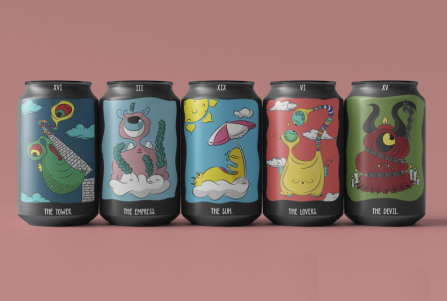
“The Adorable Tarot”, designed by Tekle Mamaladze under professor Niklas Frings-Rupp at the Miami Ad School Europe, is a collection of packaging that all feature cartoon-like alien creatures. “Future reading is very common in my home country Georgia, which inspired me to create my own Tarot deck with adorable monster illustrations to show that no matter what, the future is always bright,” Mamaladze said of the collection.
The designs all feature colorful monsters with large eyes, and Mamaladze said the most challenging part of the assignment was creating something one of a kind to stand out. The collection includes a set of soda cans with monsters named The Tower, The Empress, The Sun, The Lovers, and The Devil, a collection of paint cans featuring The Star, The Chariot, and Judgment, three plates featuring Strength, Justice, and The Emperor, a set of two bags include Temperance and The High Priestess, while a single record cover features a monster known as The World. A matchbox is The Hierophant, and a square tin can is The Moon. Each item displays the monster on a background of blue, red, or green, tying the various designs together. The series is so cute that it has already won some other design competitions, winning Silver in the Visual Arts on the Side Show 2020 and Merit in the Young Ones ADC 2020.
