Poster: Marcos Minini, Rafael Fernandes & Thiago Lacaz Represent Brazil’s Strong Poster Designs

This week’s featured posters come from some of Brazil’s best designers

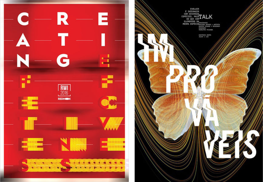
Marcos Minini’s poster design continues to draw attention. In 2018, his Silver-winning work “Creating Effectiveness” (ABOVE, LEFT) used motion-filled typography to draw attention to an event at Red Hook School. The bold letters surround the school’s small logo in the center, which appears to be stationary among the moving type. Recently, Minini submitted “Improváveis (Unlikely)” (ABOVE, RIGHT) to Poster Design Annual 2020. Again, an illusion of movement enhances his poster’s typography. In his own words, Minini related his approach to us: “The poster’s inspiration comes from chaos theory, where flapping wings of a butterfly in one place in the world can trigger unexpected reactions elsewhere on the planet. It suggests the driving of these conversations, which always have a planned starting point, but never an end point.”
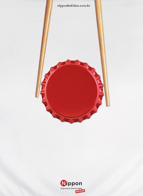
   

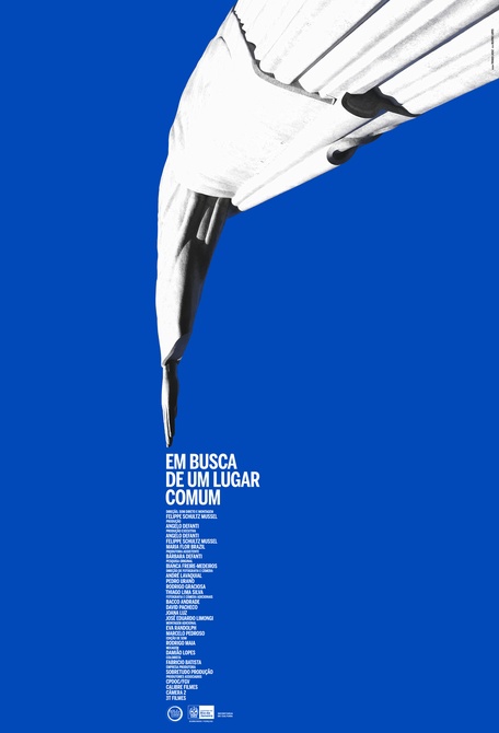
Other Brazilian poster designs used objects as their focal point. “Bottle Cap and Hashi Flag” (ABOVE, LEFT) by Rafael Fernandes gives his client Nippon Bebidas, a Japanese beverage company, a direct message that is also esthetically pleasing. In Thiago Lacaz’s poster “Em Busca De Um Lugar Comum [A Place To Take Away]” (ABOVE, RIGHT) an iconic Brazilian image is deconstructed to promote the subject of the documentary feature film “A Place to Take Away” by Felippe Schultz Mussel. We’re continuously inspired by these posters and can’t wait to see more entries come in from around the world!

Submit to the Poster Annual 2020 Competition by January 22, 2019. Winners will have the opportunity to see their work published on our website, blog, newsletter, and social media platforms!

Author: Graphis

Leave a Reply

Your email address will not be published. Required fields are marked *