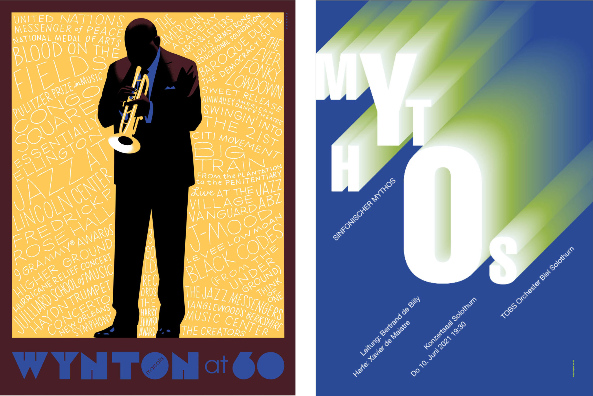
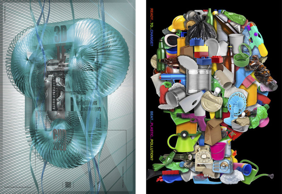
Whether it be musical tributes or environmental awareness, the designers of the newest Poster 2023 submissions have perfected the skill of creating eye-catching visuals to convey a message and tell compelling stories!
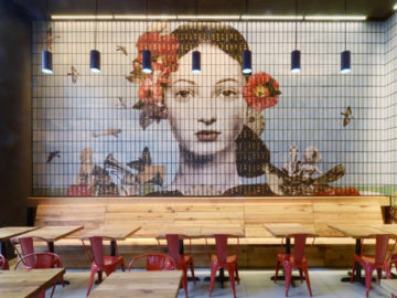
“3D Type Exhibition” (above, left) was designed by Graphis Master Hoon-Dong Chung, an assistant professor at Dankook University, and vice-chairman of the Korean Institute of Product & Design. No stranger to 3D typography, this past gold winner often uses his own 3D typography designs to create visually dynamic posters rarely seen anywhere else. Chung’s latest poster entry is a part of an experimental project called ‘Unstable Unity’, where he focuses on “expanding 2D types into 3D imagery and environments.” Using the letter T, Chung models it after the shape and texture of a Slinky or drainage pipe and uses a bright shade of teal to let us see every detail.
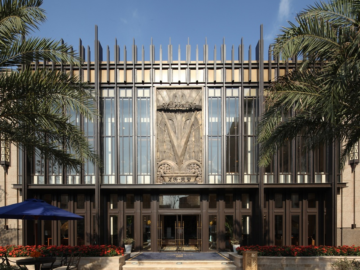
Mi-Jung Lee is an award-winning graphic designer based in Seoul, South Korea, where she works as an assistant professor at Woosuk University. Her poster “Ready… to …Change?” (above, right) was originally created for a campaign launched by the Korean Ministry of Environment, which is a branch of the Korean government entrusted with environmental protection. As the harmful effects of current waste practices come to light, they wanted to raise awareness of the impact plastic waste has on the long-term health of our society. The poster features various everyday plastic items arranged to create the shape of a human profile, indicating how these items have become a fixture in our collective lives. On its right border, the poster asks the viewer the titular question and if we can “Beat… Plastic… Pollution…?” prompting further reflection on how we may be unknowingly contributing to a destructive waste practice. As the Korean Ministry continues to explore the issues plastic waste produces, Lee hopes that it will continue to encourage more awareness of the issue of environmental sustainability and thoughtful consumption.
