Doesn’t it seem like when you have a drink, it just tastes better when it comes out of a cool can or bottle? These two Packaging entries are overflowing with such good designs, you’ll want to keep them after they go empty.
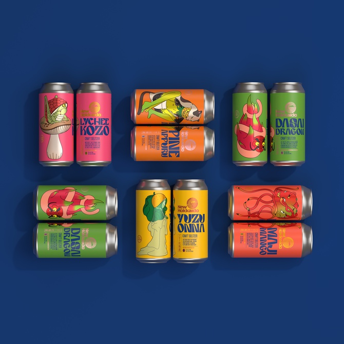
Known for creating delicious, interesting beverages, the New Hokkaido Beverage Company needed a can design that reflected the playful, Japanese-inspired flavors of their new seltzer line, and Sally Morrow Creative certainly rose to the challenge. Inspiration was easy to come by thanks to New Hokkaido’s founder, who grew up in Japan and had many stories to share about the experience as well as lots of Japanese mythology and folktales. Project manager Jill Raleigh, illustrator and designer Emile Holmewood, copywriter Doug Lowell, and account director David Morrow eventually decided to focus on one major aspect of Japanese legends: the yokai, which are spirits that either create good luck, do harm, or cause mischief.
The energetically designed 16 oz cans for “New Hokkaido Seltzer Packaging” (above) combine the best of both unity and variety with five unique designs and flavors that all come together to form an attractive product line. The design juxtaposes arresting typography and vibrant color, using layered gloss and matte finishes to add beauty and a sense of smoothness. The yokai themselves are wonderfully fun and creative, with each taking its design from the fruit that flavors the drink: lychee, pineapple, mango, dragon fruit, and yuzu. Featuring text that tells the intriguing stories of each yokai featured, you’ll definitely get into the drinking “spirit” with this beverage!
