Celebrate your good luck with some lovely wine, and feel safe while doing some with reliable home security thanks to our two featured Packaging 10 entries!
If you’ve been having good luck lately, what better way to celebrate than with a drink? Founded in 2014, Pavement is an award-winning design firm based in San Francisco and is well-known for creating packaging and brand identities for food, wine, spirits, and even cannabis. They pride themselves on offering solutions tailored to each of their clients’ specific needs and do their best to listen, collaborate, and create compelling work. In 2019, Pavement had its five-year anniversary, and as part of the celebration, Pavement founder and designer Michael Hester designed some special wine packaging.
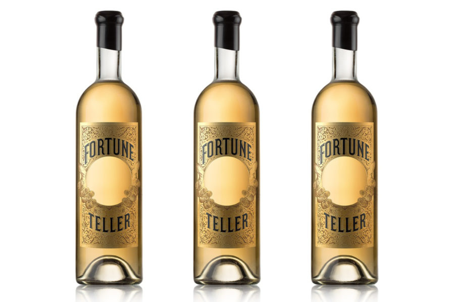
“Fortune Teller” (above) is a special release aquavit that not only rejoices at Pavement’s success but also looks to future prosperity as well. The word “aquavit” derives from the Latin aqua vitae, meaning “water of life” and is often drank at festive gatherings and celebratory events. Hester went with a gold color scheme for both the wine and the label, which features a smooth gold crystal ball being held by two hands. A textured floral pattern fills out the rest of the label, and the wine’s name is spelled out in black lettering reminiscent of carnivals and fortune-telling booths. Finished off with a black wax seal, the product is a memorable solution with a clever and unexpected hook, and we raise our glasses to Pavement and their amazing work!
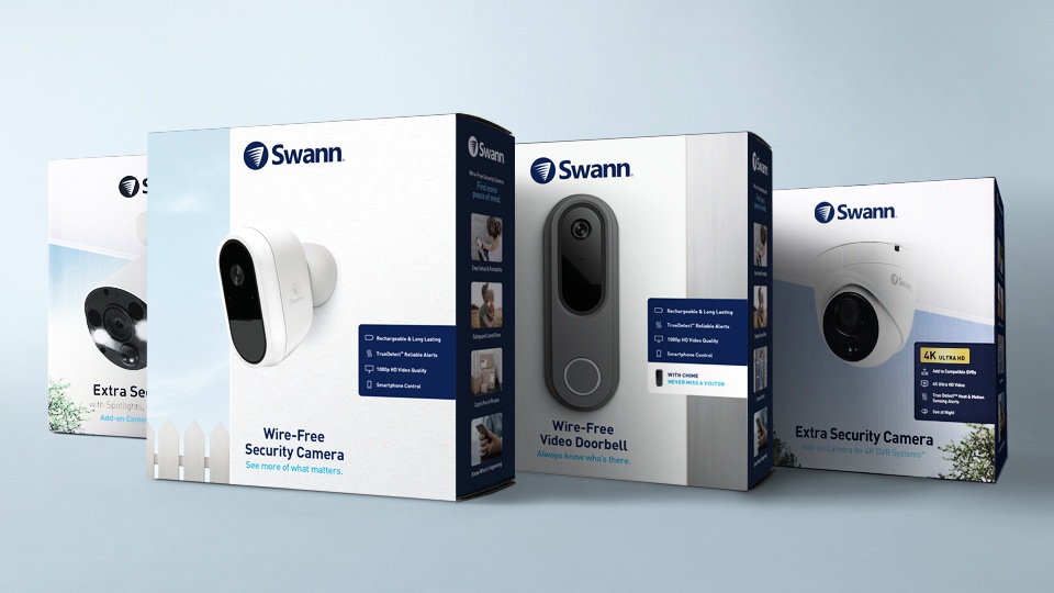
A person’s home is their castle, and you want the best home security to keep it safe. Why not give Swann a try? Swann is a global leader in security monitoring, consumer electronics, and security-centric solutions for homes and businesses. Founded in Melbourne, Australia, the company now has a presence in over forty countries on six continents and is a member of the Infinova Group, an ISO 9001 certified American security products manufacturer. Recently, Swann decided its product packaging needed a refresh to maximize impact and better compete with emerging, consumer-friendly security brands. They reached out to MiresBall, an American design agency with over thirty years of experience in packaging, advertising, corporate communications, and other solutions, for the redesign.
Designed by Lauren Lamb, “Swann Global Packaging” (above) uses in-situ photography to differentiate itself in the crowded category of home security while helping consumers choose the right product. White and navy blue are the primary colors used, balancing each out while at the same time providing a striking contrast. Large images of each security device are on the front of each box, and more images on the side show the perks of using Swann security devices. And with the company’s logo on top, you know what company you’re buying. The packaging was well-received by Swann, and the new global packaging system was embraced by big-box retailers.
To find out more about these entries and others, check out Graphis’ main website for our Packaging 10 competition, and don’t forget to submityour own!