With a keen eye for detail, the designers of these artful pieces show their spectacular talents and share their work with their clients and the rest of the world.
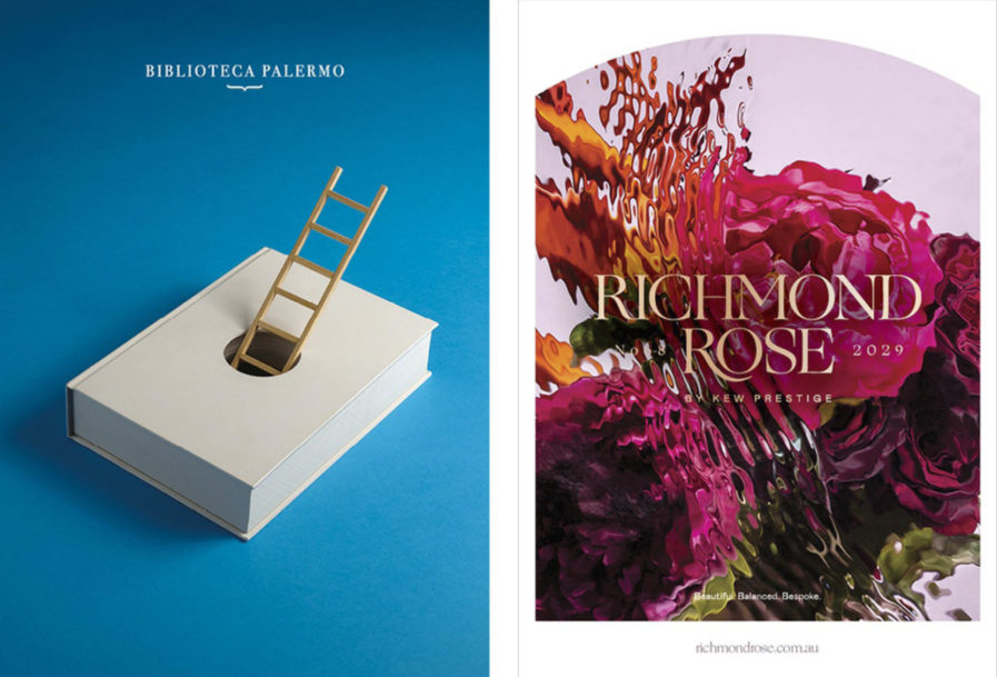
Pep Carrió‘s “Biblioteca Palermo libro/escalera” (above, left) is a winner of our Gold award. The poster was created as a proposal for Artes Gráficas Palermo, which specializes in art book printing. Carrió has been making images in which books and poetry go hand in hand since 2014, so they were the logical choice when it came to choosing a designer to express the printing company’s image and mission. The finished design shows a book with a hole in the middle, through which a ladder arises. This work is indicative of the Covid-19 pandemic, as the ladder represents hope and the book is a symbol of how reading has accompanied us and helped through these difficult times. The clients loved this piece so much that they’ve asked Carrió to complete similar projects to add to their collection of visual metaphors for their art books.
Another Gold award winner, “Richmond Rose” (above, right) was designed by Glenn Kynnersley of the Hoyne Design firm in Australia. A winner of the Gold award, this poster was created for Positive Investment Enterprise, a real estate developer located in Sydney, Australia. Hoyne makes excellent use of color with the brightly colored flowers and greenery, and adds an interesting twist with a water ripple effect that turns the photographs into a sort of faux watercolors. It’s a poster with a definite artist feeling.
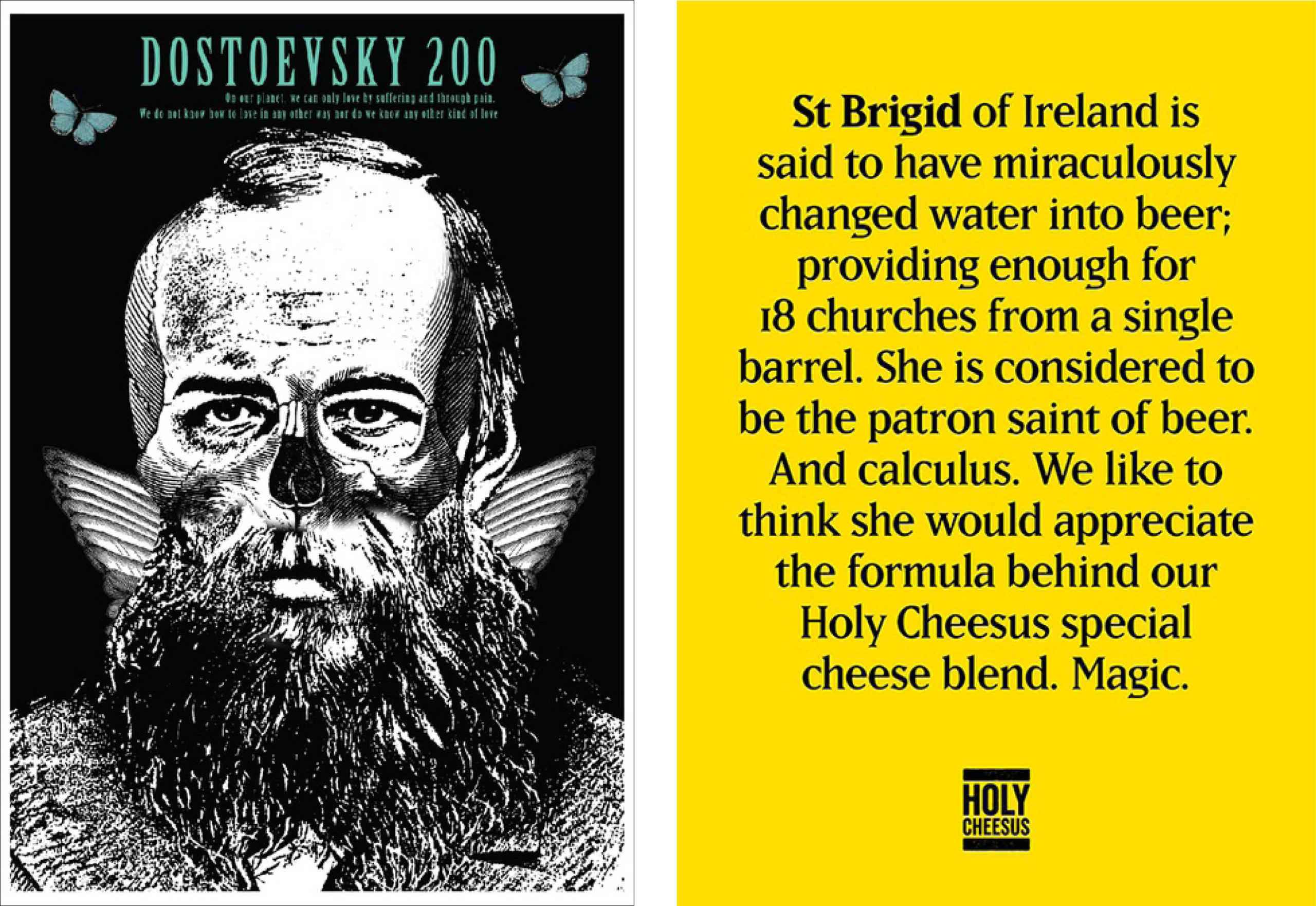
In an odd yet interesting design from our 2023 competition, Luis Antonio Rivera Rodriguez‘s “Dostoevsky”(above, left) is certainly a conundrum. Created to celebrate the novelist’s anniversary, Rodriguez chose to commemorate it with many elements that make the viewer consider the work from a variety of angles. Such angles include “Dostoevsky and world literature”, “Dostoevsky and existentialism”, and “Dostoevsky and the theater”, among others that all show Dostoevsky with a focus directed on the beauty of everyday life. This was very fitting, as the motto for the competition this was submitted to was “Beauty will save the world”. The clients loved this piece, and chose it as the winner among 1,000 competing posters.
Lastly, “Saints” (above, right) was designed by Roger Archbold for Holy Cheesus, a start-up cafe located in a church in Melbourne, Australia. Holy Cheesus approached Archbold to create a series of posters to highlight the wide variety of artisan toasted sandwiches that they offer. Each of these sandwiches was named for a different saint, so Archbold had the idea to create a series featuring whimsical descrptions regarding the different sandwiches, their ingredients, and the stories behind the saints they’re named after. This resulted in six typographical solutions with written copy as the main element. The client was ecstatic with the results, saying that the design “highlighted their brand’s sense of humor and fun”.
To check out some more of our innovative and imaginative poster designs, come visit graphis.com! Or have a look at our Poster Annual 2022 book to see a whole bunch of works we’ve loved.