 The Art of Black and White
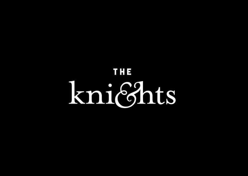
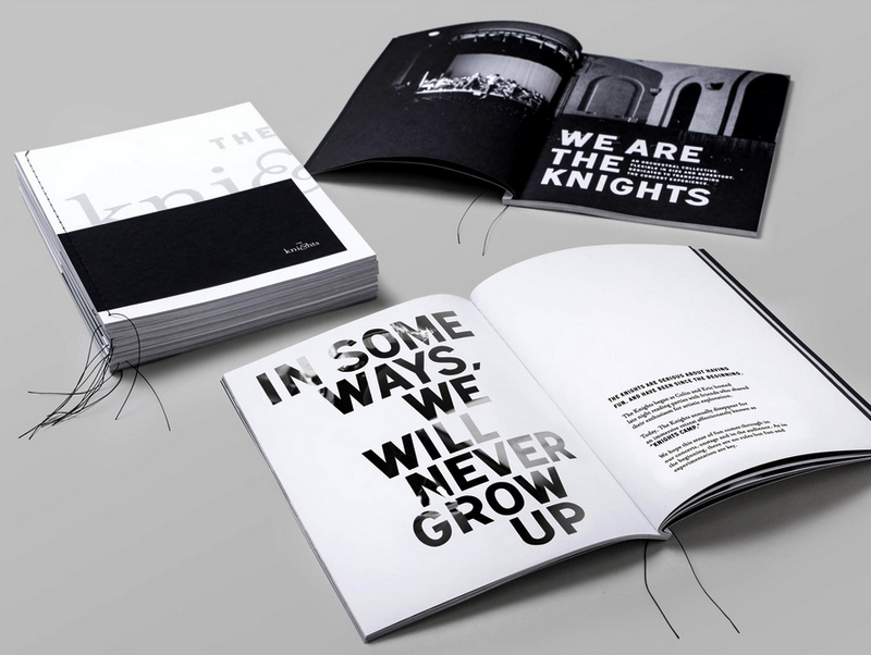
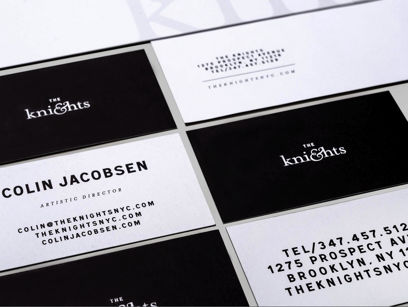
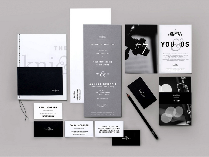
Established’s branding for The Knights, a New York City-based orchestra, demonstrates well the stunning effect of a well-designed black & white motif.
Colour increases brand recognition up 80%, according to a study conducted by the University of Loyola. A surfeit of additional studies can attest to the power of color in grabbing a viewer’s attention. But what of a choice to exclude color?
Established’s branding of The Knights nonchalantly illustrates that lack of color can be just as effective. In its understated simplicity, the contrast of the two juxtaposing colors of black and white reflect well the orchestra’s brand focus towards the classy, elegant and professional.
 Established is a full-service boutique agency, located in the heart of New York City. Founders Sam O’Donahue and Becky Jones offer architectural, graphic and product design.
The Knights branding has been submitted to our Typography competition, an ongoing competition of the world’s finest typography. Join our team and submit your work for a chance to be featured among the most compelling and influential work from international designers. To submit your work to the Typography competition, click here.
Executive Creative Director: Sam O’Donahue
Creative Director: Pierre Jeand’heur
Designer: Cat Lee
Studio: Established
Title: The Knights – Identity


