
Graphis is proud to show the newest entries to the Typography4: Typeface Design competition from Monotype. Above is a striking image of a room in their headquarters, located in Woburn, MA.
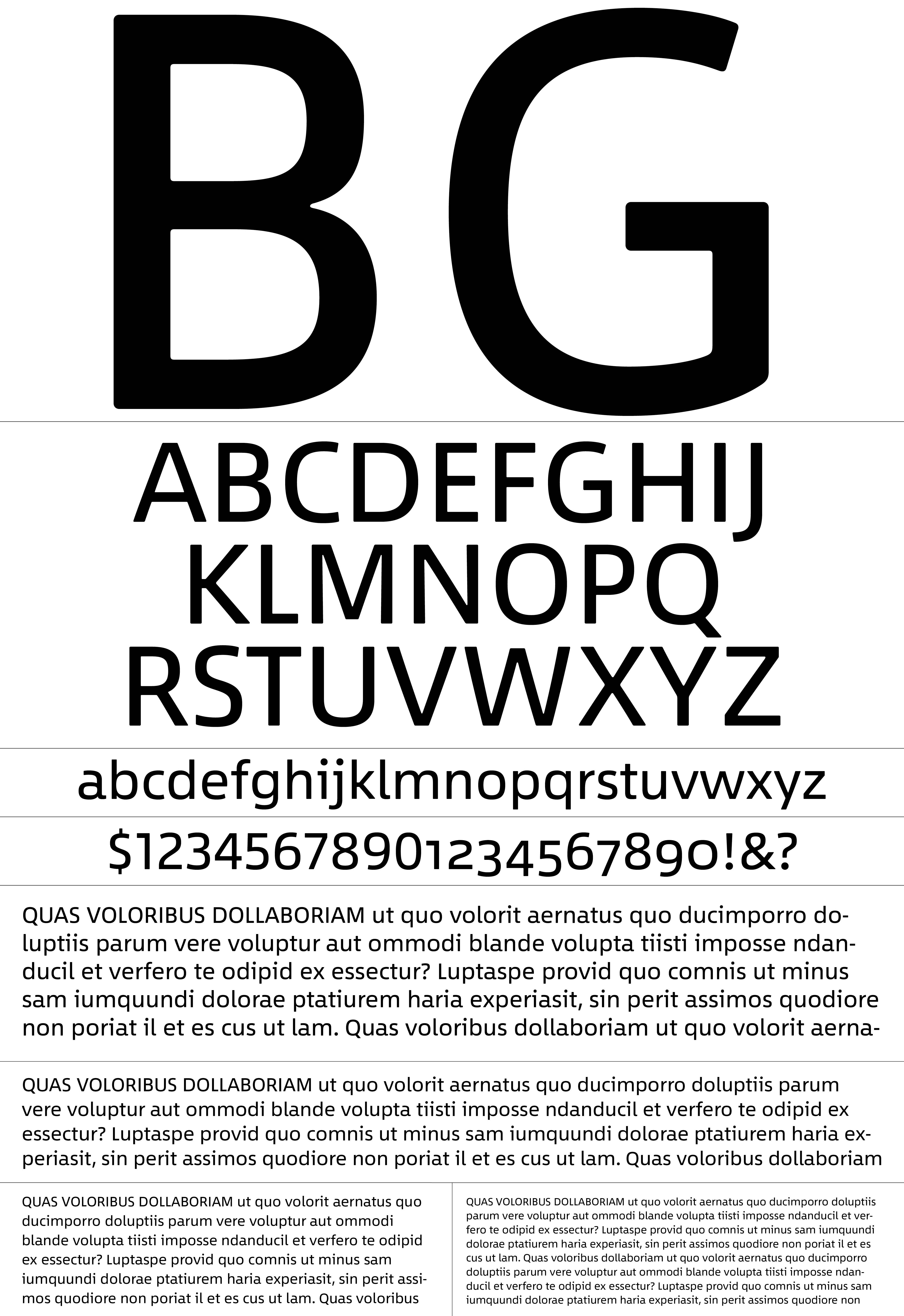
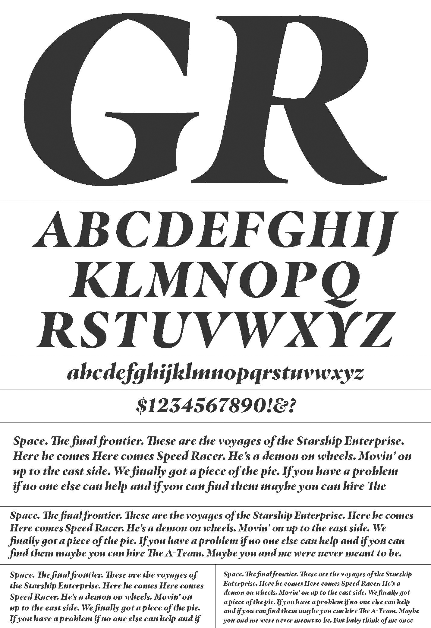
Akira Kobayashi designed the above typeface (left), titled “Between.” It is an unusual typeface because “it is comprised of one family with three distinct sensibilities. Between 1 is technical and modern. Between 2 is organic and friendly. Between 3 is cheerful and dynamic. This approach to type design has never been done before, and gives designers vast flexibility in the use of the font.” Jim Ford designed the other typeface, (right) titled “Masqualero,” which was inspired by the music of Miles Davis, and more specifically, the tune “Masqualero” from Davis’ “Sorceror” album.”
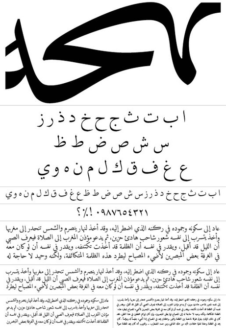
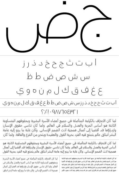
Patrick Giasson and Kamal Mansour designed the above typeface (left), titled “Bustani,” which “brings the stunning beauty and intricacies of thousand-year-old calligraphic writing into the 21st century.” Yanone designed the other typeface (right), titled “FF DIN Arabic” to “enhance the usability of the FF DIN typeface in contemporary global corporate design projects, advertising campaigns and packaging, among other media.”
The Typography4: Typeface Design Competition is open for entries! The deadline is Tues., June 6.


