Daeki Shim and Hyojun Shim of DAEKI & JUN, located in Seoul, South Korea, entered their colorful poster (left) to our current Typography4: Type in Use competition. Designed for the International Poster Invitation Exhibition / Beijing Design Week 2015, the poster responds to the event’s theme, “city.” “These multilingual signs can be easily found not only in Hong Kong, but also New York, London, Beijing, Tokyo, Seoul, or in another word, every“where.” According to the designers, “this “where” means “city” and the commercial multilingual typography of the streets is a symbolic visual language that represents a part of the city’s sight. As main typography in this poster, we used the word “where” with four different languages which are English, Chinese, Japanese and Korean.”
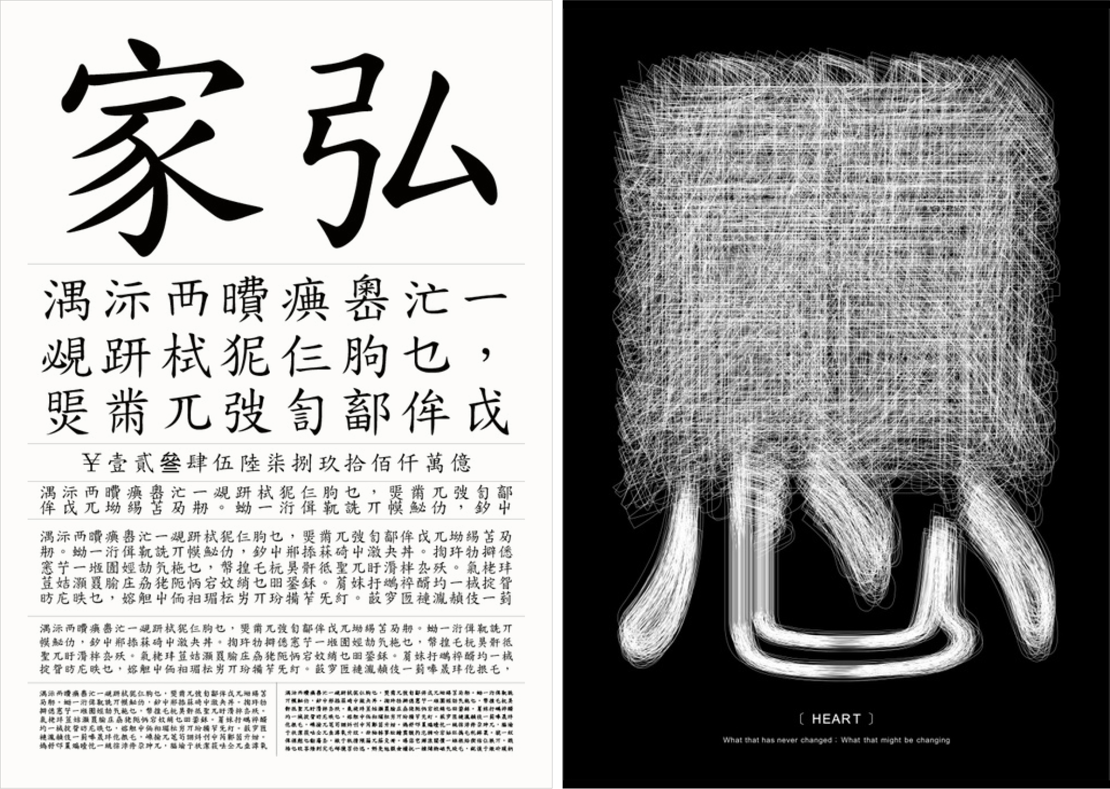
The typeface design beside it (right) was created by TIST, also located in Seoul, South Korea. Created as their own corporate typeface, it “reveals clearer connectivity of the brand by embedding the corporate philosophy to add values, drawing upon graphic features of the logo, and developing it consistently in balance.”