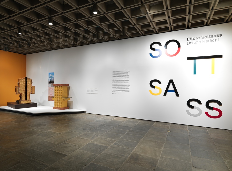
To be a Graphis Master, the art has to not only win numerous Platinum and Gold awards but also show great excellence in their respective field. And when it comes to architecture design, there are few greater Masters than the 20th-century Italian architect and designer Ettore Sottsass.
Sottsass was an Austrian-born designer who founded his studio in Milan in 1947. In regards to his designs and approach, he once said, “It is important to realize that whatever we do or design has iconographic references, it comes from somewhere.” Sottsass was an influence for all; his designs were so prestigious and unique that they can’t be replicated. Sottsass’s designs were characterized by his use of bright colors for his statement pieces and decorations. He typically used bold colors and an innovative contemporary style for everyday items, creating iconic postmodern furniture. His body of work also included jewelry, glass, lighting, home objects, and office machine design, as well as buildings and interiors.
Throughout his career, Sottsass’s designs and approaches changed from modernism to postmodernism. He liked to take a functionalist and rationalist approach, but by the 1960s, he chose to focus on symbolism, emotional appeal, and global and historical references. One of Sottsass’s unique pieces is his red typewriter (above, left). The “Valentine” is thought to have been a mistake as Sottsass intended it to be an inexpensive portable with no lowercase letters, no bell, and a cheap plastic case. In this piece, he noted he used bright red as a way to liven up monotonous working hours. His “Mizar Vase” (above, right) demonstrates an interest in colorful Greek and Roman glass, with a focus on complex geometric forms. The vibrancy of the vase is sure to grab one’s eye as soon as they enter a room.