Graphic design has the power to tell a story and stir reactions without the need for a single word. In this week’s round-up of Poster Annual 2023 submissions, the designers incorporate dynamic shapes and colors to convey a message and evoke emotion in their viewers.
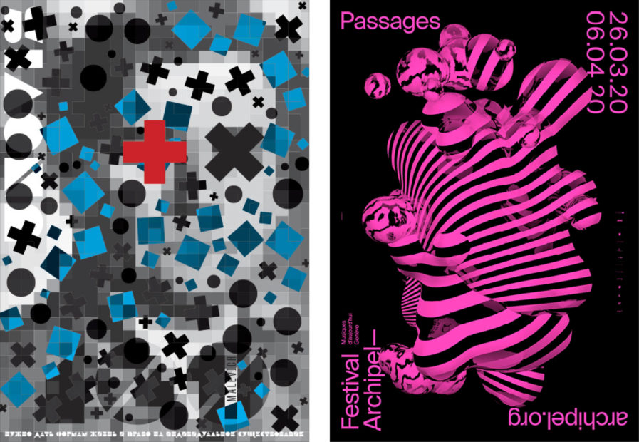
“Life of Forms” is an abstract promotional poster from Russian designer Pavel Pisklakov for the international poster contest “UNOVIS. XXI Century”. Established at the Vitebsk Art School in 1919, the poster contest was hosted by an influential group of artists called the UNOVIS, led by the avant-garde painter and art theorist Kazimir Malevich. In his design, Pisklakov paid homage to Malevich’s creation of “suprematism” which is a branch of abstract art that is based upon the belief in the supremacy of pure artistic feeling. Taking visual cues from the radical art movement, Pisklakov’s poster features a plethora of geometric forms like circles, squares, lines, and rectangles. Hidden behind the shapes, an abstract portrait of Kazimir Malevich is made up of black, gray, and white squares, with a red cross and black X covering his eyes. “Human life is life among forms; forms surround us, penetrate us, cover our eyes,” Pisklakov explains. “We are inhabitants of the world of forms; we see them and exist with them in our symbiotic space.” This concept aligns with the very basis of Malevich’s suprematism, and his belief that artists “must give forms life and the right to individual existence.”
From Switzerland is a dynamic poster created by WePlayDesign for the “Festival Archipel,” which features contemporary music, performances, and sound installations. The festival’s theme for 2020 was a celebration of the process of transformation. Keeping in tune with that, designers Sophie Rubin and Cedric Rossel illustrated the transition from one state to another as three-dimensional liquid forms in perpetual motion, using stripe and marble patterns to emphasize the form’s everchanging shape. With its vivid colors and trippy design aesthetic, the poster along with its animated counterparts received great public reaction and visibility, while the client was very enthusiastic and used the design for the festival’s teaser videos and programs. The project also won numerous awards and has been exhibited in several countries around the world.
