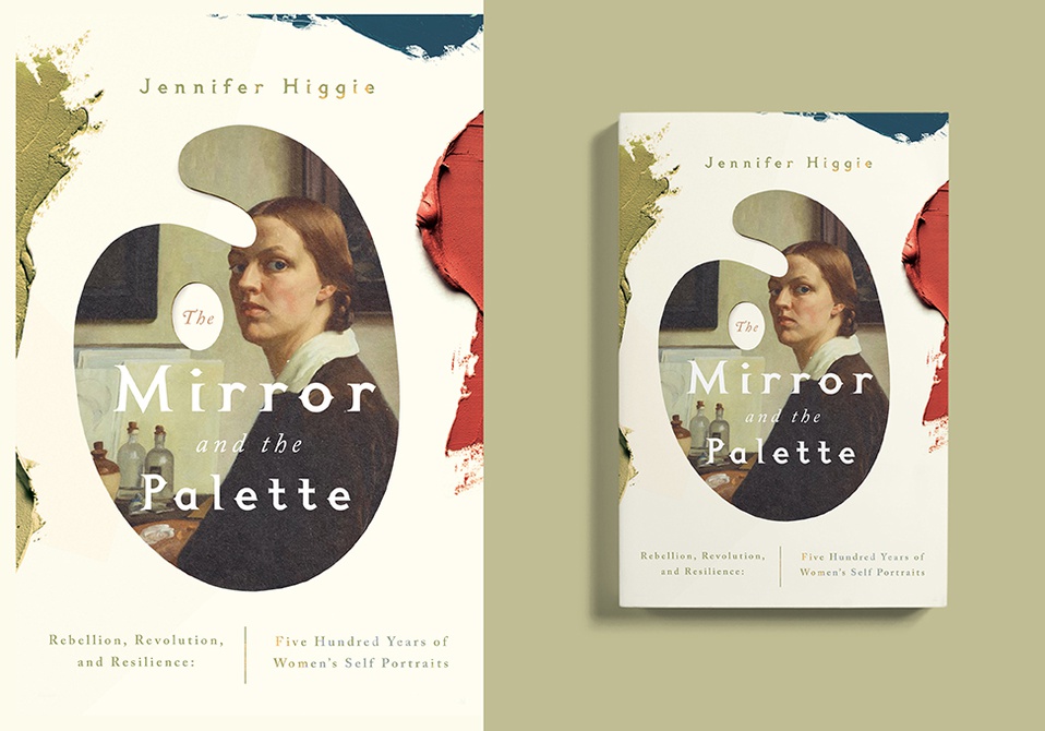
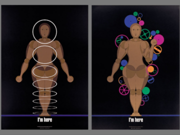
We’re told not to judge books by their cover, but a lovely logo or design on the front always makes for a more inviting read. These book-based designs from our 2022 Design competition know what we’re talking about!
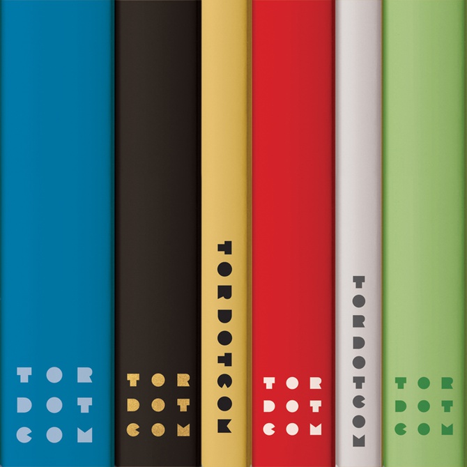
Tor Books is one of the best publishers of science fiction and fantasy novels in the world, and its imprint Tordotcom gives emerging and established writers a platform from their novellas & novels. It makes sense they need a logo as fantastic as their publications! “Tordotcom Logo” (above) was created by Michael Graziolo American design firm Drive Communications, and won Silver in our 2022 Design competition. Wanting to make something that stood out from their parent publisher, Graziolo pushed for the logo to reflect a more literary bent than traditional science fiction and fantasy work. He designed custom letterforms consisting of straight lines and basic shapes, making a logo that feels vintage yet speaks the language of its subject matter. With the clean and distilled typographic shapes, and a wide variety of iterations, the logo is always legible, even on the thinnest of book spines.


