This week, join Graphis in thanking the often unsung essential workers of the COVID-19 pandemic, then travel to Tokyo for a revolutionary exhibition using the simplest of shapes. It’s this week’s Design Annual 2022 entries!
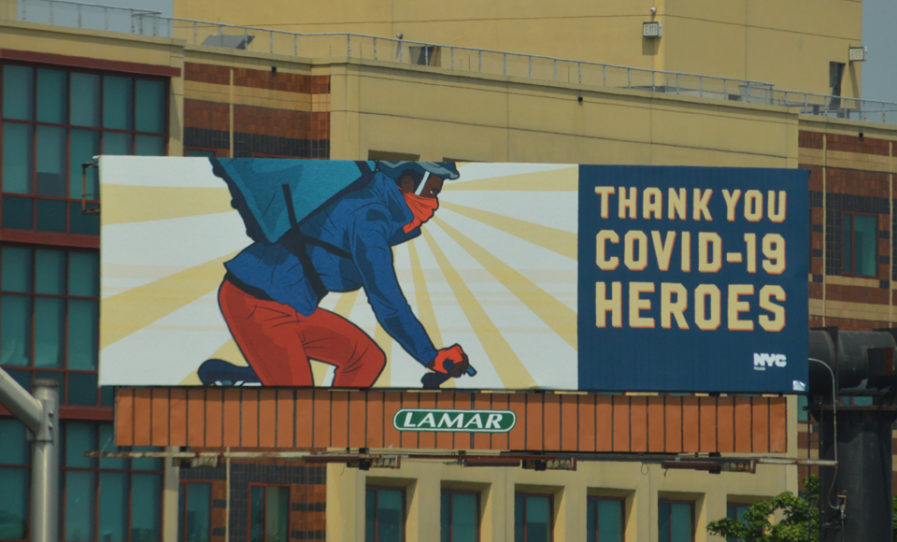
Our first featured design praises a group of people who often work tirelessly in the background: essential workers. Gabriel Escobar and Kevin Greenblat’s “Thank You COVID-19 Heroes” (above) highlights the hard work of lab technicians, garbage collectors, bus drivers, and more in a bright, comic-inspired ad campaign. Escobar and Greenblat are part of the Sherry Matthews Group in Austin, Texas, and were commissioned by the New York City Health Department. As the COVID-19 pandemic raged through New York City in the spring of 2020, the Health Department worked tirelessly to stop the spread. During the first wave—and throughout 2020—frontline workers in healthcare and many other fields heroically treated the sick and kept New York running. In addition to delivering public health information to New Yorkers, the Health Department wanted to show appreciation for the most vulnerable frontline workers.
Escobar and Greenblat were inspired by the risks so many diverse essential workers took every day. The heroes appeared on billboards, digital ads, train station ads, hand-painted building murals, and newspaper ads. The ad campaign launched in July, and Escobar and Greenblat’s work not only lifted the spirits of New York City’s essential workers, but also cheered on the Health Department as they managed policies, programs, communications, and other coordinated efforts throughout 2020. In addition to the ads, the Health Department also commissioned a few additional portraits of their own individual heroes.
