Space, Time, & Posters: Newest Poster 2023 Competition Entries

Space, time, and dystopian worlds are the common themes in this week’s featured poster entries.

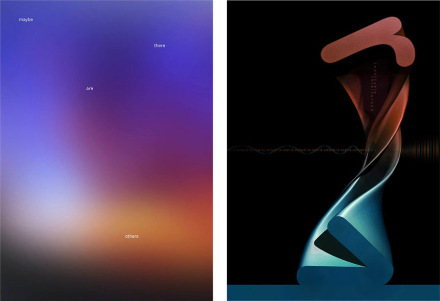
In one of two posters featured in this blog, Michael Braley looks beyond the stars with “Maybe There Are Others” (above, left). This work contemplates space and extraterrestrials with the use of typography, colors, and blurring effects, with the poster’s title spread out like a constellation. The background of the poster features a blue, purple, and orange gradient that blends together in a way that looks like the blurry image of the sky before sunset. This gives the allusion of gazing up at the sky and feeds into the wonder and curiosity of life beyond planet earth.

Graphis Master Hoon-Dong Chung is a designer based in South Korea and is an assistant professor at Dankook University. In addition, he is a vice-chairman of the Korean Institute of Product & Design. In his most recent  poster submission, Chung utilizes contrast and harmony to symbolize that “Virtual is Real” (above, right). This “inevitably intertwined” relationship is depicted in 3D typography that twists across the poster. Near the top of the poster, the red letter  R gradually contorts and transitions into the blue letter V at bottom of the poster. The phrase, “Virtual is real is virtual” is also repeated in small, red lettering across the poster, a blue wavelength wrapping around the words like a ribbon before blurring and spiking together towards the right side of the poster, becoming indistinguishable in form.
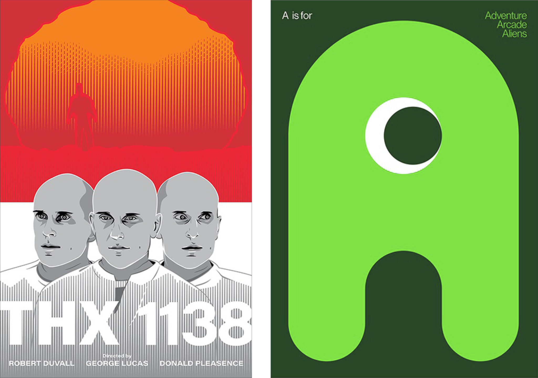
The next poster entry is from André Barnett, an award-winning designer with over 20 years of experience in graphic design and illustration. Barnett’s designs often feature his signature line hatching and thoughtful color pallets to create dynamic, eye-catching movie and television posters. In his self-assigned poster entry “THX 1138” (above, left), Barnette created an alternative movie poster for the titular 1971 film by George Lucas. The poster features the film’s main characters at its forefront, with the title in large white sans-serif lettering. Utilizing the combination of white and grey on the bottom half of the poster, the artist succeeds in capturing the sterile hopelessness of a dystopian society. This theme is further represented in the faces of the three main characters, whose blank expressions exude the bleak numbness present at the beginning of the film. However, a suggestion of hope is depicted at the top half of the poster, with the contrast of the fiery red and orange sunset hovering over the dreary characters.

In the second of Michael Braley’s new entries, he continues the theme of extraterrestrial beings with “A is for Adventure, Arcade, and Aliens” (above, left). The letter A fills up most of the page, with rounded edges, and a circle in the middle. The use of the white outline around the circle gives the letter an almost three-dimensional appearance, while the bright green color and curved shape animate the letter and playfully simulate the look of an alien. Both of Braley’s posters were initially selected for Poster Stellars’ 1st Intercontinental Poster Competition in 2021. With the theme of the competition as outer space, it’s clear why Braley’s posters were amongst the top right chosen designs from North America.

To see more outstanding entries from the 2023 Poster competition, or to submit your own designs, head to graphis.com.

Author: Graphis