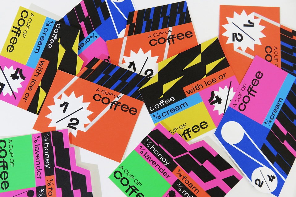
In today’s submissions for our New Talent 2022 Awards competition, futurism takes the forefront of the latest designs with three students capturing all the different ways a work of art can be modernized, ranging from outer space to quadratic formulas.
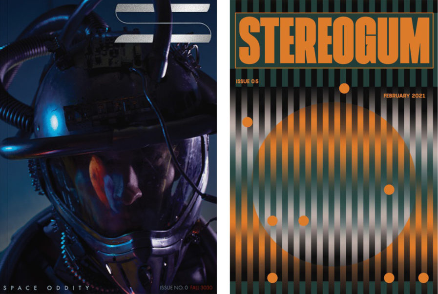
In “Space Oddity Magazine Spread” (above, left), Pennsylvania State University student Connor Schwenk reimagines David Bowie’s classic single as a print editorial. Under the guidance of professor Taylor Shipton, Schwenk was able to design every element of the magazine from photography to typography. Although the assignment originally asked to conceptualize a film, Schwenk adapted a song instead since movies already have a visual language of their own. The end result is a futuristic magazine playing on cyberpunk aesthetics to emulate Major Tom’s journey from Earth to the final frontier. With a color palette of steely blues, reds, and purples, Schwenk was able to capture the sci-fi genre’s DNA, and his magazine almost seems like it came straight out of the world of Blade Runner.
Likewise, School of Visual Arts student Doah Kwon similarly utilizes futuristic aesthetics to create a magazine cover for the music blog “Stereogum” (above, right). With the help of professor Jon Newman, Kwon’s take on Stereogum’s brand identity is a conceptualized 70’s kaleidoscope take on sci-fi aesthetics. Her design mainly relies on a gradient color palette of oranges, grays, and black, alongside subtle geometric shapes and bold typography. The end result is a captivating work of art that speaks to Stereogum’s identity as a house for music and unconventional creativity.
