Packaging is the first thing a consumer notices when looking at a product. Quality packaging reflects the quality of a product, and that’s exactly what this week’s entries for our Packaging 10 competition demonstrate.
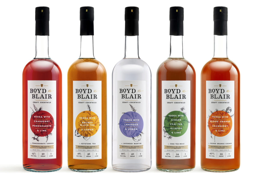
Boyd & Blair is known for their fine vodka and has expanded into the pre-made cocktails industry with “Boyd & Blair Craft Cocktails”. Packaging designer Chris Duggan from creative agencyOur Man In Havana explains that the challenge was to overcome ready-to-drink cocktails’ reputation of being low quality, cheap, and mass-produced. Boyd & Blair’s brand is different: it is a small artisan brand that delicately crafts its cocktails using “top-shelf, all-natural” ingredients.
Along with production designer Nick DiPillo, Duggan wanted to focus on creating a consistent but slightly different label. First, they created a new logo that included the keystone symbol used by Pennsylvania, which is where the company is based. Then, they had artist Adriana Picker do illustrations of each cocktail’s ingredients. The colors chosen reflect the dominant ingredients in each of the cocktails, and for the flasks, the designers made a boxed set of all five cocktails that had an accordion-fold brochure slipped in. The brand lucked out; while the COVID-19 pandemic hurt many industries, the alcohol industry thrived. Boyd & Blair’srelease in Pennsylvania and the Mid-Atlantic region was so successful that the company aims to achieve national distribution by Q1 of 2021.
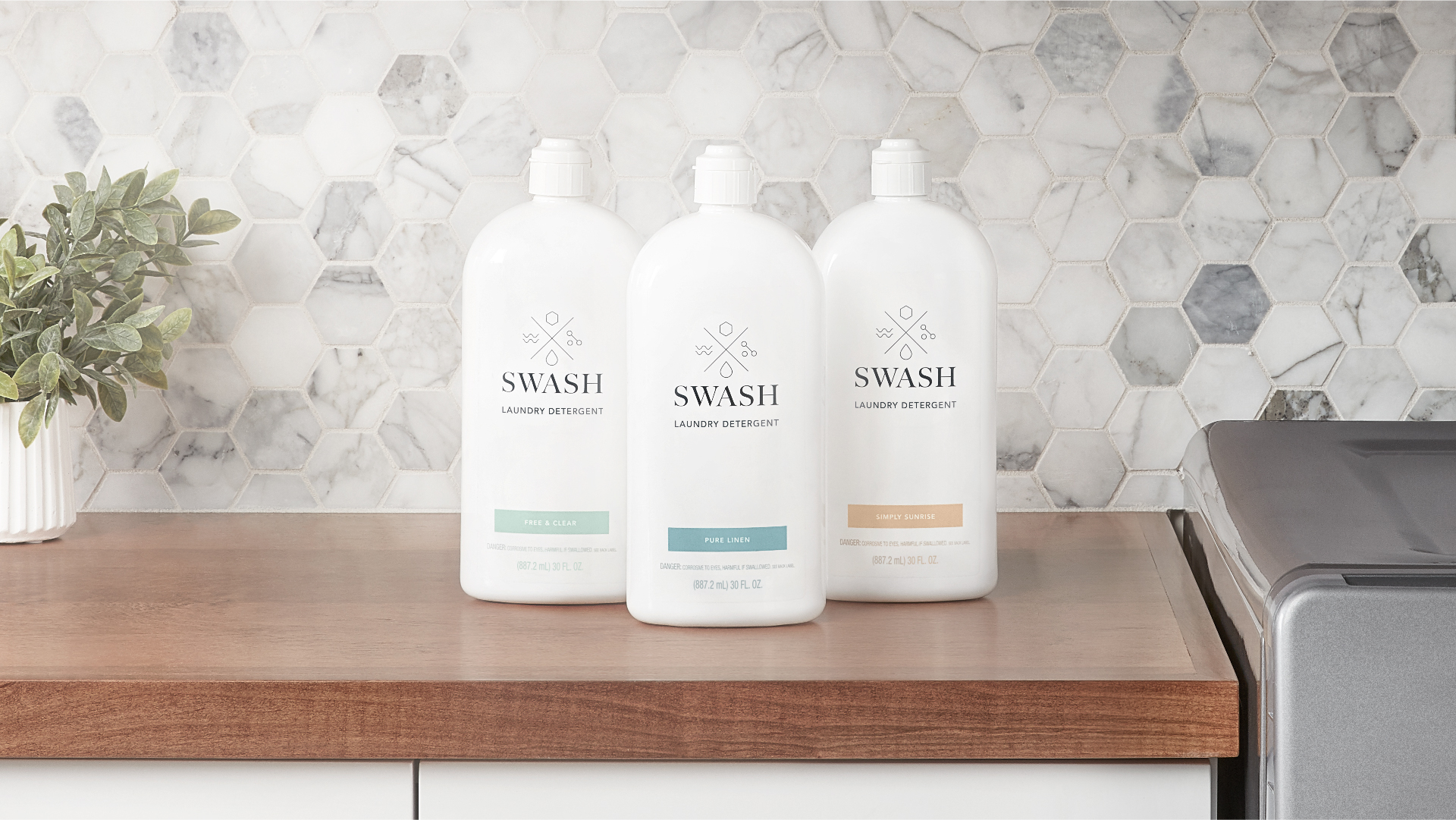
Another daily product consumers care about? Laundry detergent. Many consumers believe that more detergent equals cleaner clothes, but that’s not true, it’s actually destructive to clothes and washing machines. Whirlpool developed “SwashLaundry”, a detergent that’s friendly for both clothes and washing machines. For the packaging, they hired Deskey Branding and gave them three guidelines to follow. First, it had to be sophisticated enough to fit the modern consumer’s design aesthetic and be kept on the countertop. Second, because the formula is ultra-concentrated, the package needed to be highly functional with a dosing mechanism that exhibits a precise amount of detergent. Third, the product is sold online only, so the packaging needed to complement the digital experience that’s part of Whirlpool’s brand story.
Deskey had designer Lianna McKenzie develop the packaging, and the final product is a bottle that can be proudly displayed on a laundry room shelf by consumers who value their belongings and have an elevated sense of style. The packaging’s solid, all-white bottle form has a simple shape with elegant, rounded shoulders, and features simple but pretty graphic elements. An uncomplicated flip cap completes the look, with McKenzieopting for a self-dosing pour cap that’s activated when the bottle is turned upside down and squeezed. The pour cap contains a one-way check valve that releases exactly one-third ounce of detergent when the consumer squeezes the bottle. Invisible from the exterior, the check valve automatically stops dispensing once one-third ounce has been delivered.
Think you’ve created a unique package for a product? Test the waters and enter our Packaging 10 competition to see how your design compares to others!