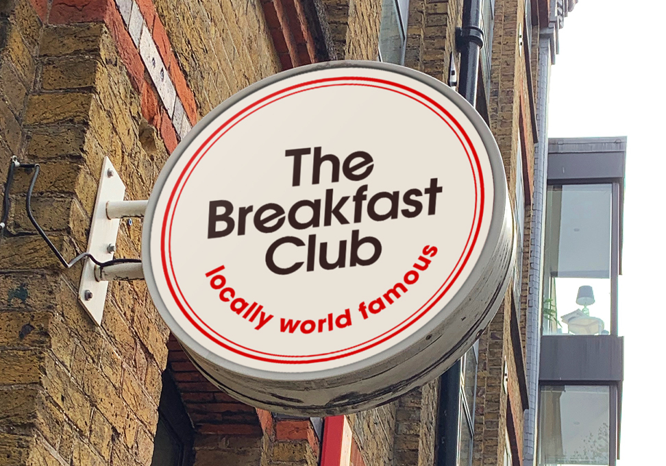
Rebranding a company is not a simple task, yet the agencies Elmwood New York and ThoughMatter make it look easy! Check out these two Design Annual 2022 entry rebrands for Tecate and The Breakfast Club.
Elmwood New York is a branch of the brand design consultancy Elmwood, with other branches located in Leeds, London, Melbourne, and Singapore. For the tenth year in a row, Elmwood was named the most effective brand design consultancy, having won more DBA Design Effectiveness Awards than any other agency. The philosophy behind Elmwood is that experience drives behavior, and all experiences must be designed. This sentiment rings true with their rebranding of Tecate Beer.
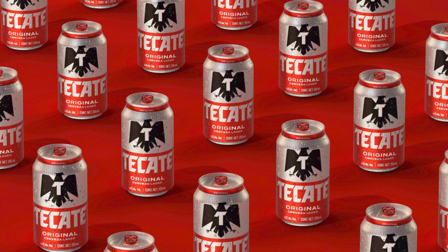
Since its inception in 1944, Tecate has become an extremely famous beer in northern Mexico and throughout the US. Hoping to modernize the brand’s iconic bottle, Elmwood New York extensively researched Tecate’s history and how it’s a staple to Mexican culture, not just a beer. Some things stay the same for this “Tecate Rebrand” (above), like the iconic black eagle, but this time, it has a large letter “T” printed on its chest. And, as a way to make the can appear less cluttered, Elmwood New York replaced the background with a simple silver pattern. National identity is a huge part of Tecate’s branding strategy, and this rebrand manages to modernize the look without minimizing the company’s roots.
