Poster: New and Winning Work from NY Displays What the City Has to Offer

Great poster design does more than advertise, it creates a visual event on its own…

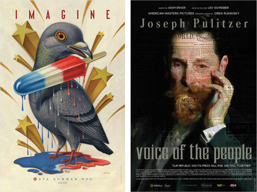
In a place like New York City where every street is lined with billboards and advertisements, it’s easy for a poster to get lost in the shuffle. Yet, these winning and new entries from New York have certainly stood out among the rest. Take Gold-winner “SVA Subway Posters” (ABOVE, LEFT) by Chris Buzelli… not only does the campaign have to grab the attention of busy subway riders, but it also belongs to a long history of subway advertisements for the School of Visual Arts starting in the mid-1950’s. Every year, artists are encouraged to come up with a poster that would showcase their talents and promote SVA, and Buzelli has certainly come up with a unique visual of a pigeon holding a melting popsicle in its beak. It truly represents summer in New York City.
Similarly, Toshiaki and Hisa Ide’s recent entry in the Poster Annual 2020 Competition, “Joseph Pulitzer, Voice Of The People” (ABOVE, RIGHT), is able to call people’s attention to this film’s subject, Joseph Pulitzer, by displaying his portrait and an overlay of newsprint. The image is intriguing and stands out among typical film posters.

   

Another past winning poster by Selman Design takes poster design to a new level. “Half Tone” (ABOVE, LEFT) takes four 1990’s albums and visually represents them in a unique and esthetically pleasing way. They told us, “We divided each album into 825 evenly timed segments and used a range of dots to represent the average waveform amplitude in each. Track breaks are marked by a space with no dot. Bespoke printing techniques and colors inspired by the original album covers were used to realize the designs.” It is certainly exciting to see how poster design can be influenced by technology and innovation.
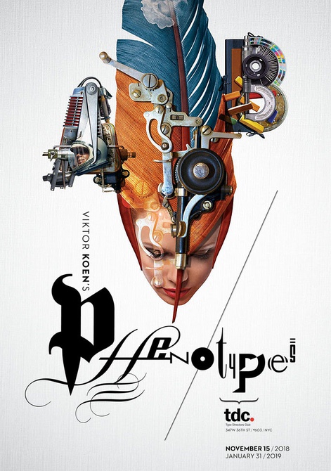
On the other hand, a recent entry by Viktor Koen in the Poster Annual 2020 Competition, “TDC Phenotypes Exhibition Poster” (ABOVE, RIGHT) displays a ingenious image in a more traditional poster design. The mechanics coupled with the quill harken back to the past. Yet, there is something modern about this poster that allows it to distinguish itself from the rest of the images seen every day by New Yorkers.

Submit to the Poster Annual 2020 Competition by January 22, 2019. Winners will have the opportunity to see their work published on our website, blog, newsletter, and social media platforms!

Author: Graphis

Leave a Reply

Your email address will not be published. Required fields are marked *