Simplicity and clever placement of text and objects can tell a story in one glance.
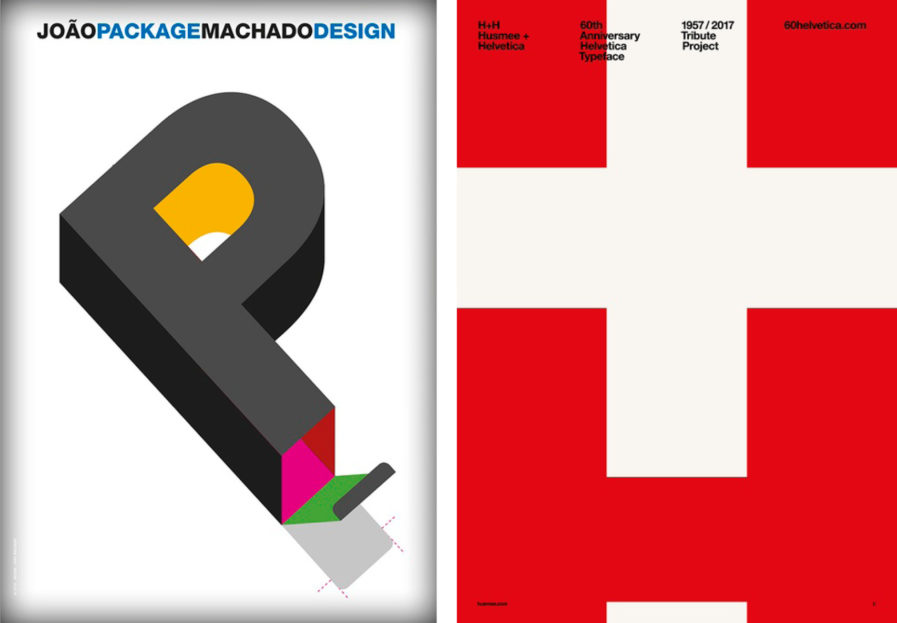
Antoine de Saint-Exupéry once said, “A designer knows he has achieved perfection not when there is nothing left to add, but when there is nothing left to take away.” João Machado and Husmee design firm both created posters that seem to reflect this very sentiment. Both share simplicity in design and in concept. Machado set out to create a poster for each of the design fields he works in, and for “João Package Machado Design,” (ABOVE, LEFT) the “P” stands for Packaging. A simple open flap at the base of the three dimensional letter does the job.
Spanish design firm, Husmee commemorated the legendary Helvetica typeface on its 60th anniversary with their poster, “H+H/Husmee + Helvetica” (ABOVE, RIGHT). It simply incorporated a few elements: Two “H’s” in the Helvetica typeface (one for Helvetica and one for Husmee) and the illusion of the Swiss flag. With the proper placement of the H to create a white cross on a field of red, Husmee was able to honor the typeface’s country of origin.
