That Photo School (TPS) was re-launching its annual advanced member showcase, which had come to a halt due to the pandemic. They wanted to come back with a bang and did not want the event to be seen as a “student photography” show, but instead as a professional and high-level exhibit. When Justin Clemons—founder of That Photo School—approached Mark Baker-Sanchez with the opportunity to design these posters, he was excited to accept the assignment
By: Mark Baker-Sanchez
That Photo School (TPS) was re-launching its annual advanced member showcase, which had come to a halt due to the pandemic. They wanted to come back with a bang and did not want the event to be seen as a “student photography” show, but instead as a professional and high-level exhibit. When Justin Clemons—founder of That Photo School—approached me with the opportunity to design these posters, I was excited to accept the assignment.
It was work that not only excited me but was also something that could push me creatively. I had ideas and Justin was open to exploring their possibilities. This project was a delightful fusion of art and commerce. Our KPIs were to 1) elevate the work 2) captivate the community and 3) drive foot traffic primarily within the professional visual communications scene.
I am proud of these posters because it is work that I fully stand behind. I’ve already had many experiences in my professional career—from working for magazines to ad tech companies. I’ve always approached what I do with soul and intent; not every place or client has these values. Since working on this project, I’ve collaborated with several others who value community and as a result, I’ve put out some of my best work. I intend to keep working with people who bring this same type of energy. There’s such beauty in collaborating with good people and it’s a blessing doing the type of work that you’re excited about and can easily speak to. This project was something that I was able to take on pro bono and I’m grateful that it has received so much praise within the creative community.
“This photography exhibit for my students was VERY important to me. My TPS students had been working for months and months, shooting and refining their story specifically for this show and I wanted it to be great. I wanted to show off their hard work and for them to feel accepted and proud in the local photo industry. It can be hard sometimes to get the public excited about an exhibition you are putting on, so I knew that we needed really good marketing content. We needed something eye-catching and unique, to get the city of Dallas to come out.” —Justin Clemons, Founder, That Photo School
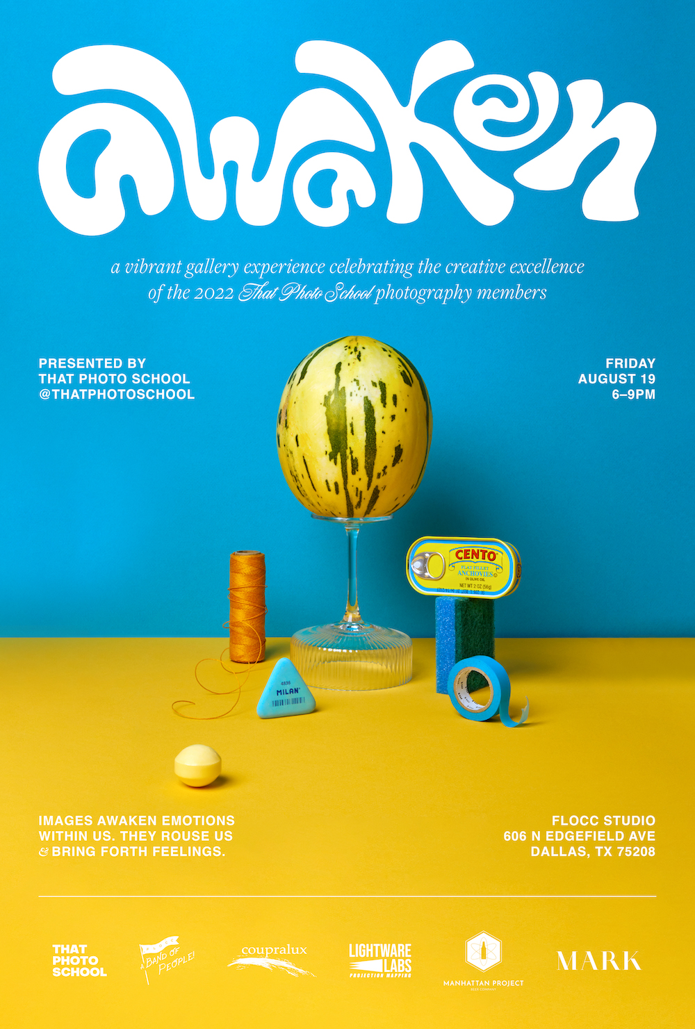
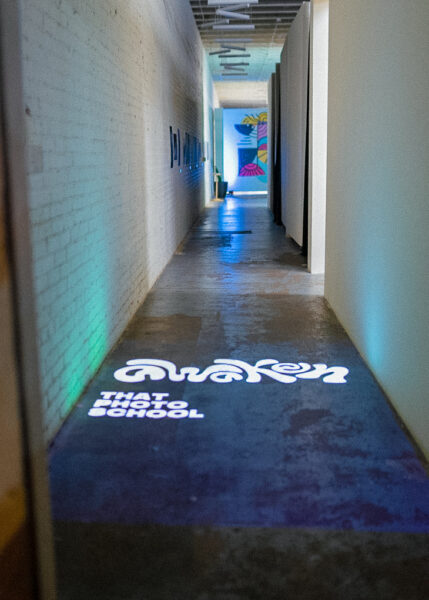
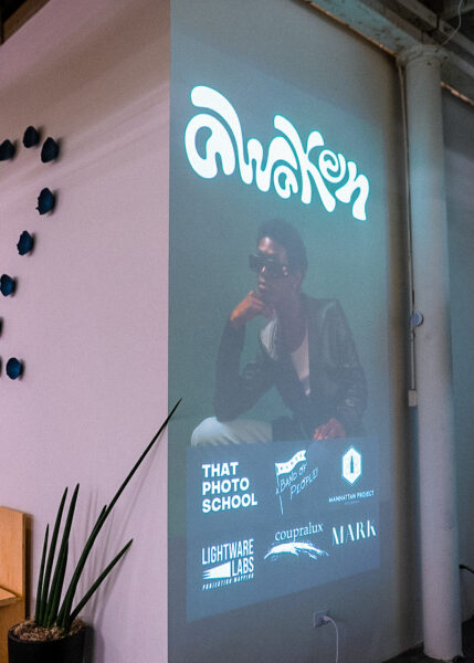
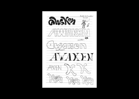
The idea for the show was based around one word: “Awaken.” This concept served as inspiration for all of the photographers in the program and was open to their interpretation as they created new work centered around the topic. Before pitching ideas to Justin, I conducted visual research on what was happening elsewhere in the industry. Examining what was hot and what was not, and why. From there, I began pulling inspiration that resonated with me and felt it was fundamentally headed in the right direction. Since the photographers were all developing new imagery, no photos were available for me to see or pull ideas from. I had to design without visuals in black and white and test with placeholder images until the official work was turned in.
My main challenge was in crafting a mark for the show and a versatile layout system for the posters as we planned to do a series of three. The mark needed to be something adaptable enough to shift with changing layouts as well as creative enough to visually convey a high-level essence while not overpowering or competing with the imagery. The concept of “Awaken” was also open to my interpretation, and I related it to the idea of movement. Liveliness is something that I wanted to incorporate into the final work. After experimenting with a few iterations, the mark became an organic, dancing-like arrangement of letterforms that gave a sense of motion. These were first hand drawn and then refined using Adobe Illustrator.
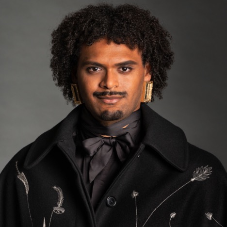
The layout system for the posters merely adjusts the position of the mark, subhead, and info up or down based on the imagery. For typography, the overall arrangement was kept minimal with Helvetica. Freight and Nautica were used for the subhead, adding a dash of elegance with their whimsical curves. I love how the final mark and typography paired with the gorgeous imagery that I selected for the posters (featuring work by Paola Monreal, Lauren Levi, and Korena Bolding Sinnett).
“I contacted Mark because he does work that is unique and different. He absolutely knows what is going on out there and the trends, but knows them enough to slightly break them, to create work that feels fresh. I asked if Mark would be interested in being a part of this project and thankfully he gave me an excited yes.” —Justin Clemons, Founder, That Photo School
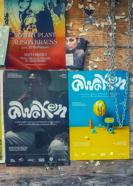
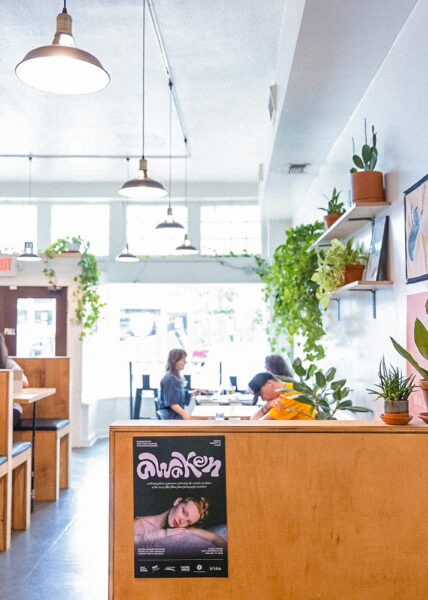
The poster designs caught the attention of various professionals in the creative field including editors, creative directors, art directors, art buyers, professional photographers, illustrators, designers, advertisers, and the broader visual arts scene in the Dallas/Fort Worth area. It also caught the attention of professional creative organizations including Where Are the Black Designers? and the Dallas Society of Visual Communications.
There was high foot traffic of 500+ attendees, leading exhibiting photographers to sell high volumes of work to patrons with some selling out completely. Most importantly, this led to an increased acquisition for the upcoming TPS Fall/Winter sign-up period.
“I supplied Mark with imagery from my students that were options to use. I told him that we really wanted to use the students’ work to promote the show. Mark took three gorgeous shots from the group and elevated them to a whole other level. I couldn’t be happier with the work that Mark created. His work was so slick and interesting, that it seriously caught Dallas’ eye big time. We had expected about 200–300 people to come to the show and I am convinced that because of Mark’s visuals, we ended up having more than 500 people come to the exhibit. I’m so thankful to have worked with Mark on this project and will definitely work with him in the future.” —Justin Clemons, Founder, That Photo School
Receiving Gold in the Graphis Poster Awards further affirms my hard work and the incredible end results of a great collaboration. I’m honored to have designed around such beautiful imagery and to have been able to apply my own creative expression. This award, most of all, affirms the great community in which I am immersed and places us all on the map.
This experience really showed me to go where I am celebrated, appreciated, and accepted. To work with good people, and never those who are not. Why would I want to showcase, submit, or talk about work that I do not love or stand behind? Why would I want to create that kind of work in the first place? Simply, I do not. I’m hoping to see the future of my field become less and less tolerant of cruel people. Immersing myself in creative communities and organizations around the country has taught me that is not how it is supposed to be. No one deserves to experience racial gaslighting, queerphobia, sexism, burnout from being overworked, etc. These are all things that I personally have experienced in my career, even when in school. The industry needs to do a better job of holding responsible individuals who perpetrate these types of discriminatory acts. I am an advocate for safe spaces and this is something that I am currently working to help build more of as I continue to grow in the global community.
Design and direction allow me to fluidly explore the intersections of art and commerce. I’m a creative person and that gift is an outlet of expression that is for me, that makes ME happy. I encourage anyone reading this to let themselves pursue the same.
Mark Baker-Sanchez is an art director focused on providing visual research and intentional creativity in the luxury space. He is passionate about bringing soulfulness into design, photography, and motion across style, beauty, and culture. His experience in both digital and print landscapes allows him to create holistic, captivating experiences that delight and inspire.
Building relationships and nurturing safe spaces is something he is passionate about, especially having worked within fast-paced corporate settings. He is the editor-in-chief and creative director of his own media brand called DONE: The Magazine which annually publishes underrepresented stories in a bespoke newsprint magazine.