In the picturesque town of Weimar, Germany, which is steeped in a rich cultural heritage and echoes of literary luminaries, a unique artistic endeavor took flight. This is the story of designer Ariane Spanier, a native of Weimar, who embarked on a journey back to her roots to illuminate the power of language through design. After two decades of urban life in Berlin, Ariane found herself reconnecting with her hometown in a way she could not have anticipated through a collaboration with the Klassikstiftung Weimar, a foundation steeped in classical literature and art. This homecoming of sorts marked the beginning of a two part project, the “Year of Language 2022” and “Language Eruptions“, that was part of a series of sculptural typography installations bursting forth in public spaces, much like language and graphics itself.
By: Ariane Spanier
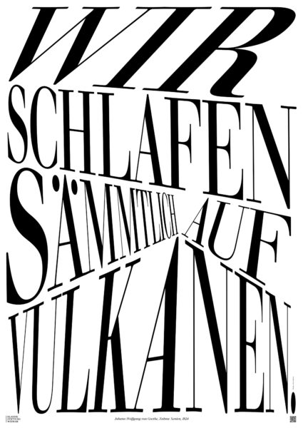
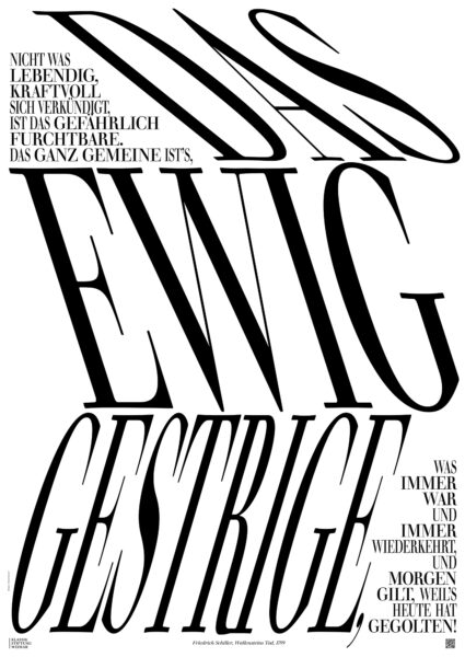
The posters for the Year of Language 2022, awarded by Graphis, are part of a larger sculptural typography project in public space.
I grew up in Weimar, a beautiful little town in the middle of Germany, rich in cultural heritage. Numerous classical German writers, thinkers, musicians, and poets have resided there. Twenty-four years ago, I moved away to study design in Berlin and hadn‘t returned for many years. In 2021, the “Klassikstiftung Weimar,” a foundation that collects and archives classical literature and art, approached me for a project. I felt an unusual excitement to work on something in my old hometown.
One of the most prominent figures of that 18th–19th-century era in Weimar was Johann Wolfgang von Goethe, the author of Faust. Many of his writings, poems, and plays are part of the foundation‘s collection. His friend Friedrich Schiller and later German philosopher Friedrich Nietzsche also resided in the town and left their mark. The Bauhaus was founded in Weimar before moving to Dessau. Additionally, some darker periods of German history played out there. Weimar and the Classical period were of particular interest to National Socialism, where the entire city and its cultural life were transformed to conform to the Nazi ideal of German culture for the national community.
The “Year of Language” was a year-long program of exhibitions, experiments, and debates, exploring language in all its aspects, uses, and meanings—from classical literature writings to the powerful propaganda terminology of the Nazis—and researching its impact today.
Besides designing the graphic identity for the program and its events including numerous printed matter, the exhibition design studio FrankeSteinert, the foundation, and I conceptualized a series of public sculptures covered in black and white typography. We used quotes by various authors, selecting them based on their connection and relevance to contemporary matters such as truth, the power of language, love, politics, society, and various human sensitivities.
During the process of developing the installations, we began by cutting a styrofoam cube into several pieces, imagining it falling down to the city and exploding into smaller pieces—spreading the sculptures throughout the city. Hence the name “Language Explosions.” The title of the sculptures became the motif for the promotional poster for the year—an exploding shape that stretched the word “Sprache” (language) on a bright pink background. An Instagram filter could activate an animation of the poster, where many words fly towards the viewer. However, it was more than a direct reference to a cube exploding into small pieces; it emphasized that language can be explosive, taking on various forms and purposes—mean, seductive, demagogic, enlightening, protesting, or questioning.
A significant amount of paper modeling was involved in figuring out the placement of the typography. It was incredible to see these initially modest models transform into actual installations where people could sit, take photos, and even use them as playgrounds for kids.
One particular structure, a “selfie” installation containing words from a historical word list by Christoph Martin Wieland, who collected unusual, almost untranslatable words like “Magical Sisters” (Zauberschwestern), “Owl’s Soul” (Eulenseele), “Fairy King” (Feenkönig), and “Philistine” (Spiessbürger) provided a background for people to immerse themselves in oversized typography.
We created a series of nine installations distributed throughout the city, in front of museums or on the walking streets. Additionally, we covered a whole room in Goethe‘s former house with some of his poems on the walls and floor. To change the perspective of visitors accustomed to looking down at small typeset poetry in books, they found themselves surrounded by the words.
This has been a dream project for a designer who loves typography and language. To be allowed to play with strong black-and-white lettering, be a bit rough with a nice serif typeface, and create something highly visible and dimensional for the town I am from—I couldn‘t ask for more. It has been received very well, and after it ended, some people bought some of the sculptures to place them in their gardens.
Ariane Spanier is a Berlin based graphic designer. Born in Weimar, Germany, she studied visual communication at the Art Academy Berlin-Weißensee. After a stay in New York, she opened her studio in Berlin. Ariane works primarily with clients from the cultural sphere, designing printed matter as books and posters as well as identities and everything else that sounds exciting. Ariane is the creative director and co-editor of Fukt, an annual magazine for contemporary drawing. Her work has won many awards, including from TDC New York and Tokyo, D&AD, Graphis, Stack Awards, and ADC New York and Germany. Her work has been published in numerous magazines and design publications. She is a member of the international graphic design organization AGI Alliance Graphique Internationale.