The first thing that a consumer sees is the product’s packaging, so it’s pretty important to resonate with the consumer they’re marketing towards. PepsiCo Design and Chinese designer, Xiongbo Deng, did exactly that in their entries for the Graphis Packaging 10!
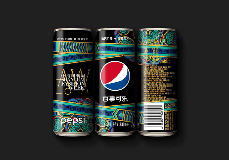
In PepsiCo’sentry, “Pepsi X Shanghai Fashion Week Autumn/Winter 2018” (above), they designed a can that was inspired by Shanghai Fashion Week 2018’s theme of ‘Integration and Origin,’ and Pepsi’s ‘live without compromise,’ attitude. The maximum cola, Zero Sugar Pepsi limited edition black can was minimally designed with sophisticated, traditional, and decorative Chinese elements, colors, and patterns. Pepsi seamlessly blended illustrative art with the context of packaging design.
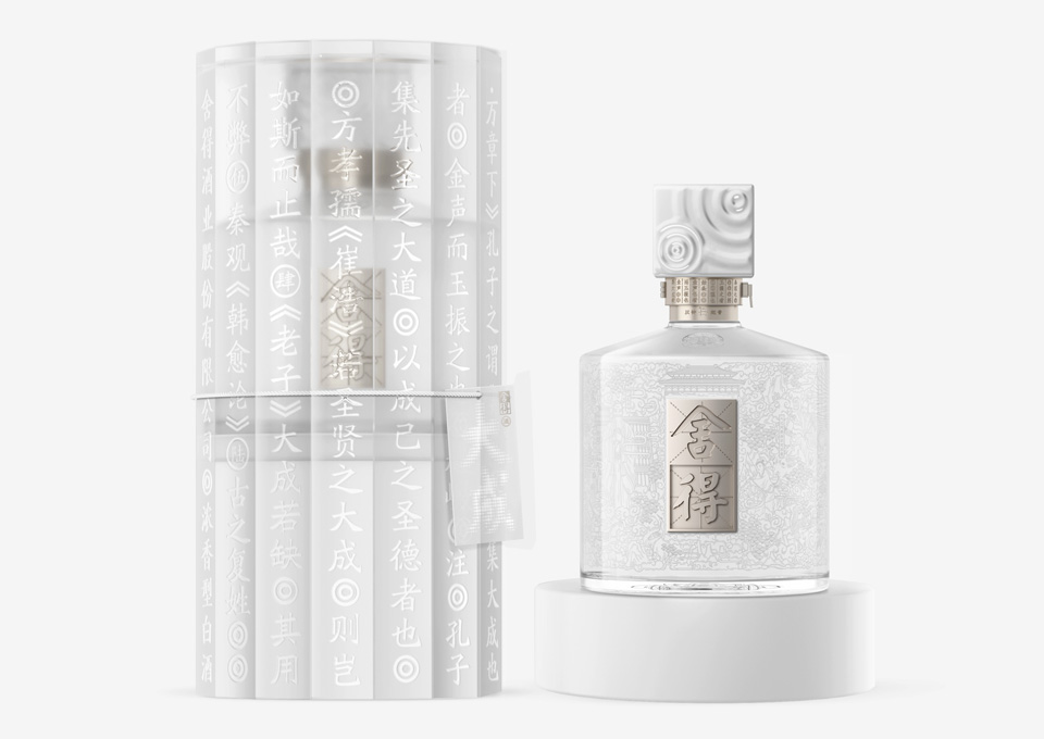
In comparison, SheDe Spirits co., ltd. in collaboration with designer Xiongbo Deng of ShenZhen Lingyun, created a tasteful design for a popular Chinese liquor brand in the entry, “SheDe-DaCheng” (above). She De is well-known both in China and overseas for the profound eastern culture it has. The goal of this project, however, was to align the brand with both the original oriental philosophy and a new quality – Da Cheng. The meaning of Da Cheng is close to “master,” referring to a person or thing that excels in a certain area.
In China, Da Cheng is generally used to refer to “the Greats,” such as Confucius. Therefore, images of Confucius and others can be found on the transparent container of the liquor. The design and patterns on the bottle allow it to look both simplistic but also beautifully elaborate. This design easily brings the charm of eastern culture to the consumer.
Enter your elaborate packaging designs to the Packaging 10!