Orange brandy blooms with a series of delicate images, and cooking is easy with pre-cut meat in a shapely package with this week’s Packaging entries.
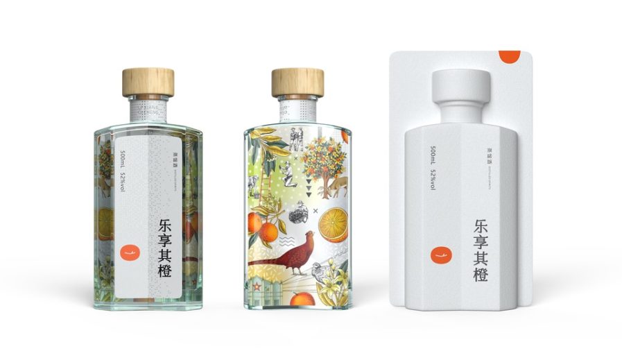
Shenzhen Excel Brand Design ConsuItant Co., Ltd. has been featured before for its beautifully crafted packaging designs, and their latest entry is no exception. In partnership with the China-based brandy company Enjoy the Orange, Shenzhen’s lead designer, Kuanfu Wu, was entrusted with the packaging design for the brand’s distilled orange brandy. In his design concept “Enjoy the Orange” (above), Wu takes the traditional liqueur bottle and makes it personal to the brand’s identity. Through mixing visual elements such as color and shape, the bottle design stands out amongst similar products on the market, “reflecting the uniqueness and innovation of orange brandy.”
The outer packaging is made of eco-friendly material, dawning the company’s name in crisp black Chinese calligraphy and logo. While the front label of the bottle utilizes a similar minimalistic design, the art featured on the back label can be seen through the glass of the bottle, and works as a subtle backdrop to the front label’s design. Inspired by orange orchards, Wu aimed to “highlight the characteristic of orange wine so that people feel the orange flavor at first glance.” The rustic illustrations feature working fruit farmers, animals, and orange trees which convey the company’s commitment to quality standards. Brandy-based orange liqueurs are often described to have a smooth and deep flavor of fresh flowers, and dried fruit, with the sweet citrus zest of oranges. These characteristics are exemplified in the warm, mellow shades of orange, yellow, green, and red which signify the rich and complex flavors of the liqueur. The wood grain cork ties everything together, presenting a rural yet modern design that exceeded the company’s expectations.
