How do we package food? In today’s submissions for our Packaging 10 Competition, two design firms capture the intricate process that goes into advertising classic food products for a new and modern audience.
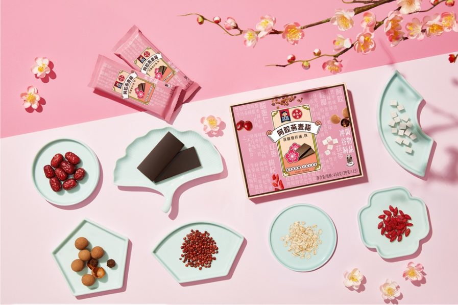
In “Quaker Oat Congee” (above), PepsiCo Design & Innovation were tasked with designing the packaging for an on-the-go breakfast bar infused with traditional Chinese herbs. On the design process, PepsiCo shared that the firm’s biggest challenge was figuring out a way to package what they called “1000 years of Chinese tradition” into a grab-and-go breakfast bar for modern consumers. The solution was found in pharmacies and herbal stores, where PepsiCo’s designers took aesthetic inspiration from authentic and traditional medicines. The end result is a marriage between old Chinese visuals and current contemporary design.
When explaining the final product, PepsiCo shared that their packaging relied on “modern, reductive illustrations of [their] ingredients layered with textures and symbols from traditional Chinese medicine.” Ultimately they created a perfectly packaged, pastel breakfast bar that promotes wellness and tradition through a “visual language that is quintessentially Chinese.”
