Rabiya Gupta, a student at the School of Visual Arts and a junior designer at Penguin Random House, made a significant mark in the 2024 New Talent Awards. Her stunning “Goldfrapp Album Packaging,” guided by Professor Justin Colt, earned her a prestigious Platinum honor. Rabiya’s ability to synthesize the duo’s vibes into a sleek, stylish package is as dynamic as their music. Her work on the double-album set project for “Felt Mountain” and “Silver Eye” is a visual universe that perfectly mirrors Goldfrapp’s sonic evolution. Now, this is art that sings!
By: Rabiya Gupta, Junior Designer, Random Penguin House
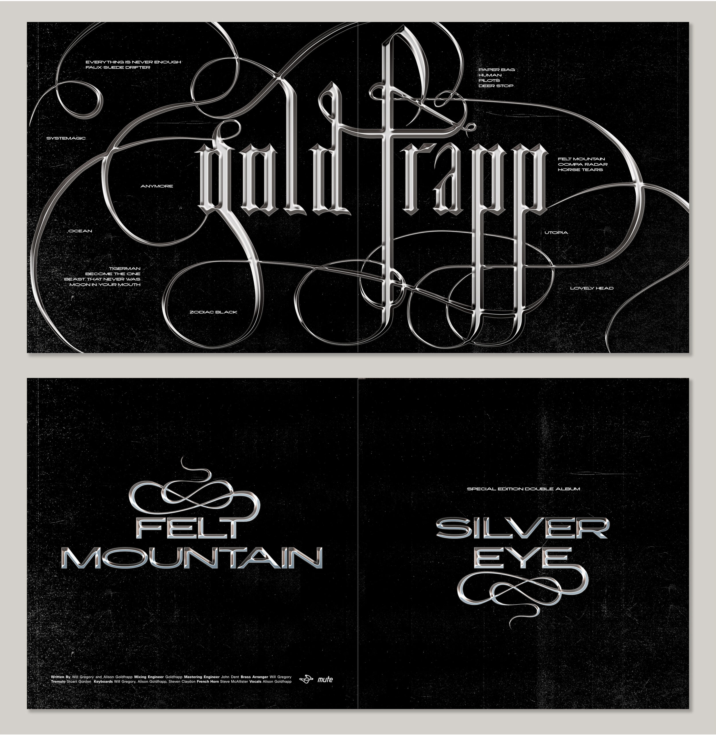
Comprehensive Overview: Goldfrapp Album Packaging Design
Goldfrapp, a prominent electronic music duo from London, has captivated audiences with its unique sound. As a designer tasked with creating packaging for the double-album set that included the album covers for their debut, “Felt Mountain,” and their latest, “Silver Eye,” I wanted to encapsulate the essence of their music visually.
Design Process:
The journey began with an in-depth exploration of various typography styles, aiming to reflect Goldfrapp’s enigmatic and mysterious musical qualities. A decision was made to hand-letter a blackletter typeface, selected for its ability to convey an organic yet haunting aesthetic—perfectly aligning with the duo’s eerie musical tone.
Typography Development:
Creating this lettering involved extensive trial and error, with countless hours spent sketching, redrawing, and tracing, ensuring every curve and line conveyed the desired emotion and style. This meticulous process ensured the typography reflected Goldfrapp’s distinctive sound.
Visual Enhancements:
To elevate the eerie mood further, a chrome effect was applied to the typography, enhancing the mystical feel of the design. This required additional research and fine-tuning to achieve the right visual balance. The chrome texture gives the blackletter a contemporary feel, which can otherwise feel like a dated lettering style.
Album Packaging Design:
The final packaging for the double-album set prominently features this custom blackletter typeface. Each album inside the double set maintains stylistic coherence, utilizing a modified sans-serif typeface with added flourishes that echo the main cover’s design elements. A subtle grunge texture complements the overall dark and intense theme, which is aimed at being evocative yet not somber. The cover is detailed with the names of individual songs from both albums, scattered artistically across the surface, symbolizing the passage of time between the two album releases.
LP Sleeve and Typography Consistency:
The LP sleeve features a radial pattern that mirrors the flourishes found on the main cover, enhancing the visual experience of unpacking and exploring the album set. This design decision amplifies the unified aesthetic from the outer cover to the inner visuals, creating a seamless experience for the viewer.
The design for the “Felt Mountain” and “Silver Eye” Goldfrapp album set merges visual and auditory elements effectively, presenting a unified brand image that captures and enhances the listening experience. This packaging represents Goldfrapp’s musical evolution and serves as a visual narrative of their journey from their beginnings to their current status in the music industry.
Rabiya Gupta is a graphic designer from India based in New York. She is passionate about creating expressive visual content that transcends convention. Utilizing diverse techniques and perspectives, some of which are rooted in her Indian culture, Rabiya’s work has a unique voice and communicates at multiple levels. Her portfolio includes a variety of projects, including book and album covers, exhibition design, and visual identities. Beyond her interest in design, Rabiya also loves traveling, reading books, and playing the piano. Currently, she is working at Penguin Random House.