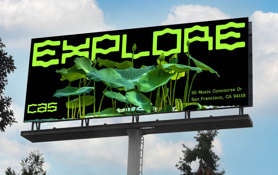
As a student project at ArtCenter College of Design, Jo Iijima’s rebranding for the California Academy of Sciences (CAS) beautifully reflects the institution’s mission to regenerate the natural world through science and education. Central to the design is “CAS Ultra,” a custom typeface inspired by the Academy’s Renzo Piano iconic living roof, with its organic, hill-like curves symbolizing interconnected ecosystems. By merging natural forms with innovative typography, Jo crafted a visual identity that celebrates environmental stewardship and reminds audiences of their responsibility to reconnect with the planet
By: Jo Iijima, Freelance Graphic Artist
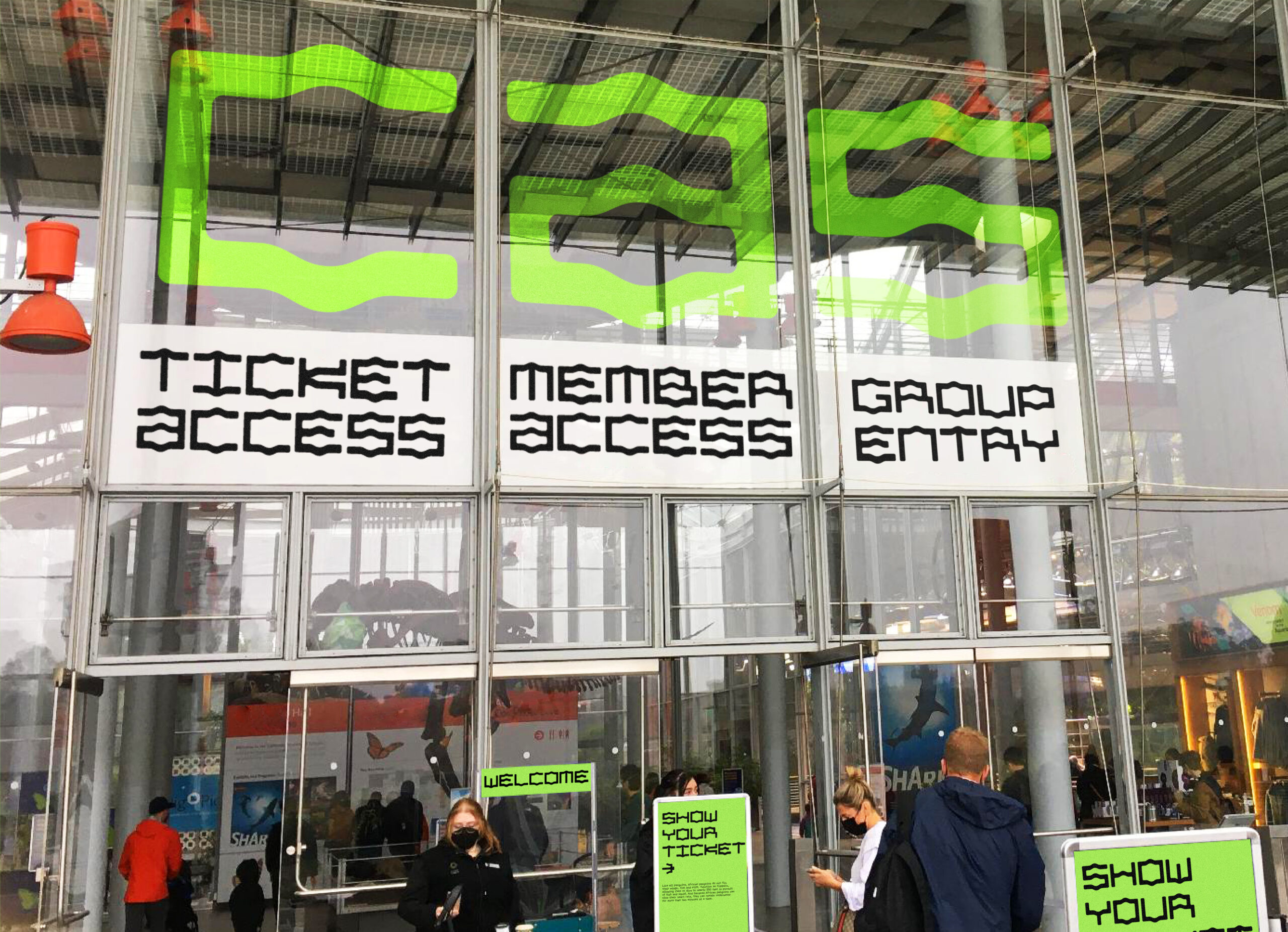
This rebranding project for the California Academy of Sciences (CAS) highlights the institution’s commitment to regenerating the natural world through science, education, and collaboration. As a science museum and a leading scientific and educational institution, CAS is dedicated to fostering a healthier, more resilient, and wilder planet.

At the core of this rebrand is the custom typeface “CAS Ultra,” featuring organic, hill-shaped curves inspired by the Academy’s renowned “living roof,” designed by architect Renzo Piano. The roof’s organic, hill-like structure reflects the harmony between nature and architecture. The shape of the hills can interconnect and form a pattern symbolizing a genome, reinforcing CAS’s central message of regeneration. The new identity system integrates this architectural flow, symbolizing the growth of nature and reflecting the Academy’s dedication to environmental stewardship and scientific exploration.
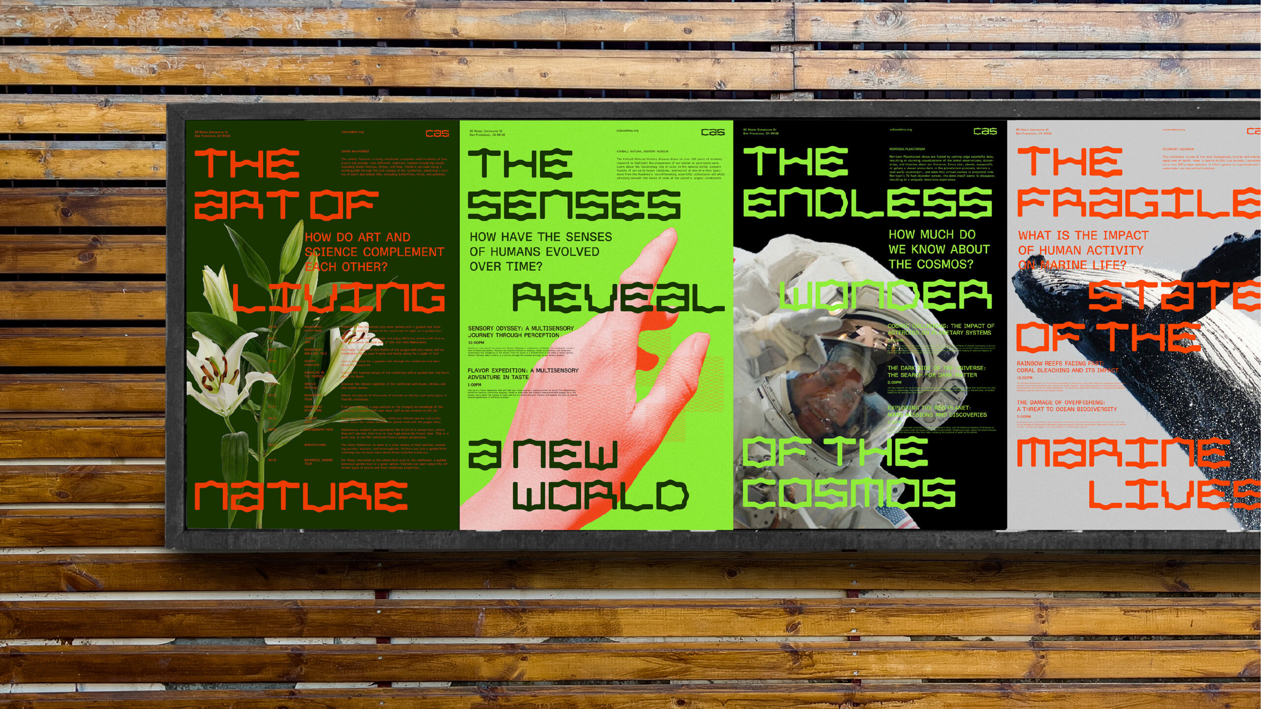
Curiosity has been a key driver throughout the creative process, allowing me to dive deeply into the institution and the broader concepts of ecosystems and innovation. This project fueled my passion for pushing creative boundaries, particularly in merging typography with natural forms. Having lived in cities like Tokyo, Hong Kong, Vienna, Toronto, and New York, I am passionate about experimentation—blending my multicultural background with creative exploration to design work that is both visually striking and culturally resonant. Growing up in different environments has taught me how communication shifts across cultures, languages, and contexts, with certain words and meanings only fully expressed in their original form. This curiosity fuels my drive to create compelling narratives through dynamic typography that surprises and offers fresh perspectives.
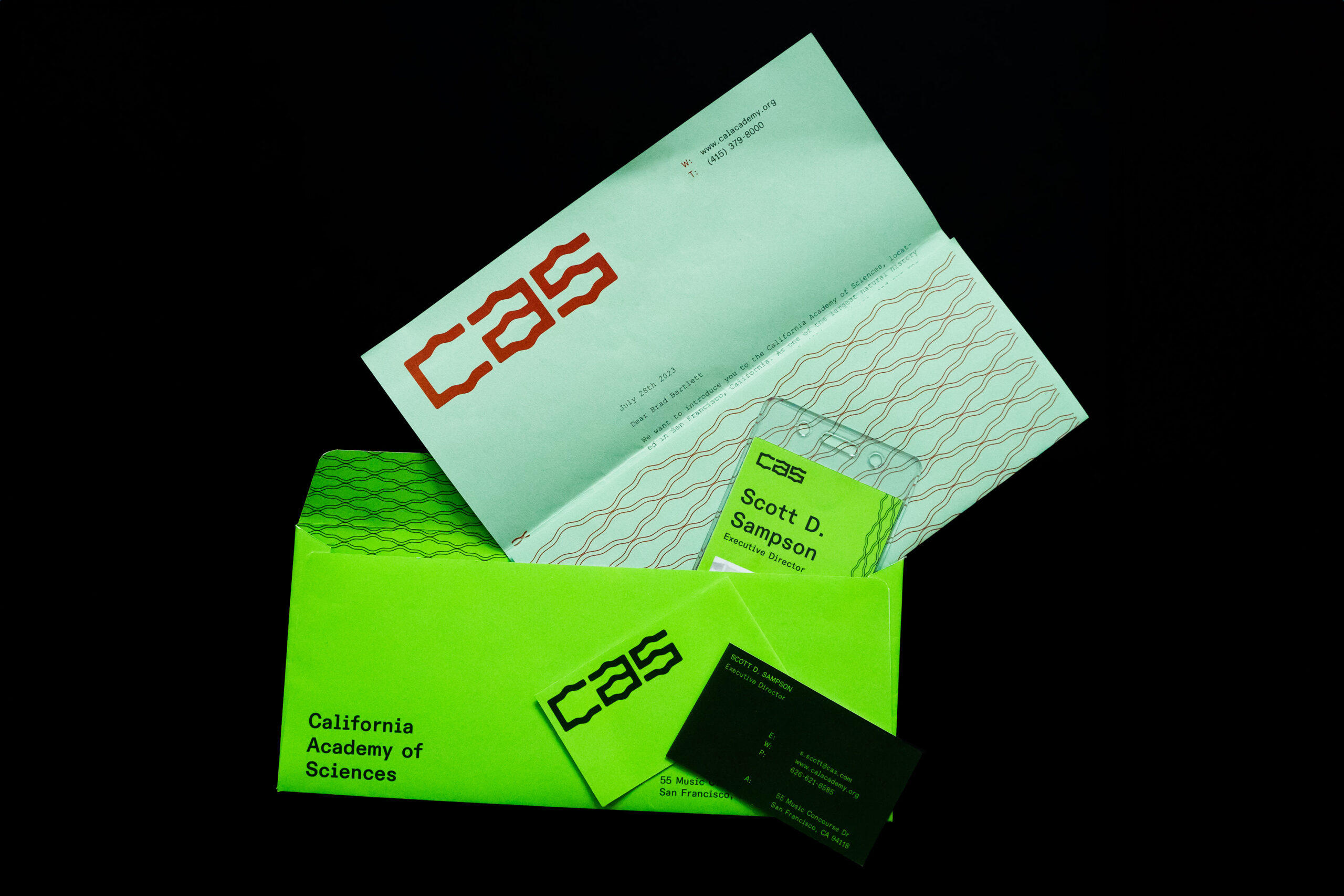
Through this project, I reflected on how the custom typeface, CAS Ultra, could integrate with the natural world, crafting an organic feel where typography seems to coexist within an ecosystem. Constantly inspired by my surroundings, I draw from everyday experiences—whether observing objects, animals, typography, or the interplay of languages in urban and natural settings.
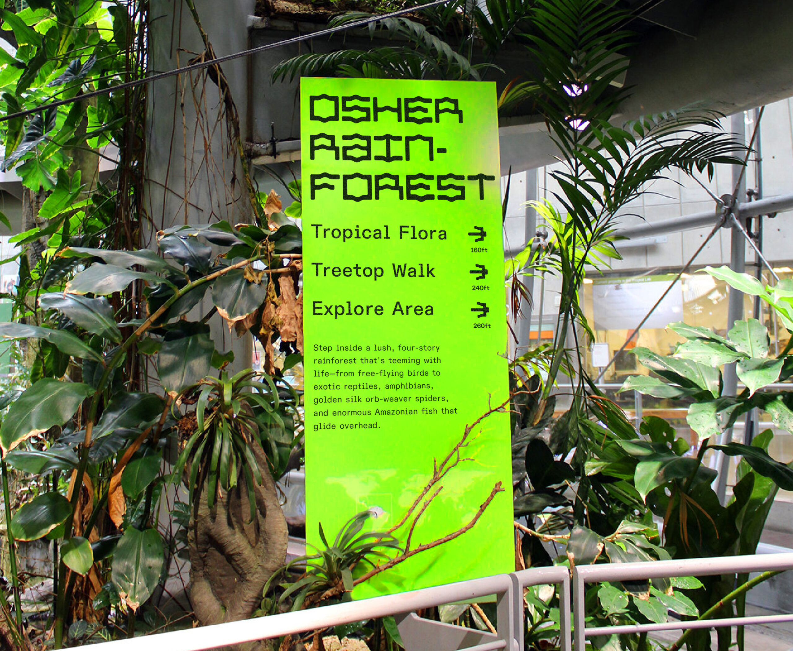
These observations spark new ideas, and my adventurous mindset keeps me seeking fresh perspectives. The CAS rebrand embodies this curiosity, offering a narrative that aligns with the Academy’s mission and encourages audiences to reconnect with the natural world.
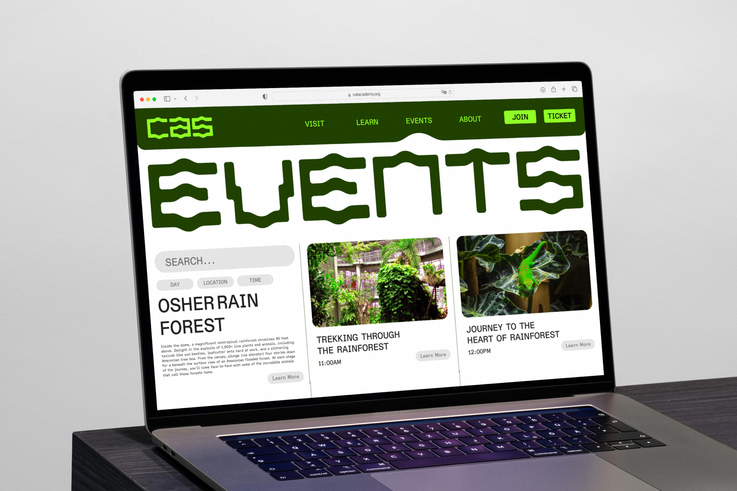
Hi, I’m Jo Iijima! I am a multicultural graphic artist and director based in Pasadena and New York City. I specialize in creating visual expression across brand identity, art direction, typography, and campaigns. I have lived in various cities worldwide, including Tokyo, Hong Kong, Vienna, Toronto, and New York City. I’m passionate about experimentation, blending my background with creative exploration to create visually striking and culturally resonant designs. My curiosity constantly drives me to learn and push creative boundaries.
