In her conceptual rebranding of Kodak as part of her ArtCenter College of Design project, Esther Yeseul Lee reimagines the iconic brand’s identity with a modern twist. Drawing on Kodak’s rich photographic history, she skillfully blends nostalgic elements like the 3:2 aspect ratio of 35mm film with contemporary design innovations. Esther’s approach captures the emotional essence of Kodak while ensuring its relevance to today’s audience, making her project a compelling exploration of how legacy brands can evolve to resonate with new generations.
By: Esther Yeseul Lee, Former Student, ArtCenter College of Design, & Freelance Designer
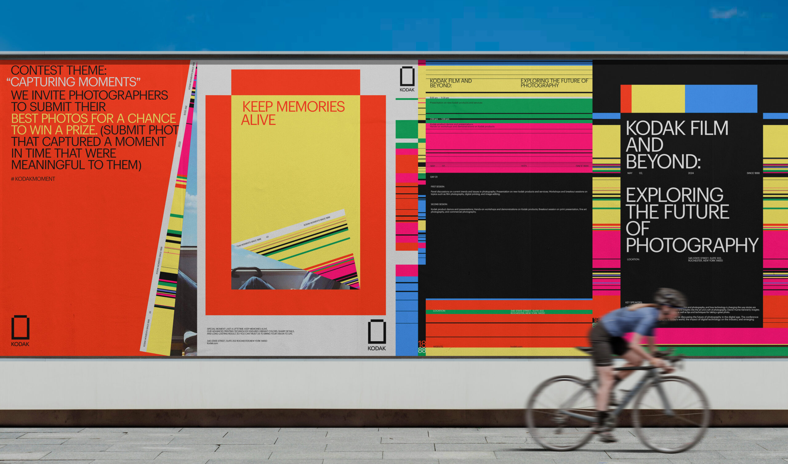
This rebranding effort strives to bridge Kodak’s rich legacy with modern advancements, ensuring that the brand continues to resonate with new and existing audiences by celebrating the essence of photography that transcends time. The identity systems are built upon the core experience of photography—capture, share, and duplicate their memories with the high-quality imaging and printing technologies of Kodak.
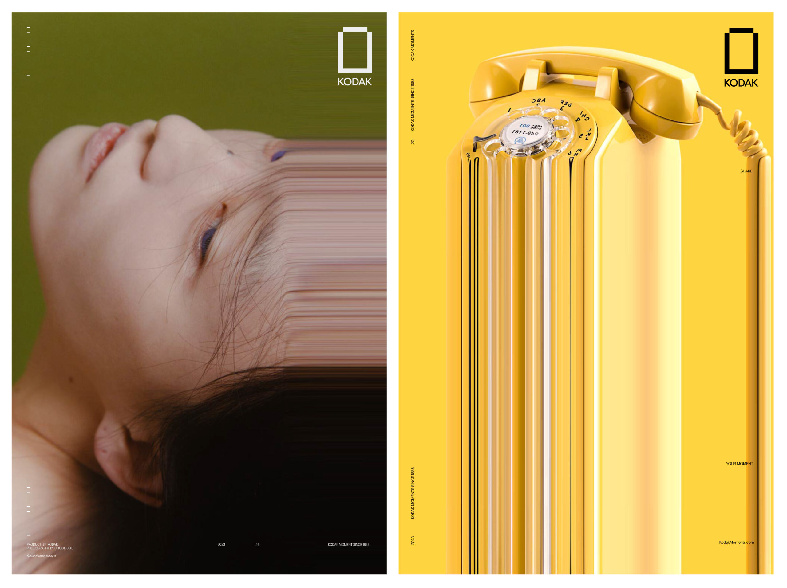
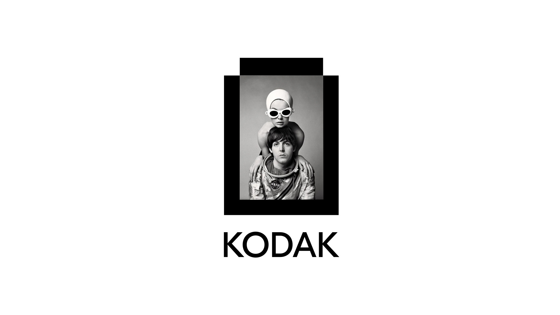
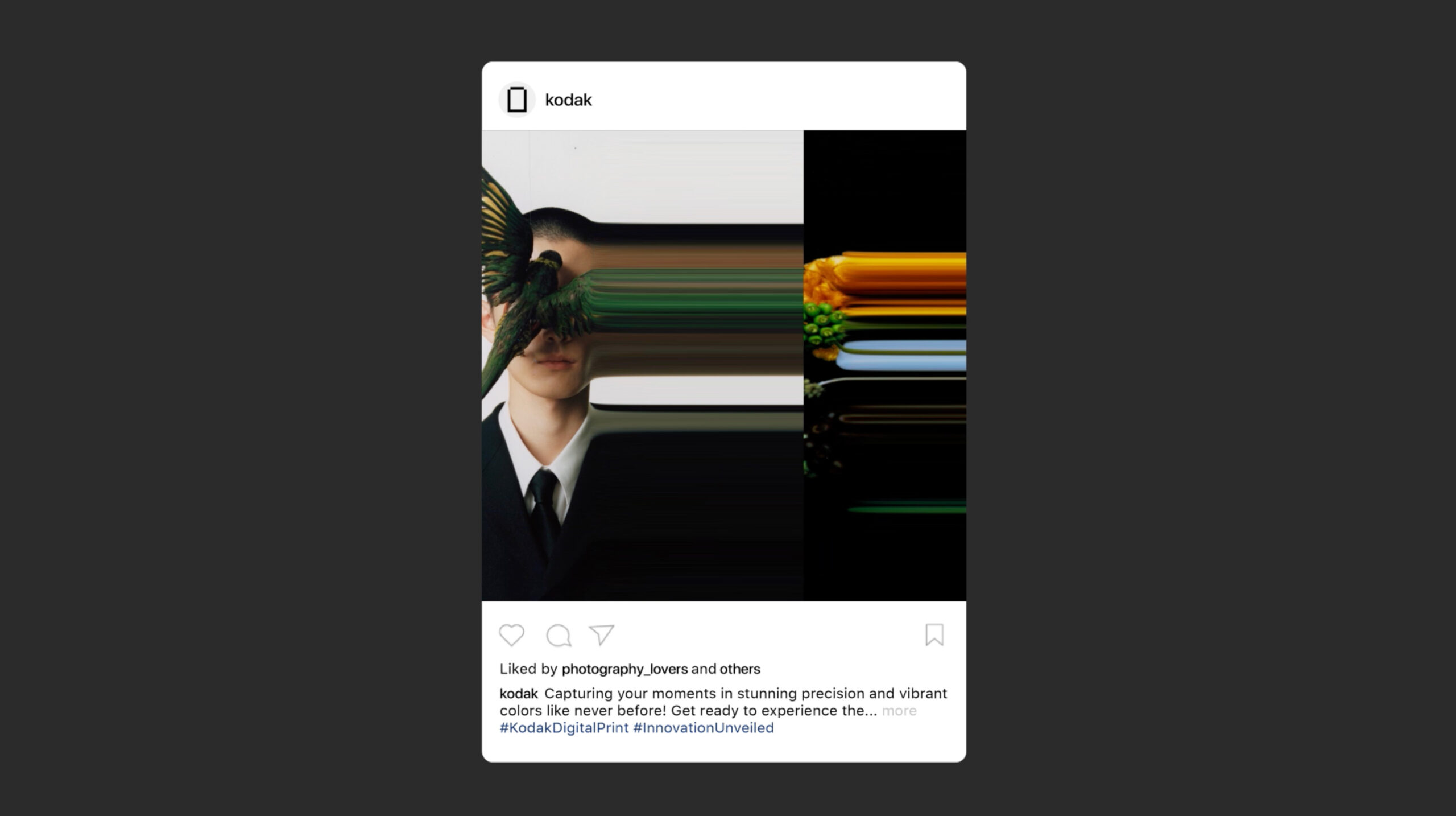
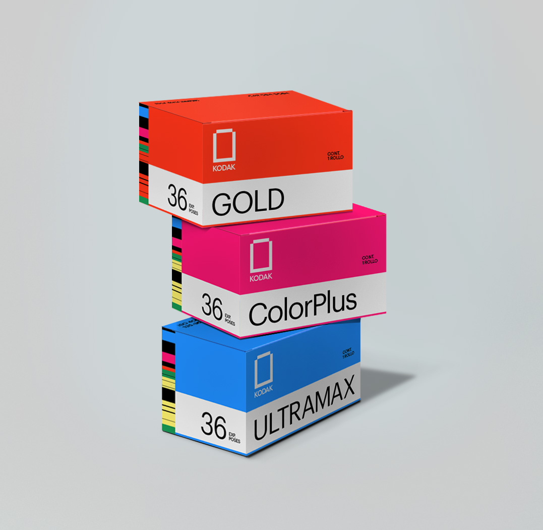
The inspiration behind this work stemmed from a desire to reinterpret the past, returning to Kodak’s emotional roots while showcasing how its innovations make sharing pictures easier than ever. The aspect ratio of the logotype is built upon a 3:2 of 35mm film cameras. The core motif and motion of two rectangles slide each other, intersecting—forming a negative rectangle inside, which is used to reveal that the photograph has become a central visual element. As Kodak’s historical identity is rooted in film photography, the process of developing a film has inspired me to create this core motif for Logofrom. Taking both modern and nostalgic approaches, the motion of the logo form replicates the moment of ‘clicking the camera button’—capturing the moment and motion of developing a film to reveal the image taken. The idea of promotional posters is inspired by Apple’s “Shot with iPhone” advertising campaign, which aims to showcase pictures of the impressive photographic capabilities of Kodak cameras. My strategy was to highlight photographers on these posters. I chose to feature the work of Chogiseok specifically, as his photography is vibrant and aligns with the idea of Kodak Moment—capturing just the right moment that would get forgotten if not captured. To emphasize Kodak’s high-quality printing technologies, I incorporated a pixel stretch treatment into the design.
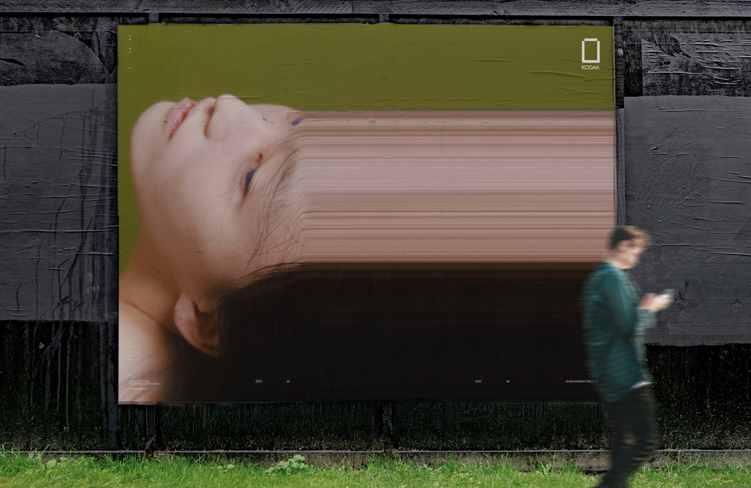
My creative strategy involved extensive research and multiple iterations to align Kodak’s historical identity with current trends. I focused on understanding how the retro sensibilities of the ’70s and ’80s, combined with modern elements, are being redefined as “hip.” This fusion of past and present, often called Newtro culture, served as the foundation for Kodak’s rebrand. By intertwining nostalgic elements with contemporary reinterpretations, I aimed to create a brand identity that resonates with today’s audience while honoring Kodak’s legacy.
Since Kodak is such an iconic brand, the challenge was mainly from the effort to balance the brand’s heritage with the need for a fresh approach to make a modern update.
This award is meaningful to me at this stage of building my career, as it reaffirms my confidence in the direction and work I’ve been pursuing. It provides valuable reassurance and validates the path I’m on.
To my fellow creatives, don’t be afraid to explore, embrace diverse creative perspectives, and trust your ideas. Believe in yourself, whether it’s your design or illustration style, picking up a new interest, or trying out a new hobby—keep exploring and have fun. Continue pushing boundaries of creativity and stay enthusiastic.
Photography Credit: Chogiseok
Esther Yeseul Lee began her career as an illustrator, focusing primarily on drawing and painting. Her interest then shifted to motion graphics, where she became fascinated by how movement can put energy into still images. This shift trained Esther to understand how images transition from one sequence to another. Despite her background in illustration, Esther often incorporates graphic elements into her work, exploring how type and images can combine in diverse ways. Her style is playful and energetic, yet she strives for a balance between simplicity and elegance in every detail. Currently, Esther specializes in visual identity and motion illustration. She’s excited about exploring new techniques to expand visual communication and is keen to collaborate with diverse brands on a wide range of projects.