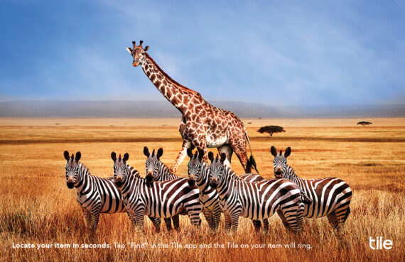
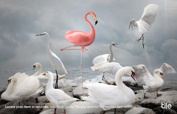
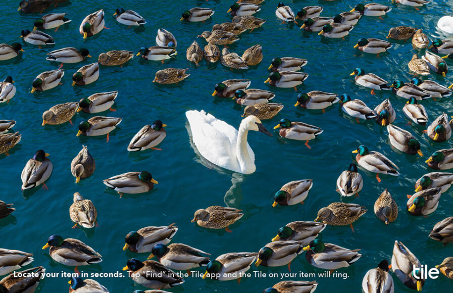
“Spot it in Seconds” is more than an academic project; it’s a creative solution born from the everyday frustration of misplaced items. Yaoxinyu Guo, guided by Syracuse University Newhouse School’s Professor Mel White, developed an advertising campaign that earned a New Talent Gold Award. The series skillfully leverages Tile trackers to turn the often frantic quest for misplaced items into an immersive visual adventure. Inspired by a nature photo of zebras standing out amidst a throng of wildebeests, Guo employs the same bold contrasts in her ads. This creative approach underscores the simplicity with which a Tile can pinpoint possessions in common scenarios, such as finding your keys or retrieving lost luggage in the bustling atmosphere of an airport.
By: Yaoxinyu Guo
This happens to all people: a specific item, normally a small one, that you must take with you suddenly goes missing right before the time you should leave. The clock was ticking, and you crazily searched every corner of the room. If you were lucky enough, you would find the item before it is too late to leave the house, but if you were not, you would find the item and be on time. In situations like this, you desperately wished that the item you were looking for could either make a beep beep sound, glow, or become gigantic, just do something that could make it stand out from the pile. Someone heard this wish, so the Tile trackers came out.
Every product was born for a reason. If the goal is to persuade people to take a product home, it’s important to catch this reason. The problem is that the reason why a product was born always seems so obvious and ordinary, not something exciting, so it gets ruled out and tossed away immediately during the brainstorming sessions for a campaign. But obviousness and ordinariness do not necessarily lead to a boring campaign, and they can be made to blossom. The simple reason why the Tile trackers came out – to help people locate their items in seconds – is what leads to my campaign “Spot it in Seconds.”
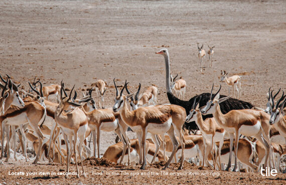
Tile trackers are the magic; they make the item stand out from the crowds. I closed my eyes to imagine how to show this magical moment in a visually appealing way. I thought of those magnificent scenes I had seen in many nature documentaries: thousands of wildebeests were crossing the river. However, I could quickly tell several zebras were in this cloud of dark gray because their stripes made them stand out. Right, this was what I was looking for. In each of the final ads, you will find two different animals: one animal is greater in number but significantly smaller in size/shorter in height/dimmer in color, which makes the other animal, who is the one and only on the page, stand out significantly. Simple but magical.
Recently graduated from Syracuse University’s S.I. Newhouse School of Public Communications, Yaoxinyu “Lexi” Guo is an art director from Kunming, a small but fabulous city in China. Yaoxinyu actively explores design in many fields. Before becoming an art director, she was a data analyst who tried her best to create visually appealing infographics for analysis results. She might become a product designer in the future because she enjoys coming up with designs that can solve everyday problems, and she is passionate about making sketches on paper into real things.