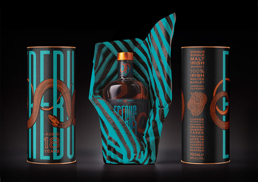
Australia-based agency Harcus Design submits their 5-part entry “Erebus” (above) to the Graphis Packaging 10. For Spicers’ Wine and Gourmet collection, Harcus Design introduces a luxurious packaging design for a single malt Irish whiskey. Every detail of the design and its significance was thought out, from the deep black of the label to the orange snake circling the name.
‘Erebus’ was the Greek god of Darkness, while a snake is often associated with the underworld. The snake also uses the myth that there are no snakes in Ireland, creating a sense of uniqueness and rarity for the whiskey.
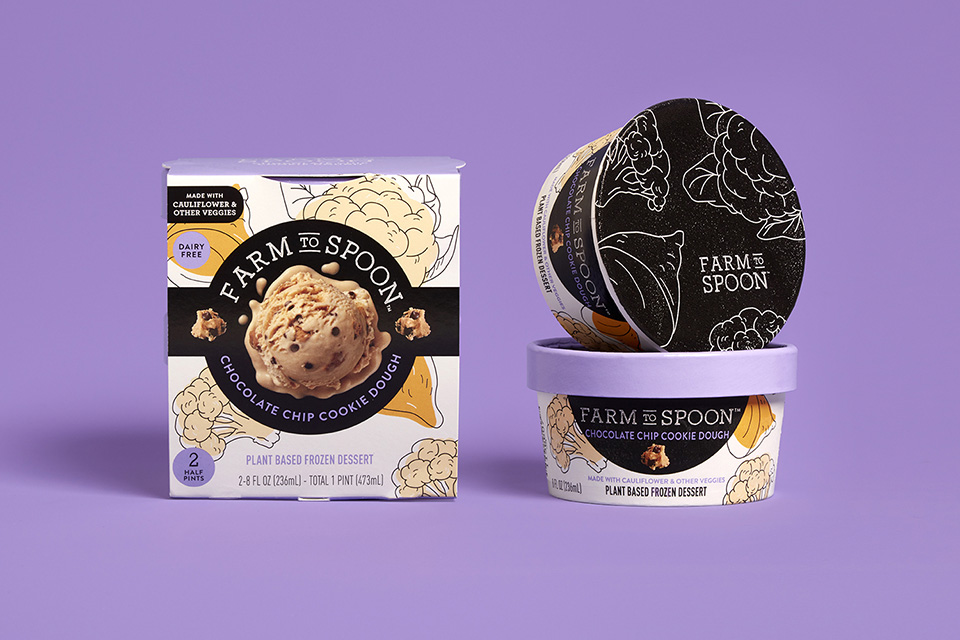
This tasty-looking new design above for “Farm to Spoon” ice cream was designed by Sutasinee Seitz of Ultra Creative. They wanted to convey transparency above all else – to show the product as a wholesome alternative to the processed dairy industry. To emphasize the healthy ingredients used, there are quirky illustrations of vegetables, including sweet potato and cauliflower, dotted around the packaging.
Images of the ice cream itself are placed front and center, clearly stating although it is plant-based, it looks and tastes like regular ice cream. Each flavor has its own distinct color, but still maintains a cohesive look.
Good packaging deserves praise, great packaging deserves awards. Enter the Packaging 10 today!