New Packaging 10 Entries from Zhou Yao and Nestlé That Modernize Nostalgia.

Tang Fu Liquor and Nestlé’s packaging redesign expertly blends old with new.

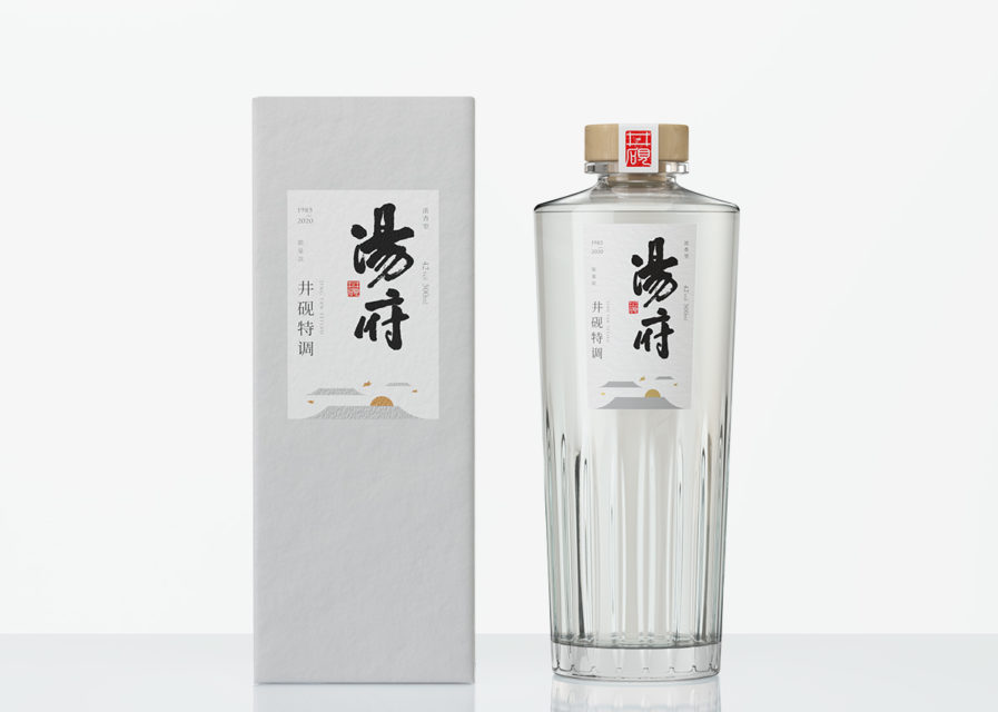
Inspired by a Chinese glass commonly used in the ’80s, designer Zhou Yao creates a sleek reverse-cone liquor bottle in entry “Tang Fu Liquor” (above) for Jiangsu Tangfu Wine Co. with a simple, white packaging and label that easily attracts the eye. Vertical shapes in the glass’s base give a modern feel to the product and represent rice fields and bring to mind images of crashing waves. Zhou Yao has 10 years of experience in brand design consultancy which he uses to bring out innovative design in products. His knowledge of the industry has led brands to success in saturated markets.
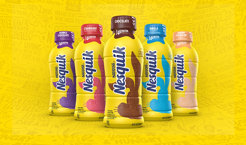
Revamping their own design, Nestlé looks to inspire and instill an energetic feeling with their new milk bottles. The Nesquik “’Ready-to-Drink’ Redesign” (above) still features the bold contrasting blue and yellow colors that many are familiar with, but replaces the iconic rabbit character with his silhouette, filled with motivational quotes and popular catchphrases. The packaging engages with consumers in a fun manner, relating to new generations while maintaining a classic look.

Both designs have seen an increase in sales for their respective companies and have shown how traditional designs can easily mix with modern minimalism to create a bold, impactful image. 

Make your impact with your packaging designs in Packaging 10! ENTER HERE

Author: Graphis

Leave a Reply

Your email address will not be published. Required fields are marked *