With a variety of designs that include silver award winners from last year and brand new entries, we can’t wait to share with you what our wonderful designers have submitted. These designs bring a sense of creativity that is truly inspiring!
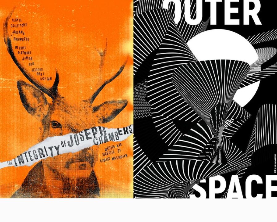
“The Integrity of Joseph Chambers” (above, left) was designed by Nick Mendoza for 433 Pictures’ new film of the same name. The film follows an insurance salesman named Joseph Chambers, who, in a desperate attempt to acquire the skills necessary to provide for his family in the case of an apocalypse, goes hunting for the first time all by himself. After his friend falls ill and can’t attend the hunting trip, Joseph Chambers goes through with it anyway and accidentally kills a man. The rest of the film shows Chambers as he grapples with the guilt of his actions. For the design, Mendoza chose to take the hunter, Chambers, and turn him into the hunted. To accomplish this, the designer placed a deer’s head on Chambers’ body to create an intriguing half person, half animal look. The client loved the design, and was very excited to submit it with the film to a variety of film festivals all over the world. Keep an eye out for this movie, which is set to be released in Spring 2023.
In a design that brings us into the unknown, Ivan Kashlakov‘s “Outer Space” (above, right) was created for the Poster Stellars 1st Intercontinental Poster Competition. One of the competition’s themes, “Outer Space”, was perfect for this piece. Kashlakov, like many people, is fascinated by outer space and wanted to depict how he sees it: something bold, mystical, and transformative. The poster won Silver in its category and was displayed alongside forty-five other posters at the Galleria WIT Warsaw in Poland, which was organized by Anna Klos; Wesam Mazhar Haddad took care of the United States display.
