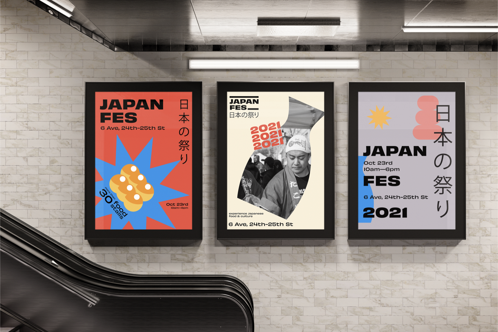
For this week’s featured New Talent work, we learn about radar systems with an educational poster that’s smart in both design and content, a poster series uses collage to promote a speaking event for artists, and one of New York City’s best food festivals gets some colorful rebranding.
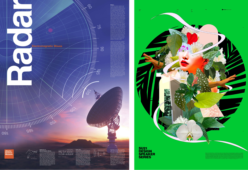
Where would this world be without radar? A detection system that uses radio waves to determine the distance of objects relative to a location, what started as a tool for war now helps navigate ships and planes, as well as monitor the weather, map the Earth’s crust, and more. Kushboo Udaay Nayak, a graphic design and visual experience master’s student at the Savannah College of Art and Design, sought to educate others about radar, and under the direction of Professor Peter Wong, designed “Educational Poster_Radar: The Electromagnetic Wave” (above, left), an educational, informative poster that explains how radar works and how it calculates electromagnetic waves.
Even before reading the poster’s text, which goes into detail about how radar works, the visual design is narrative and easily understandable. Set against a setting sun that calls to mind radar’s use in space, a disk beams outs crescent-shaped waves, one of the most recognizable symbols today thanks to wi-fi. As they move across the poster, they overlap with another recognizable image, a round radar screen with a red circular target. Additional images and graphs are printed on the bottom. Informative with a clean layout, this poster is already an award winner, winning silver in the Poster Stellar competition and an Honorable mention in the 2021 International Design Awards.
As fun as it is looking at art, it can also be great to hear people talk about it and learn how it was made. The ArtCenter College of Design, one of the best design and art schools in the United States, hosts a speaker series each year that features the school’s latest graduates talking about their portfolios. Under the direction of Professor Sean Adams, students Jo Iijima and Alan Xu made the “SU21 Design Speaker Series Poster” (above, right) as both a school project and to help promote the event.
The series is composed of six posters, with one representing the series as a whole, and the other five referencing the five guest speakers. Iijima and Xu split the design process in two; the former made created five freeform, dynamic, and unique collages that spoke to each guest speaker’s style, while the latter designed a grid and typography system with some background iconography that tied the posters together. This division of duties not only maximized their creative talents but also brought the posters to a new level when both parts were combined, “creating a balance between freeform and systematic design.” Their posters were well received by their professor, fellow students, school faculty, and guest speakers, and were displayed at the ArtCenter South Campus Gallery.
