Do you prefer TV, a musical, or just really good poster art? Indulge in all three thanks to this week’s newest entries to our Poster Annual 2022 competition!
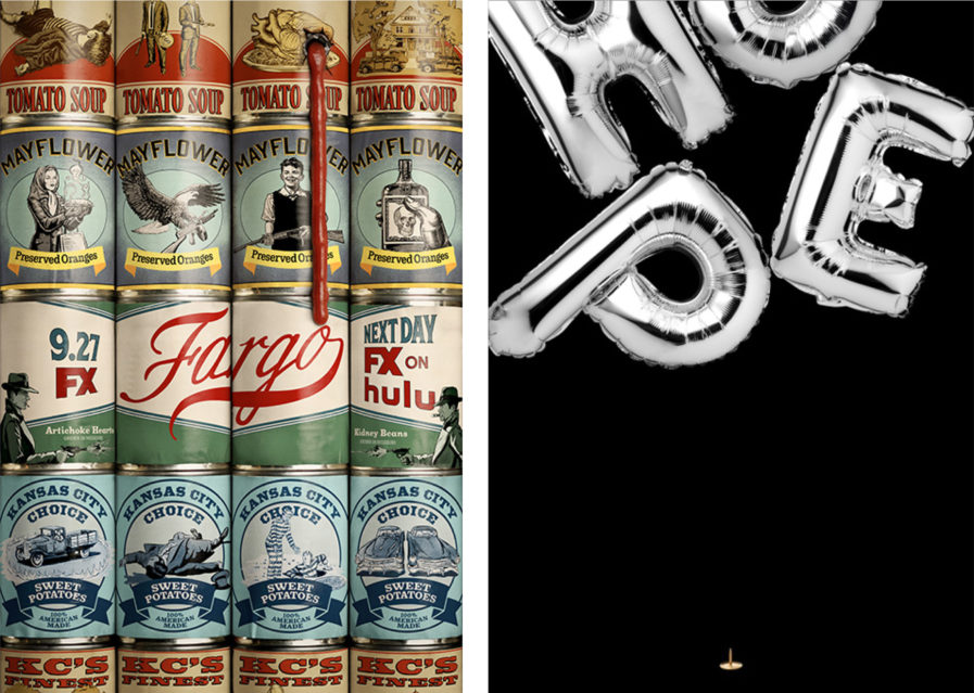
One of TV’s most popular shows, Fargo, gets some amazing promotion with “Fargo Season 4 – Key Art” (above, left) by Arsonal and Eclipse Advertising. The series, based on the 1996 movie, is an anthology black comedy crime drama, featuring a different story, characters, and setting each season, with the latest season set in 1950 Kansas City, Missouri. With that setting in mind, Arsonal and Eclipse Advertising went with a wall of canned goods featuring period-accurate typography and a folksy Midwest aesthetic. A closer look reveals a series of violent images, calling back to the crime element of Fargo, and to top it off, a single bullet hole leaking tomato sauce promises the newest season will be a bloody good time.
If COVID-19 and social distancing are keeping you down, this poster will lift your spirits. “Hope” (above, right) was designed by Danish designer Rikke Hansen for the 2nd Emirates International Poster Festival, the first-of-its-kind creative platform in the Middle East and North Africa that showcases contemporary international poster design. Metallic silver letter balloons spelling out the word ‘Hope’ float against a black backdrop. At the bottom lurks a gold thumbtack, threatening to pop the balloons. Hansons’s poster is a metaphor for how hope is a part of people’s daily practice and how our mindsets determine whether we sink, pop, or soar. This design was so popular, it was exhibited at EIPF during Design Week Dubai in 2020.
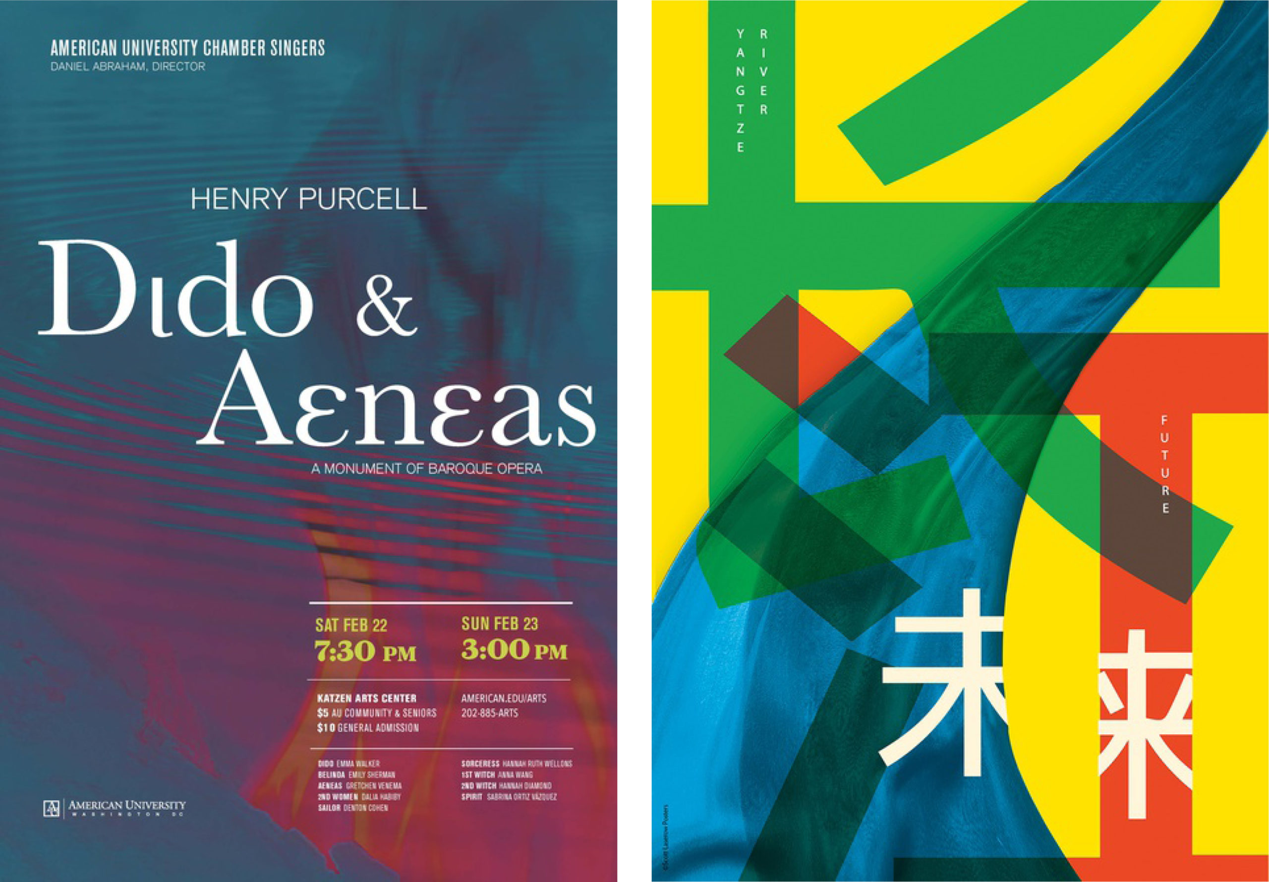
If TV isn’t your thing, maybe watch an opera instead! Anna Leithauser, an American designer, created this promotional piece for American University’s production of the opera Dido and Aeneas(above, left). The opera, written around approximately 1688 by British Baroque composer Henry Purcell, is based on part of Virgil’s epic poem, The Aeneid, and tells the tragic love story of Dido, queen of Carthage, and the Trojan hero Aeneas. Leithauser smartly mixes blue water ripples with red-pink flames to make a haunting reminder of the story’s sad ending; when Aeneas eventually sails away to discover Rome, Dido commits suicide on a flaming pyre. Leithauser also makes wise typography choices, using yellow and white font to clearly display the times and dates of the show.
Our last poster is another exhibition entry. American designer Scott Laserow, founder of Scott Laserow Posters, designed “Silk Rivers” (above, right) for the International Charity Poster Design Invitational Exhibition. Sticking to the exhibition’s theme of ‘The Yangtze River – The Future,’ Laserow was further inspired by China’s history of silk production for his poster. Blue silk lays out the Yangtze River, while green for the riverbeds and a traditional Chinese red finishes off the color palette. The typography and characters overlap, representing how the river and China’s people are tied together. In using such valuable fabric and symbolism for the poster, Laserow highlights how important the river is to China and how it should be preserved for future generations.
Our Poster Annual 2022 competition ends on February 15th, so enter while you can! And if you want to see more competition entries, click here.