Craig Frazier’s drawings aren’t just art—they’re clever little puzzles that make you think, smile, and wonder, “What’s going on here?” With decades of experience, his illustrations are marked by their simplicity, wit, and a relentless focus on engaging the audience. In this Q&A, Frazier reflects on his creative process, the evolution of his work, and the stories behind his latest book, Drawn. Uncover Craig’s creative world here.
Introduction by Ken Segall, Author & Former Creative Director, Apple
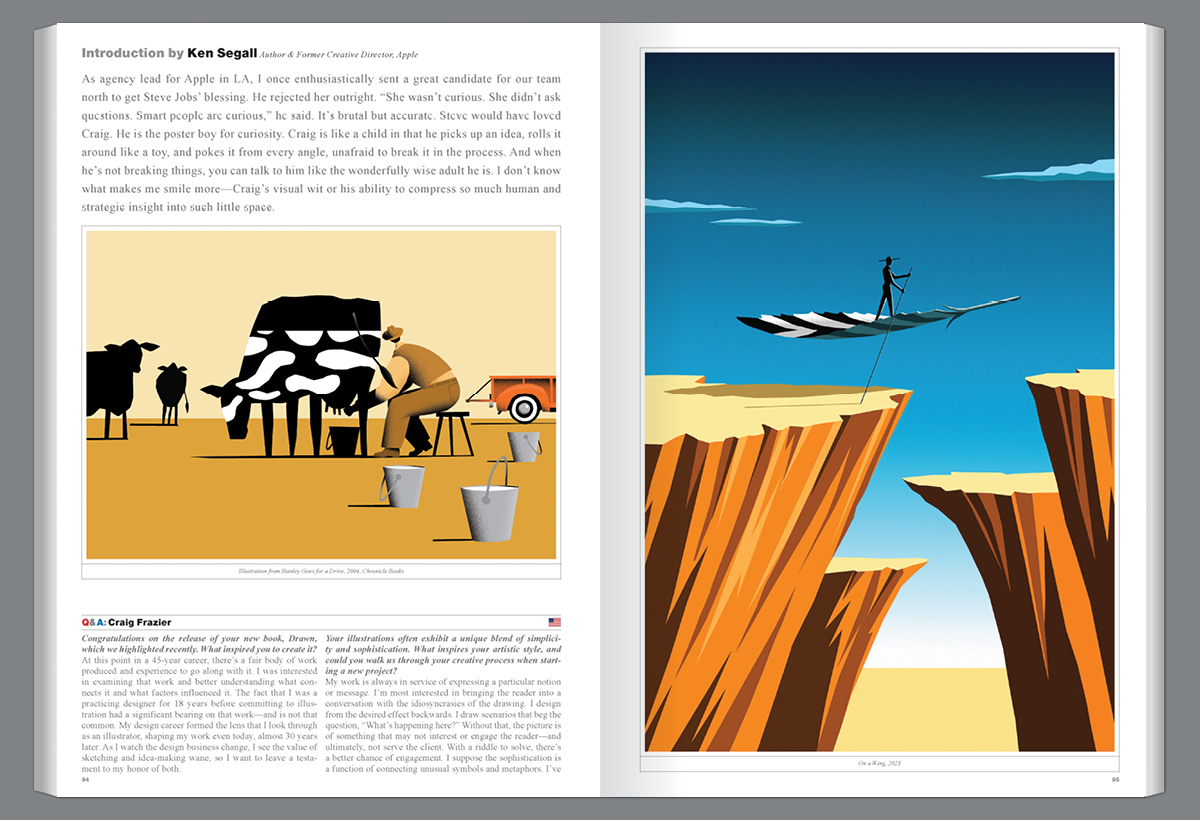
As agency lead for Apple in LA, I once enthusiastically sent a great candidate for our team north to get Steve Jobs’ blessing. He rejected her outright. “She wasn’t curious. She didn’t ask questions. Smart people are curious,” he said. It’s brutal but accurate. Steve would have loved Craig. He is the poster boy for curiosity. Craig is like a child in that he picks up an idea, rolls it around like a toy, and pokes at it from every angle, unafraid to break it in the process. And when he’s not breaking things, you can talk to him like the wonderfully wise adult he is. I don’t know what makes me smile more—Craig’s visual wit or his ability to compress so much human and strategic insight into such little space.
Congratulations on the release of your new book, Drawn, which we highlighted recently. What inspired you to create it?
At this point in a 45-year career, there’s a fair body of work produced and experience to go along with it. I was interested in examining that work and better understanding what connects it and what factors influenced it. The fact that I was a practicing designer for 18 years before committing to illustration had a significant bearing on that work—and is not that common. My design career formed the lens that I look through as an illustrator, shaping my work even today, almost 30 years later. As I watch the design business change, I see the value of sketching and idea-making wane, so I want to leave a testament to my honor of both.
Your illustrations often exhibit a unique blend of simplicity and sophistication. What inspires your artistic style, and could you walk us through your creative process when starting a new project?
My work is always in service of expressing a particular notion or message. I’m most interested in bringing the reader into a conversation with the idiosyncrasies of the drawing. I design from the desired effect backward. I draw scenarios that beg the question, “What’s happening here?” Without that, the picture is of something that may not interest or engage the reader—and ultimately, not serve the client. With a riddle to solve, there’s a better chance of engagement. I suppose the sophistication is a function of connecting unusual symbols and metaphors. I’ve built a trustworthy visual vocabulary over the years. Simplicity is always a result of removing unnecessary elements or details. Simply, my process requires a lot of sketching to find a story to tell. I know if I give up on an idea too early; it takes persistence. I also rely entirely on my sensibilities, not my client’s. I want to be surprised with the possibilities I see.
Over a career spanning more than 40 years, how have your illustration styles and techniques evolved? How do you stay motivated and inspired?
If my style has changed, I’m certainly not aware of it. I’ve always felt that your style arrives when you become comfortable with your shortcomings and embrace the principles you are drawn to. It’s a strange combination of your limitations and your preferences. For me, the only real change is a sharpening of technical and conceptual skills. I’m always trying to make the image simpler, more concise, and more interesting. I’m motivated to stay relevant; it’s the only way to stay in the game. Inspiration is a job requirement—you must remain attentive to the world around you and look for the oddities that can show up in a drawing.
Your work spans various mediums, from editorial illustrations to children’s books and beyond. How do you adapt your style and approach for different projects and audiences? How do you decide what elements to include or exclude to communicate your message effectively?
The primary difference in the mediums is the messages I’m asked to communicate. Editorial is more far-reaching in content and subject, corporate more expected, yet—in the case of finance and technology—more inviting of metaphor and abstraction. I’m often trying to explain subjects that require abstract ideas to communicate. Keeping things simple is critical to making tough subjects understandable and interesting. I think of my job as portraying subjects “in other words” in service of comprehension. Kid’s books require an elemental description of things, like a snake in a car or pouring milk into the sky. Kids can accept the most far-reaching notions. I have full license to be playful and fun. Anything is possible. Ironically, I try to apply that same discipline to adult illustrations.
Your illustrations often incorporate playful and whimsical elements that appeal to readers of all ages. How do you balance creating accessible illustrations for younger audiences while still resonating with older readers?
I never think about the age of my readers. Even when I make a kid’s book, I let the publisher decide the age group for my work after I make it. Good symbols and clarity are universal and not age-sensitive. Honestly, playfulness and whimsy are critical to me as they can bring a smile to the mind, and everyone enjoys that. Sometimes, just the slightest visual twist permits a viewer to leave the boredom of reality, even if it’s only for a moment.
Color plays a significant role in your illustrations, often conveying mood and emotion. How do you select color palettes for your projects, and what considerations do you take into account?
Color is very intuitive to me by now. I gravitate toward brighter, more saturated color, which serves the boldness and simplicity of my illustrations. I temper the hues occasionally if I want the mood to be more solemn or dark, but I generally use color for emphasis and to direct eye movement. A little well-placed color sometimes speaks louder than a lot of color everywhere. I’m drawn to great poster design and apply that same sensibility to most of my illustrations.
How much of your work is design versus illustration today, or is it co-mingled?
I’ve done a little more design in the past couple of years simply because opportunities have presented themselves. If I’m designing, I never pass up a chance to illustrate, often trying new mediums or methods. Much of this work is around packaging and the wine industry. It’s different than my early years in design. I’m not trying to build a business and a portfolio; I’m just trying to help companies communicate better.
How has the business side of illustration and design changed for you since you started? And how has the advent of digital tools and platforms influenced your work?
This question warrants a lengthy discussion, but in summary, we have become so technology-enabled that production has eclipsed idea-making. It shows in the sameness of so much work, particularly corporate. Since print is virtually non-existent in corporate communication, companies commission—or worse, produce in-house—work that is safe, often derivative, and fundamentally lacking in ideas. The commitment that was once invested in print is replaced with posting digital work that is subject to change by the whims of many cooks in the kitchen. It’s fast and relatively inexpensive due to technology. Lastly, when everyone uses the same tools, the products bear an uncanny likeness—the opposite of the goal. I still cut my illustrations out of amberlith and scan them into Photoshop. I could use the second version of Photoshop for everything I do. The internet has made doing business easy and fast—sometimes too fast.
With all the technological advancements, the price of illustrations has stayed the same or declined. Stock, AI, and Pinterest have all contributed to the devaluation of illustration and photography. AI may be the final blow to the careers of creators. It is infringement at a global level.
Your essays in Drawn delve into the personal stories behind your work. Is there one story or anecdote that particularly resonates with you?
Well, they all resonate with me! I think the overarching story is that I have always been drawn to a certain kind of work and spent a career learning and perfecting it. I’m drawn to simplicity, wit, and, above all, inviting the viewer to take a second look. These are the principles of good design, and they transcend into illustration. I am truly a designer at the core and work toward function first.
The second story is my dedication to keeping my hand in my work. Besides the physiological effect of making marks on paper, sketching and keeping the process as analog as possible slows the pace and—for me—produces meaningful ideas and works with character. That’s the goal.
How do you see your work influencing future generations of illustrators and designers?
My goal has always been to figure out what I am drawn to and how to find it and create it. I want to find what I have to offer and what is authentically mine to contribute. If I can help another do the same, I’d be delighted.
What is the value of sketchbooks to you?
I can’t imagine approaching a project in design or illustration without the benefit of a habit I formed early on—working in a sketchbook. Drawing in a sketchbook makes me feel like I’m making room in my head, like moving stuff from the dining room table to the garage. It permits a certain aimless visual wandering with no particular destination. No creative brief, no rules, no deadline, no judgment; it’s a perfect place for conducting tests and storing pieces of ideas.
Do you have any secrets to problem-solving?
I have maintained the “multiple solutions” approach my entire illustration career. With this process, several things can happen. When you abandon the single-solution tact, you are free to “walk around the problem.” This leads to expanding the horizon of ideas. It sustains a state of ideation and suspension of judgment for a longer time, which means more ideas. It’s the opposite process of going down a single rabbit hole that, in fact, may not lead to the best solution at all. To focus on creating one solution only narrows the funnel. It rushes you to the tail end of the process before there is a lot to choose from.
The fact is that multiple solutions reveal myriad vantage points from which a problem can be viewed. Frequently, I will develop a couple of solid solutions, which gives me the liberty to think outside the given definition of the problem. As a result, I may discover something that supports a redefinition of the challenge. Discovery can’t be truncated. Some of my most exciting ideas arrive when I’m about to put my pen down.
Craig Frazier has been an illustrating designer since 1978. His work is recognized internationally for its wit, surprise, and simplicity. He is a frequent contributor to The New York Times and publications like Time Magazine, Fortune, Bloomberg Business Week, Harvard Business Review, and The Wall Street Journal, to name a few. His corporate clients include Adobe, American Express, Boeing, Chevrolet, Deloitte, MasterCard, Mohawk Paper, Navigant, the Royal Mail, the U.S. Postal Service, and United Airlines. Craig has created eight postage stamps, including the 2006 Love stamp and the 2010/11 commemorative Scouting stamps. Craig published his second monograph, Drawn (Goff Books), in January 2024; his first is a 176-page monograph titled The Illustrated Voice (Graphis Press, 2003). He is also the author and illustrator of ten children’s books.