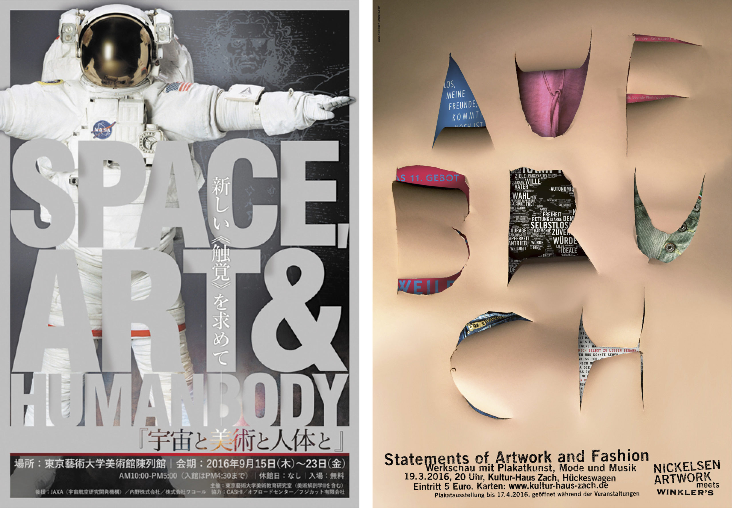
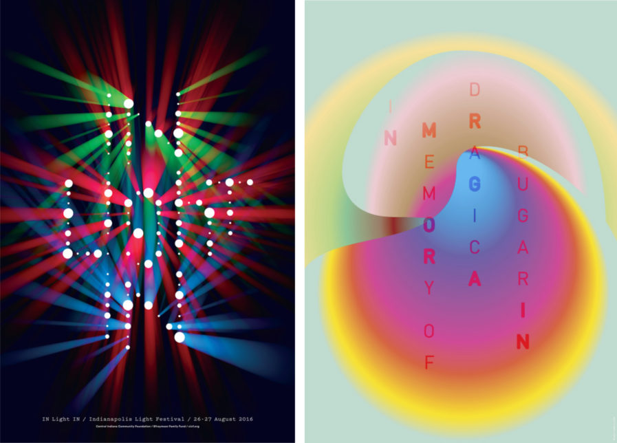
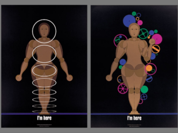
These Platinum and Gold-winning posters from 2017 and 2018 are designed with a great preference for bold colors and fascinating typography. Each entry, designed by various design firms for all sorts of different clients, is extremely polished and well deserving of their awards.
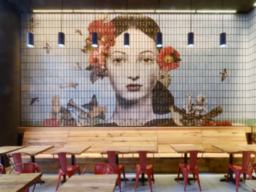
The first Platinum winner comes from the design firm Thirst with a series created for the Central Indiana Community Foundation. Rick Valicenti and Zach Minnich designed the limited edition promotional posters for the first-ever Indianapolis Light Festival in 2016. Entitled “IN Light IN” (above, left) as a nod to the ‘In’ of Indiana and Indianapolis, these works are positively illuminating. The brilliant color schemes reach out with warmth and brightness, and the style for each piece spans from appearing three-dimensional and lit from within, to illusionary with marquee-esque light bulbs. The range of looks is quite impressive, as all four posters are sure to spark the imagination of any viewer.
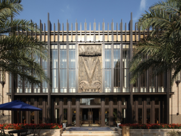
Designed by Sasha Vidakovic of SVIDesign for Porodica Bugarin, “In Memory of Dragica Bugarin” (above, right) beautifully captures the aura of a beloved figure as a commemoration of the client’s beloved family member. Various emotions are expressed through color, form, and composition, and the diverse, abstract shapes reference both the personal patterns of the viewer’s own lives and the connection that is formed between them and Dragica Bugarin, whether a stranger or known to them. This connection is further strengthened by the text whose typography is designed to be semi-transparent, melting into the shapes and boldly declaring who this piece is for. Vidakovic certainly made a poster full of warmth and worthy of admiration.
