Illustrated and reinvented images are all the rage with this week’s New Talent entries. It takes imagination to create some new or reinvent what already exists, and these student show they have the creativity to do so.
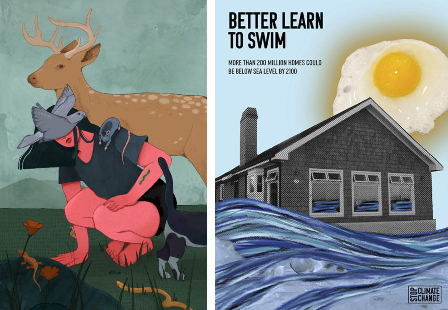
“Anabelle” (above, left) by Abigayle Smith, a student at the ArtCenter College of Design, was assigned by her professor Jim Salvati to make a portrait that portrayed someone close to her, but without showing their face. While a little backwards considering a portrait is pretty much mostly and face, Smith took the challenge in stride. The obvious subject choice was her partner, Anabelle, who according to Smith has always been close with animals and nature. She wanted to showcase her surrounded by animals and in a relaxed environment, and the final image is just that, with Anabelle outside in casual clothes and surrounded by animals, a bird in flight covering her face. The picture is given an additional touch of whimsy with the use of complementary colors, with the greens and blues of the background helping the pink skin pop. Ultimately, Smith felt the goal was met, and her partner felt it represented her well.
California State University, Fullerton student Jennifer Coats was assigned to create a poster that addresses the problem of climate change. “Better Learn to Swim” (above, right) by was designed to be displayed in a college setting in order to reach college-aged students, which is its primary audience. It addresses the rise in sea levels that end up taking over residential homes, and invoke a call to action to address this global problem. It is explicit with this message, relying on curated imagery and techniques such as a photo montage and collage, with added textures and illustrative elements to enhance the content. Coats’ main inspiration came from previous art movements that use similar techniques, such as Dada and Bauhaus. However, because the target was college students, she also made sure the poster could fit into modern culture and be something that can work in both digital and printed formats. In the end, Coat’s professor was pleased with the overall outcome of the poster, and the message that was being conveyed was clear to its viewers.


